From the Archive; Peter Saville interview

Screen Shot 2017-09-26 at 16.37.26

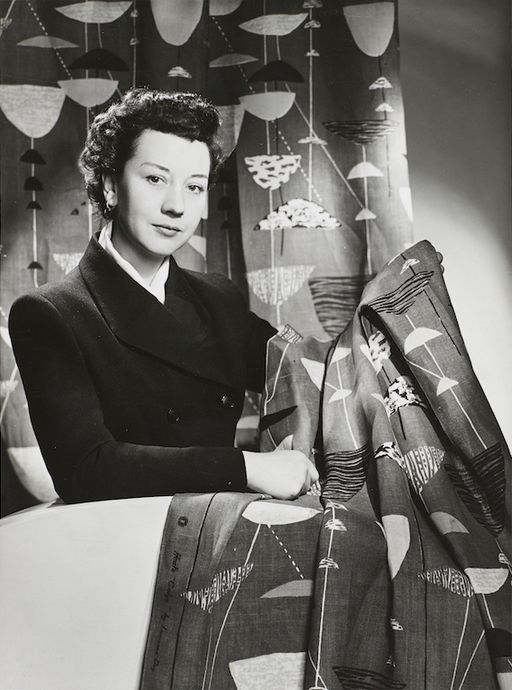
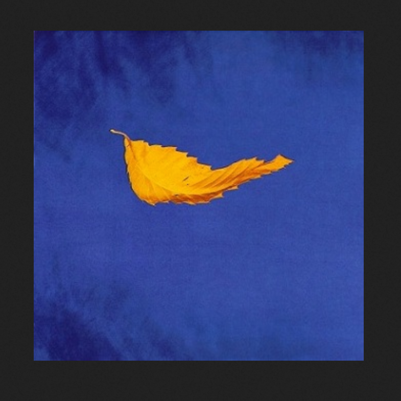
The London Design Festival is the capital’s most prestigious design event, taking over the city for much of September each year. Back in 2013, Peter Saville won the London Design Festival Medal; I interviewed him for Blueprint and the article is available online via DesignCurial. At the time I asked a number of creatives about their favourite Saville works, and one guest blogger, Paul West of Form, mentioned True Faith by New Order, with photography by Trevor Key. Now, a display of work by that legendary photographer, a regular collaborator with Saville, is on show as part of Hull 2017, UK City of Culture. Trevor Key’s Top 40, features his iconic photographic images for some of the twentieth century’s most famous record sleeves. I’m using this opportunity to post another unpublished interview with a contributor to Sound Design, this time Peter Saville, as a number of their joint efforts featured in this exhibition, which the British Council toured across Asia and Australia in the early years of the new Millennium. These edited interviews come from long phone conversations or studio visits. I tried to keep the interviewees focused on the topic of designing for the music industry, and rather than bombard them with penetrating questions, I preferred to let the designers do the talking and reminisce anecdotal stories about the finer details of working with musicians and labels. You can find the Aubrey Powell interview, here, and there will be more in this series. As I’ve said before, I’m reluctant to post copyrighted images to illustration the interviews, but this Japanese website offering a complete discography of Peter Saville’s record sleeve designs is all you’ll need.

Peter Saville, interviewed by Liz Farrelly on 1/8/2000.

Liz Farrelly: Tell me about your involvement with Factory Records.

Peter Saville: Going right back to the beginning, I was at school with Malcolm Garrett, and at that point our horizons stretched no further than a Hawkwind, Velvet Underground or Roxy Music cover. Then Malcolm went to Reading University, and courtesy of the library there, the history of twentieth-century design became known to us, via his reading list, which included design theory that we at Manchester Art College didn’t get. I started college in 1974 and graduated in 1978. Malcolm did a year at Reading University while I did a Foundation Course and I encouraged Malcolm to do his next three years at Manchester.
Continue reading

signature

Seminar Paper; Mediating Design, a case study in diversity

Modes of Mediating Applied Art and Design
7th Tallinn Applied Art Triennial
Soprus Cinema
Vanna-Posti 8, Tallinn, Estonia
21 April 2017

This is an edited version of a paper I presented amidst Art Deco splendor in Tallinn. While the city was still waiting for spring the reception was warm, and the audience and fellow speakers contributed to a lively discussion around the role of media in the mediating art and design. I’d like to thank Triin Jerlie and Keiu Krikmann for inviting me to speak, and the organising committee of the Tallinn Applied Art Triennial and the British Embassy Tallinn for funding my trip. Look for another post about Tallinn, the city-wide Triennial and the Estonian Museum of Applied Art and Design.

This paper is still in the form of a ‘talk’, but also constitutes work-in-progress that will inform the last chapter of my doctoral thesis on the future of design museums. In May, I presented a longer version to University of Brighton MA Art and Design History students as part of the module, Critical Reflection, at the invitation of my colleague, Megha Rajguru, and that version of the talk provided an opportunity to explore changing definitions of ‘interpretation’. The images are from my PowerPoint presentation, and either taken from the Internet or using my Apple iPhone 4S.
Continue reading

signature

From the Archive; summer anarchy

2017-06-21 09.57.242017-06-21 09.57.42

It’s the Summer Solstice and I’m re-posting this article as the Glastonbury Festival kicks off and protesters take to the streets for a Day of Rage. In heatwave temperatures (warmest since 1976), the soixante-huitards’ slogan, ‘les pavés, la plage!’ (translates as, under the paving stones the beach) is ringing in my ears. It’s twenty years since I went to Glastonbury; 1997 was a mud bath, two years before it had been glorious sunshine. Both times friends were made and tested, and despite the odds familiar faces popped out of the crowd. That era was all Parties & Protests and although my plans to visit a Euro Teknival didn’t materialise, later that summer I made it to Burning Man in the Nevada desert and learnt the mantra of hydration from the daily newsletter, Piss Clear!

Much has changed; the underground events mentioned in this article were organised without the aid of social media and minimal Internet coverage, even though I make much of ‘the daily mayhem of mobile phones, faxes and pagers’! One source of information (not mentioned in this article, but I wrote about it another time) was the indomitable SchNEWS, a photocopied newsletter reporting on legal and political campaigns and listing direct actions. It worked like this; you posted them a pile of stamps and they mailed you weekly issues. I met the photographer, Nick Cobbing, through SchNEWS, and by an odd quirk of fate have ended up living next door to their old office!

Now, come the summer there’s a stage in a field catering to every taste and subculture. Festivals are bespoke, niche, glampy affairs, with fancy dress, boutique beers, Insta-Stories and Twitter-Moments. This branch of the music, entertainment and events industries has blossomed, fanned by the British love of a camp-fire sausage and a piss-up in a tent. But I’d suggest that the roots were there back in the 1990s, as innovation and diversity were the order of the day. So I’m not complaining, just suggesting that an updated article would be a whole other story. On a more serious note though, the Millennials have discovered politics, and protest is once again in vogue…plus, we have the weather for it.
Continue reading

signature

From the Archive; You never know when you might need them

Spread from ‘Blueprint’ showing University of Brighton Gallery and exhibition design featuring salvaged fire doors

Spread from ‘Blueprint’ showing the University Gallery in Brighton and the exhibition design featuring salvaged fire doors

I was reminded of this article when visiting another exhibition, George Hardie …Fifty Odd Years, also at the University Gallery at University of Brighton. (Look out for a review of that exhibition, soon).

Back in 2005, Professor Hardie contributed his collection of rulers to You never know when you might need them, and they feature in the opening spread of the Blueprint article about the show, see above. At the time, my husband, Gregg Virostek, was an Interior Architecture student and worked on the exhibition build, while I was beginning to explore an obsession with collecting. That interest has developed into a research topic, as evidenced by this blog. So, as this article has yet to be digitised and made available online by the originally publisher it, here it is for reference.
Continue reading

signature

First Visit; Vitra Schaudepot

Exterior of the Vitra Schaudepot, by Herzog & de Meuron. Photo © Vitra Design Museum, Julien Lanoo

Exterior of the Vitra Schaudepot, by Herzog & de Meuron. Photo © Vitra Design Museum, Julien Lanoo

Vitra Schaudepot
Vitra Design Museum
Charles-Eames-Str. 2, Weil am Rhein, Germany
Visited, 31 May 2016

I used to go on press trips so regularly that I thought I didn’t need holidays. Travelling on planes and trains across Europe, America and further afield I visited designers, studios, factories and museums. Having swopped my peripatetic lifestyle for a more sedentary teaching gig, this press trip came out of the blue. I previously visited Vitra for a MUSCON conference (read about it, here) and marvelled at the Vitra Haus (read, here), so was aware of the upcoming addition to the extraordinary campus and keen to see the Schaudepot (Open Storage), a relatively new development in museum practice. A return visit wasn’t on my agenda though, so when this invitation popped into my inbox along with a commission to review the Vitra Collection’s new home, I was up for it! My article appeared in Blueprint magazine (no.347, p.36) and is available online at Design/Curial, here. This post adds details from the press conference and a conversation with Curator Janna Lipsky.
Continue reading

signature

From the Archive; remembering Lucienne Day

Lucienne Day in New York with Calyx (1951), 1952: The Robin and Lucienne Day Foundation and archive. Photographer: Studio Briggs.

Lucienne Day in New York with Calyx (1951), 1952: The Robin and Lucienne Day Foundation and archive. Photographer: Studio Briggs.

The current issue of Blueprint celebrates the life and work of Lucienne Day in the centenary year of her birth, with articles by and about her. The back pages of the magazine collect previous articles about the renowned designer, including a review I wrote about an exhibition at Manchester’s Whitworth Art Gallery, long before the stunning renovation and addition (mentioned in a previous post about Manchester, here); when I visited the Gallery presented a perfect example of late Victorian institutional architecture, a fine addition to the “Red Brick” University of Manchester. Initially, the thought of re-reading an article written over 24 years ago was a bit daunting, but then it helped me recall my first time in Manchester, an extraordinary day trip, meeting Lucienne Day and Jennifer Harris (the curator and author of the exhibition catalogue), and the privilege of walking the exhibition in their company. A new exhibition at the Gallery, Lucienne Day – A sense of growth, from 14 April to 11 June 2017, examines how plant forms inspired many of Lucienne Day’s iconic patterns. I hope to get back up north to visit it…

Lucienne Day celebrated in Blueprint, no. 351.

Lucienne Day celebrated in Blueprint, no. 351.

“British design’s first celebrity”
by Liz Farrelly
Blueprint, June 1993, pp.36-38
Exhibition review of Lucienne Day: a career in design
Whitworth Art Gallery, Oxford Road, Manchester
23 April to 26 June 1993
Visited 22 April 1993

Calyx screen-printed furnishing fabric, Lucienne Day, Heal’s Wholesale &; Export, 1951. The Robin and Lucienne Day Foundation and archive.

Calyx screen-printed furnishing fabric, Lucienne Day, Heal’s Wholesale & Export, 1951: The Robin and Lucienne Day Foundation and archive.

After a long and distinguished carer, Lucienne Day is being honoured with a retrospective exhibition which, appropriately enough for a textile designer, is in Manchester. Over 80 per cent of her furnishing fabrics are here, supplemented by examples of designs for wallpaper and tableware, showing a great virtuosity of image-making and variety of aesthetics. And while the exhibition sheds light on an individual’s career, it acts just as effectively as a review of changing styles in domestic taste, albeit at the upper end of the market.
Continue reading

signature

First Visit; IKEA Museum

Gallery

This gallery contains 36 photos.

IKEA Museum IKEAgatan, 5, 343.36 Älmhult, Sweden ikeamuseum.com Visited, 9 June 2016 Invited to the Press Preview of the new IKEA Museum, I travelled to the company town of Älmhult in southern Sweden. Later I wrote an article about the … Continue reading

From the Archive; revisiting Norwegian design

2016-05-15 13.12.18

“Non-competitive Advantage”
by Liz Farrelly
Blueprint
No.336, pp.148-164

On the occasion of an exhibition promoting Norwegian design in New York, here’s an article from my archive, “Non-competitive Advantage”, available on DesignCurial. Originally published in Blueprint magazine, I wrote it after a snowy trip to Oslo in February 2014, organised by the Norwegian Embassy in London and hosted by DOGA, the Norwegian Centre for Design and Architecture. A group of European journalists met and mingled with Norwegian designers, and as well as seeing and hearing about new work the big surprise (for me) was the Norwegian government’s commitment to promoting Norway’s nascent design industry.
Continue reading

signature

Imaging New Tate Modern

2016-03-23 15.14.01

From digital to analogue, consider this a signpost to a printed, published article in Blueprint, issue 345. After interviewing Peter Saville, reading Tate Modern press releases, navigating official webpages and searching the media coverage, I wrote a review of an image created by Saville and team that was commissioned to accompany communications about the extension and renovation of Tate Modern, aka “New Tate Modern”. Eventually the image will be incorporated into a revamped identity for the entire Tate empire.
Continue reading

signature

Anthony Dunne; two meetings

Anthony Dunne on Design Week website

With the news last week that Professor Anthony Dunne, Head of the Design Interactives programme, and his partner Fiona Raby, a founding member of CRD Research Studio and a Senior Research Fellow, are stepping down from their roles at London’s Royal College of Art at the end of the 2015 academic year, I’ve looked back through my archive of design magazines and found a couple of interviews with Tony. Now Fiona and Tony plan to concentrate full-time on their joint practice, Dunne & Raby, which has brought us, among other memorable moments, the “design fiction” United Micro Kingdoms (in exhibition form at London’s Design Museum), reviewed here.

Part One

“Loewy’s Children”
by Liz Farrelly
Blueprint
No. 76, April 1991, p.44-47

Standfirst: As the Design Museum celebrates the father of industrial design, Michael Horsham assesses its history and Liz Farrelly looks to its future (profiling five young(ish) product design practices)…

Tony Dunne’s intrepid move to Japan, after graduating from the RCA, led him to a full-time job at the Sony Corporations’s Design Centre. Being one of only two western members of a design staff over a hundred strong, and being expected to develop ten products a year, Dunne has been exposed to a rate of technological change, and social and cultural differnces, that have profoundly affected his view of product design. Using this as material for a redefintion of perception and information, he has come up with a product aesthetic that attempts a “mapping of the void”.
Continue reading

signature