The Future is in development

IMG_2859

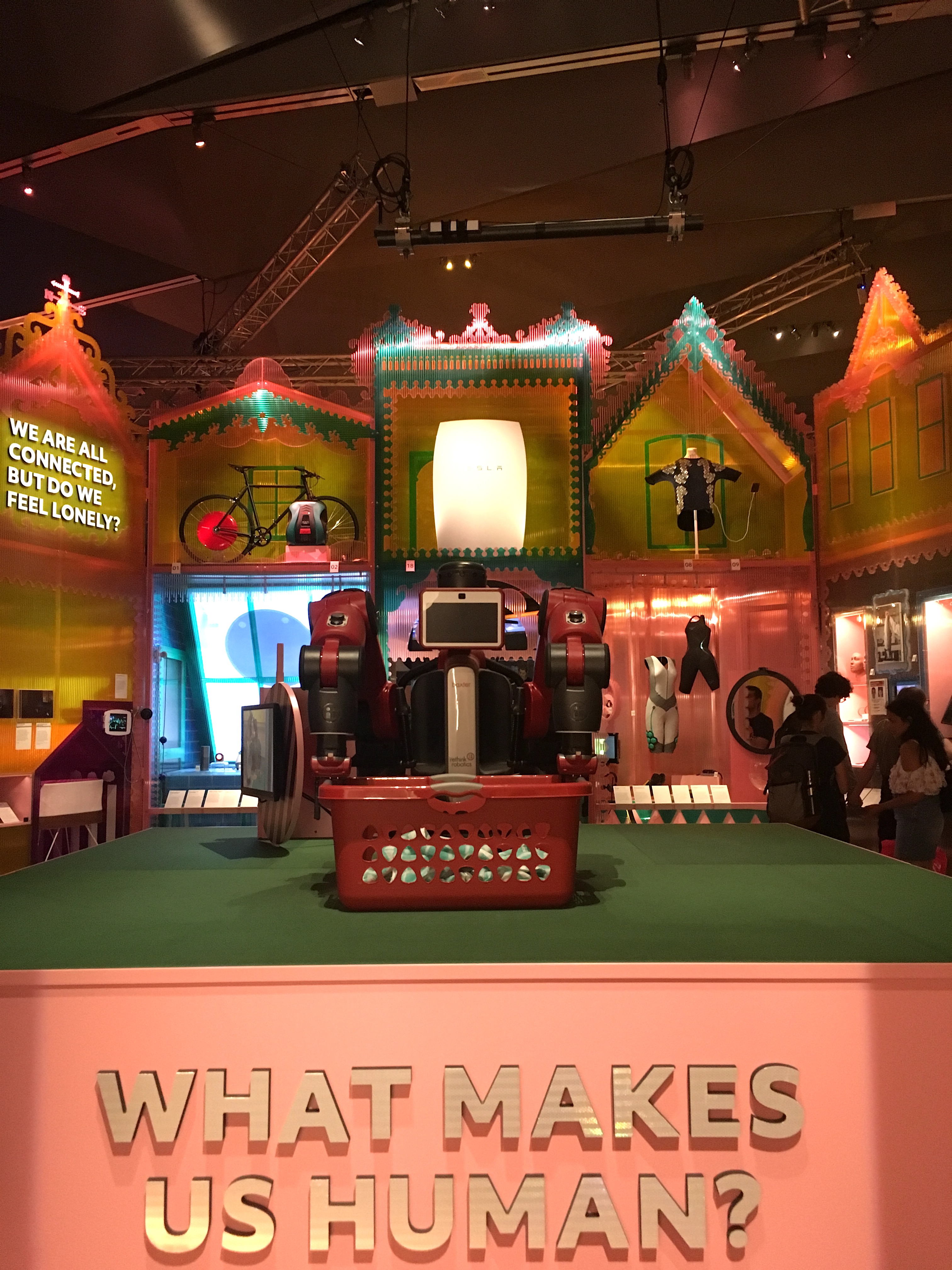
The Future Starts Here
Victoria and Albert Museum
Exhibition Road, London SW7
12 May to 4 November 2018
Symposium, “A Toolkit for the Future”, 29 June 2018

I’m a little tired of the future, perhaps because my doctoral research requires me to think about “the future of design museums”, but also I’m old enough to recall another time when the future was centre stage; back when we worried that the Millennium might put a bug in it I edited a book with “future” in the title.* Contextualising our current future obsession (see Nesta’s Future Fest) I teach a semester of Cultural and Critical Studies lectures and seminars to Visual Communication students at University of Brighton, “Visions and Versions of the Future”, where we look at significant moments and sites of post-war design culture, from the white-heat of technological progress to the anti-design roots of Postmodernism, alongside the imagined futures of science fiction, the smoke and mirrors of future-gazers and the commercial hocus-pocus of trend forecasting. The crux of the argument is, we may imagine multifarious futures but they are often prophetic, based on hints, hunches and the cutting-edge of disciplines, so it’s often just a matter of time before we catch up with our imaginations. That (hopefully) runs counter to the prevailing tendency of seeing the future as strange and difficult, whether utopian or dystopian, always out of reach and therefore beyond our capacity to influence or change; that version of the future which got us to the dangerous situation we are in now…
Continue reading

signature

Guest blogger; protest student

I teach Cultural and Critical Studies to Graphic Design and Illustration students at the University of Brighton and was suitably delighted when, on my way to give a lecture, I spotted this piece of ‘pallet protest art’. An Illustration student, Mhairi Lockett, created this message, so I invited her to tell us more in a guest blog.

Photo by Mhairi Lockett

Photo by Mhairi Lockett

Why did the University of Brighton lock up a student’s protest art?
by Mhairi Lockett

It is soon to be the May Festival here in Brighton and the Guest Director this year is Illustrator, David Shrigley. One of the themes of the Festival is protest art, this is timely as 2018 marks the 50th year since the student protests in Paris. As a third year student of Illustration at the University of Brighton, I have been moved to make my own protest art — pallet protest art.
Continue reading

signature

From the Archive; design Boom

James Jennifer Georgina, 2010, by Jennifer Butler, designed by Irma Boom

James Jennifer Georgina, 2010, by Jennifer Butler, designed by Irma Boom

Last week I wrote and delivered a lecture about Feminism to first-year Graphic Design and Illustration students at the University of Brighton. In addition to the feminist art history strategy of re-evaluating under-appreciated women artists, I’d like to stress the importance of presenting female role models to students, more so now that the gender balance in the classroom is tipping in favour of female students while the teaching is mainly done by men. Of course this is an old story; I wrote about the invisibility of women in design in 1995, first published in Eye and re-posted here. Kudos goes to the women’s advocacy groups within design academia and the profession, including WD+RU and Graphics UK Women, who are curating, teaching and writing about women in design. So, with the aim of increasing visibility, as the last few posts have been interviews with the usual suspects, here is an interview with one of the world’s most renowned designers, Irma Boom, who has consistently advocated experimentation with materials and techniques (which is good advice for all), while self-directing her career and occasionally stepping into the limelight to promote her work.
Continue reading

signature

From the Archive; Peter Saville interview

Screen Shot 2017-09-26 at 16.37.26

The London Design Festival is the capital’s most prestigious design event, taking over the city for much of September each year. Back in 2013, Peter Saville won the London Design Festival Medal; I interviewed him for Blueprint and the article is available online via DesignCurial. At the time I asked a number of creatives about their favourite Saville works, and one guest blogger, Paul West of Form, mentioned True Faith by New Order, with photography by Trevor Key. Now, a display of work by that legendary photographer, a regular collaborator with Saville, is on show as part of Hull 2017, UK City of Culture. Trevor Key’s Top 40, features his iconic photographic images for some of the twentieth century’s most famous record sleeves. I’m using this opportunity to post another unpublished interview with a contributor to Sound Design, this time Peter Saville, as a number of their joint efforts featured in this exhibition, which the British Council toured across Asia and Australia in the early years of the new Millennium. These edited interviews come from long phone conversations or studio visits. I tried to keep the interviewees focused on the topic of designing for the music industry, and rather than bombard them with penetrating questions, I preferred to let the designers do the talking and reminisce anecdotal stories about the finer details of working with musicians and labels. You can find the Aubrey Powell interview, here, and there will be more in this series. As I’ve said before, I’m reluctant to post copyrighted images to illustration the interviews, but this Japanese website offering a complete discography of Peter Saville’s record sleeve designs is all you’ll need.

Peter Saville, interviewed by Liz Farrelly on 1/8/2000.

Liz Farrelly: Tell me about your involvement with Factory Records.

Peter Saville: Going right back to the beginning, I was at school with Malcolm Garrett, and at that point our horizons stretched no further than a Hawkwind, Velvet Underground or Roxy Music cover. Then Malcolm went to Reading University, and courtesy of the library there, the history of twentieth-century design became known to us, via his reading list, which included design theory that we at Manchester Art College didn’t get. I started college in 1974 and graduated in 1978. Malcolm did a year at Reading University while I did a Foundation Course and I encouraged Malcolm to do his next three years at Manchester.
Continue reading

signature

Seminar Paper; Mediating Design, a case study in diversity

Modes of Mediating Applied Art and Design
7th Tallinn Applied Art Triennial
Soprus Cinema
Vanna-Posti 8, Tallinn, Estonia
21 April 2017

This is an edited version of a paper I presented amidst Art Deco splendor in Tallinn. While the city was still waiting for spring the reception was warm, and the audience and fellow speakers contributed to a lively discussion around the role of media in the mediating art and design. I’d like to thank Triin Jerlie and Keiu Krikmann for inviting me to speak, and the organising committee of the Tallinn Applied Art Triennial and the British Embassy Tallinn for funding my trip. Look for another post about Tallinn, the city-wide Triennial and the Estonian Museum of Applied Art and Design.

This paper is still in the form of a ‘talk’, but also constitutes work-in-progress that will inform the last chapter of my doctoral thesis on the future of design museums. In May, I presented a longer version to University of Brighton MA Art and Design History students as part of the module, Critical Reflection, at the invitation of my colleague, Megha Rajguru, and that version of the talk provided an opportunity to explore changing definitions of ‘interpretation’. The images are from my PowerPoint presentation, and either taken from the Internet or using my Apple iPhone 4S.
Continue reading

signature

From the Archive; summer anarchy

2017-06-21 09.57.242017-06-21 09.57.42

It’s the Summer Solstice and I’m re-posting this article as the Glastonbury Festival kicks off and protesters take to the streets for a Day of Rage. In heatwave temperatures (warmest since 1976), the soixante-huitards’ slogan, ‘les pavés, la plage!’ (translates as, under the paving stones the beach) is ringing in my ears. It’s twenty years since I went to Glastonbury; 1997 was a mud bath, two years before it had been glorious sunshine. Both times friends were made and tested, and despite the odds familiar faces popped out of the crowd. That era was all Parties & Protests and although my plans to visit a Euro Teknival didn’t materialise, later that summer I made it to Burning Man in the Nevada desert and learnt the mantra of hydration from the daily newsletter, Piss Clear!

Much has changed; the underground events mentioned in this article were organised without the aid of social media and minimal Internet coverage, even though I make much of ‘the daily mayhem of mobile phones, faxes and pagers’! One source of information (not mentioned in this article, but I wrote about it another time) was the indomitable SchNEWS, a photocopied newsletter reporting on legal and political campaigns and listing direct actions. It worked like this; you posted them a pile of stamps and they mailed you weekly issues. I met the photographer, Nick Cobbing, through SchNEWS, and by an odd quirk of fate have ended up living next door to their old office!

Now, come the summer there’s a stage in a field catering to every taste and subculture. Festivals are bespoke, niche, glampy affairs, with fancy dress, boutique beers, Insta-Stories and Twitter-Moments. This branch of the music, entertainment and events industries has blossomed, fanned by the British love of a camp-fire sausage and a piss-up in a tent. But I’d suggest that the roots were there back in the 1990s, as innovation and diversity were the order of the day. So I’m not complaining, just suggesting that an updated article would be a whole other story. On a more serious note though, the Millennials have discovered politics, and protest is once again in vogue…plus, we have the weather for it.
Continue reading

signature

From the Archive; You never know when you might need them

Spread from ‘Blueprint’ showing University of Brighton Gallery and exhibition design featuring salvaged fire doors

Spread from ‘Blueprint’ showing the University Gallery in Brighton and the exhibition design featuring salvaged fire doors

I was reminded of this article when visiting another exhibition, George Hardie …Fifty Odd Years, also at the University Gallery at University of Brighton. (Look out for a review of that exhibition, soon).

Back in 2005, Professor Hardie contributed his collection of rulers to You never know when you might need them, and they feature in the opening spread of the Blueprint article about the show, see above. At the time, my husband, Gregg Virostek, was an Interior Architecture student and worked on the exhibition build, while I was beginning to explore an obsession with collecting. That interest has developed into a research topic, as evidenced by this blog. So, as this article has yet to be digitised and made available online by the originally publisher it, here it is for reference.
Continue reading

signature

First Visit; IKEA Museum

Gallery

This gallery contains 36 photos.

IKEA Museum IKEAgatan, 5, 343.36 Älmhult, Sweden ikeamuseum.com Visited, 9 June 2016 Invited to the Press Preview of the new IKEA Museum, I travelled to the company town of Älmhult in southern Sweden. Later I wrote an article about the … Continue reading

From the Archive; listening to Kalle Lasn

2017-02-06 15.32.43

The outpourings of unease, dread and fear that recent political events have caused reminds me of an earlier era, 1999 (although back then we were asked to party too). The run up to the Millennium witnessed the kind of end-of-days headbanging practiced by religious zealots since the Middle Ages, spiced with a dose of fin de siècle decadence and topped with the techno-paranoia of the Y2K Bug and the predicted meltdown of communications, power and defence systems worldwide. With the Internet still in its infancy and social media merely a glint in its circuitry, hysteria was polarised. Mainstream media presented experts and button-holed politicians while conspiratorial survivalists used grass-roots networks to challenge official messages meant to placate the public.

One media practitioner commanding attention was Kalle Lasn not because he peddled doom-laden prophecies, although he was angry, but because the magazine he had launched a decade before seemed to (now) perfectly fit the zeitgeist. Adbusters gave a message of resistance and not from a place of despair. It advocated for urgent action using the incendiary power of the image, documentary and manipulated, while retaining a stance of positivity, and the look and feel of the magazine – colourful, glossy, eye-catching – helped promoted that can-do, future-focused message.
Continue reading

signature

Shopping Paradise; objects on display

Gallery

This gallery contains 33 photos.

Outside looking in, the glazed facade of Brighton’s premier flea market, Snoopers Paradise (“Snoopers”), projects domestic objects right into the street. Close-up window-shopping is only possible out of hours when external stalls have been packed away, but it draws people … Continue reading