From the Archive; design beyond the glass ceiling

IMG_6464

While moving piles of magazines around, I found this copy of Design Review, which was produced by the team that made Blueprint back in the early 1990s, when it was published by Wordsearch. It was an exercise in “contract”, the publishing company was paid by the Chartered Society of Designers (CSD) to create this quarterly magazine for its membership. I’m posting this article as a companion piece to “Mysterious Absence at the Cutting Edge”, which I wrote for Eye, as a member of the editorial team when employed at Wordsearch from August 1990 to August 1994.
Continue reading

signature

From the Archive; Vaughan Oliver interview

Pod by The Breeders, 1990, released by 4AD, designed by V23, photography by Kevin Westenberg

Pod by The Breeders, 1990, released by 4AD, designed by v23, photography by Kevin Westenberg

Here’s another interview from the unpublished series done for the Sound Design exhibition, which I curated for the British Council back in 2000. Vaughan Oliver’s work, as the studio known both as v23 and 23 Envelope, has been described as ‘graphic design for designers’; and while some people find it is difficult to decipher, it treats the initiated to a mix of undiluted wildness and superb craft. Indeed, it continues to win new fans, as Unit Edition’s successful Kickstarter campaign suggests. The aim is to publish a lavish ‘archive’ of Vaughan’s work, drawn from the extensive collection at the University of the Creative Arts, Epsom, where Vaughan is Visiting Professor of Graphic Design. Over the years, Vaughan has been a high-profile member of the graphic design community, participating in events and interviews, while his work has been collected by the Victoria and Albert Museum. This won’t be the first book about Vaughan either; Rick Poynor’s Vaughan Oliver: Visceral Pleasures was published by Booth-Clibborn Editions (who I worked with at the time), and designed by Vaughan himself, also in 2000.

Vaughan Oliver, interviewed by Liz Farrelly on 18/7/2000.

Liz Farrelly: How did your connection with 4AD start?

Vaughan Oliver: My interest in music graphics goes back to being a kid and the idea of combining my twin passions, music and visual arts.
Continue reading

signature

From the Archive; Peter Saville interview

Screen Shot 2017-09-26 at 16.37.26

The London Design Festival is the capital’s most prestigious design event, taking over the city for much of September each year. Back in 2013, Peter Saville won the London Design Festival Medal; I interviewed him for Blueprint and the article is available online via DesignCurial. At the time I asked a number of creatives about their favourite Saville works, and one guest blogger, Paul West of Form, mentioned True Faith by New Order, with photography by Trevor Key. Now, a display of work by that legendary photographer, a regular collaborator with Saville, is on show as part of Hull 2017, UK City of Culture. Trevor Key’s Top 40, features his iconic photographic images for some of the twentieth century’s most famous record sleeves. I’m using this opportunity to post another unpublished interview with a contributor to Sound Design, this time Peter Saville, as a number of their joint efforts featured in this exhibition, which the British Council toured across Asia and Australia in the early years of the new Millennium. These edited interviews come from long phone conversations or studio visits. I tried to keep the interviewees focused on the topic of designing for the music industry, and rather than bombard them with penetrating questions, I preferred to let the designers do the talking and reminisce anecdotal stories about the finer details of working with musicians and labels. You can find the Aubrey Powell interview, here, and there will be more in this series. As I’ve said before, I’m reluctant to post copyrighted images to illustration the interviews, but this Japanese website offering a complete discography of Peter Saville’s record sleeve designs is all you’ll need.

Peter Saville, interviewed by Liz Farrelly on 1/8/2000.

Liz Farrelly: Tell me about your involvement with Factory Records.

Peter Saville: Going right back to the beginning, I was at school with Malcolm Garrett, and at that point our horizons stretched no further than a Hawkwind, Velvet Underground or Roxy Music cover. Then Malcolm went to Reading University, and courtesy of the library there, the history of twentieth-century design became known to us, via his reading list, which included design theory that we at Manchester Art College didn’t get. I started college in 1974 and graduated in 1978. Malcolm did a year at Reading University while I did a Foundation Course and I encouraged Malcolm to do his next three years at Manchester.
Continue reading

signature

From the Archive; Aubrey Powell interview

Screen Shot of Pink Floyd's exhibition website

Screen Shot of Pink Floyd’s exhibition website

With the Victoria and Albert Museum staging the blockbuster exhibition, Pink Floyd: Their Mortal Remains, and an upcoming talk by Aubrey Powell titled, ‘Art of Hipgnosis and the Album Cover’ (14/9/2017), here’s an interview with the man himself. Back in 2000 I spoke with Aubrey on the phone while curating an exhibition, Sound Design, for the British Council, which featured the very best British record sleeve designs from the heyday of Rock to the rebellion of Punk, the eccentricities of New Wave and the innovations of Rave and Rare Groove.

The exhibition included extracts of interviews with all the contributing record sleeve designers but the complete interviews were not published, even though the designers gave permission for them to be compiled into a book. The publishing industry being what it was, at the time, the book didn’t fly, so look out for more interviews on this blog. My questions were quite general; the aim was to get the designers talking about what interested them. The interviews were edited from longer conversations, but I tried to keep the designer’s tone of voice, and each interviewee signed off on the final version. What’s particularly interesting is that at the time vinyl had been replaced by digital technology in the form of CDs; Web 2.0, online downloads and MP3s were still ‘experimental’ and the first Apple iPod wouldn’t be launched for another year. The implications of the Internet for the music industry were beginning to be talked about but not yet felt.

Why am I posting this interview now? To celebrate the work of Aubrey Powell and his (late) partner, colleagues and clients, and the V&A exhibition that he helped to create, which I also hope to review. For more information on the exhibition visit the band’s exhibition website and the museum’s extensive programme, here. To see masses of images check out the websites dedicated to Hipgnosis and Aubrey Powell; for the best of Hipgnosis’s work in print have a look at Aubrey’s book, Vinyl . Album . Cover . Art: The Complete Hipgnosis Catalogue, published by Thames and Hudson.

Aubrey Powell, interviewed by Liz Farrelly on 5/7/2000.

Liz Farrelly: How did you start Hipgnosis?

Aubrey Powell: We started Hipgnosis in the 1960s…It’s not what you know it’s who you know and Storm Thorgersen and I came from Cambridge and Pink Floyd originated in Cambridge – Syd Barrett, Dave Gilmore, Roger Waters – we all came to London at the same time, around 1965/66 and were all attending various art schools. Storm was at the Royal College of Art film school, and I was at the London School of Film Technique. Syd Barrett was at Hornsey Art School. And we were very together, all coming from Cambridge. We shared flats; Storm and I and then Syd and Dave had a big flat in South Kensington. Storm and I were looking to get some holiday money and we had a connection to photograph some cowboy book covers, and at the time everybody was getting stoned and dropping acid and were very drug-oriented. We were right in the middle of that psychedelic revolution. We were all part of that. Pink Floyd were doing gigs in tiny clubs like the UFO club on Tottenham Court Road and had just released their first album and were about to have a hit called See Emily play.
Continue reading

signature

The Happy Film; graphic design on screen

Stefan Sagmeister in ‘The Happy Film’, seeking discomfort on the streets of New York. Photograph: Ben Wolf.

Stefan Sagmeister in ‘The Happy Film’, seeking discomfort on the streets of New York. Photograph: Ben Wolf.

The Happy Film
Duke of York’s Picturehouse
Preston Road, Brighton, East Sussex
14 June 2017 at 6pm

I’m not a fan of solo cinema visits but even with my partner-in-crime currently ‘away’, I had to see this just released, much discussed film at this special screening. Right on the money, the power-couple hosts of Glug Brighton, Carl Rush of creative agency Crush, and Helen, the renowned Illustration agent and founder of Agency Rush, invited graphic-design hero (and I don’t use the term lightly) Stefan Sagmeister to show his seven-years in the making documentary, The Happy Film. Despite the lure of a glorious summer evening, Brighton’s historic Duke of York’s cinema was packed with the city’s creative community including a good number of Graphic Design and Illustration students from University of Brighton, come to see the legend in action, for after a film of thrills and spills Sagmeister stepped up for the Q&A.
Continue reading

signature

Johnny Hardstaff imagines the future; interview

Michael Fassbender in David Promo, by Johnny Hardstaff (RSA Films)

Michael Fassbender in David Promo, by Johnny Hardstaff (RSA Films)

Johnny Hardstaff and Liz Farrelly
Interview, 13 December 2013

A shorter version of this article appears in étapes 218, translated into French; the issue is themed, Fiction and Anticipation, published March 2014.

A director and designer who includes the title “modern storyteller” in his biography, Johnny Hardstaff studied Graphic Design at St. Martins School of Art (now called Central Saint Martins College of Art and Design), graduating in the early 1990s and going on to teach design and illustration at Camberwell College of Arts (both are part of University of the Arts London). Hardstaff’s exploration of graphic imagery and use of drawing within his practice are prompted by a desire to build fantastical but believable on-screen worlds; two early short films, “History of Gaming” and “Future of Gaming” suggest that the concepts of utopia and dystopia are inextricably linked. Whether working with commercial clients (Sony, Smirnoff) the entertainment industry (often in collaboration with filmmaker, Ridley Scott) or cultural institutions (Tate, Victoria and Albert Museum), Hardstaff aims to imagine the future.

Liz Farrelly: How do you imagine the graphic language of the future? Do you see other designers trying this too?
Johnny Hardstaff: I used to think that I worked in a cultural vacuum and it was a positive thing. I was adhering to the principle that you don’t have heroes, don’t look at other designers’ work. Instead, you look at interesting triggers and stimuli that are erratic, and fuse them together in a postmodern way. When I try to help students to be original, I say, take two things that do not belong together and see what happens when they implode.
LF: Like the quote by the 19th-century poet, Lautréamont: “As beautiful as the chance meeting on a dissecting-table of a sewing-machine and an umbrella”.
JH: That’s absolutely the principle. I love thumbnails of things that you can’t quite see, images that are so broken you don’t know what they are, so you have to decide what they are.
LF: Like an inkblot test; by deciding what an image is, you are interpreting those half-formed marks, and that comes straight out of your head.
JH: And it’s a trigger. I like industrial languages and detailing on cars, things that already exist, but then you mess with them. They already have cultural resonance, but you remake it. It comes down to monsters; I like the idea of weird cultural monstrosities.
Continue reading

signature

Guest blogger; assessing Peter Saville, legend

Peter Saville Blueprint spread

Interview, 13 September 2013
Published, Blueprint, issue 331, 10 December 2013
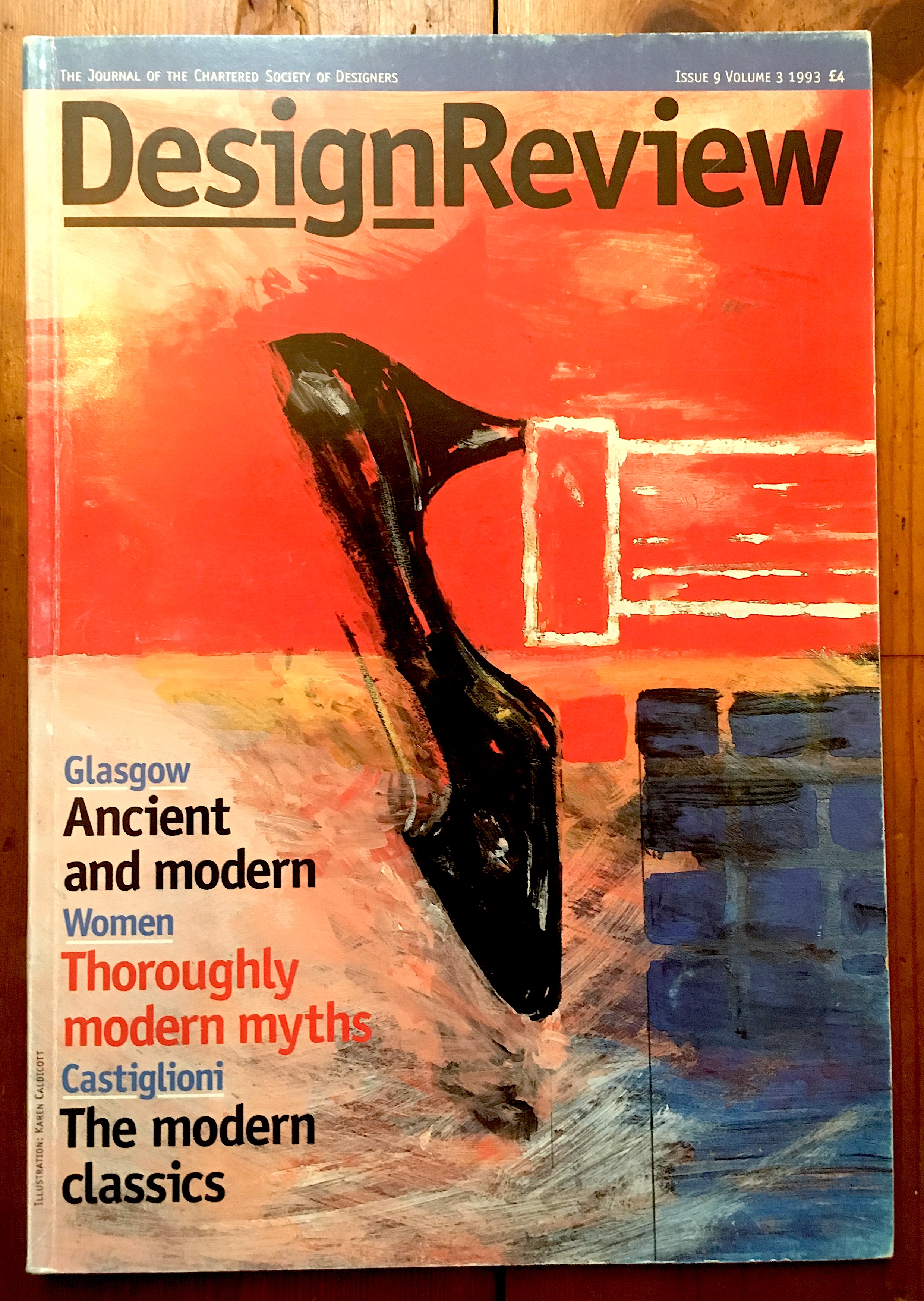
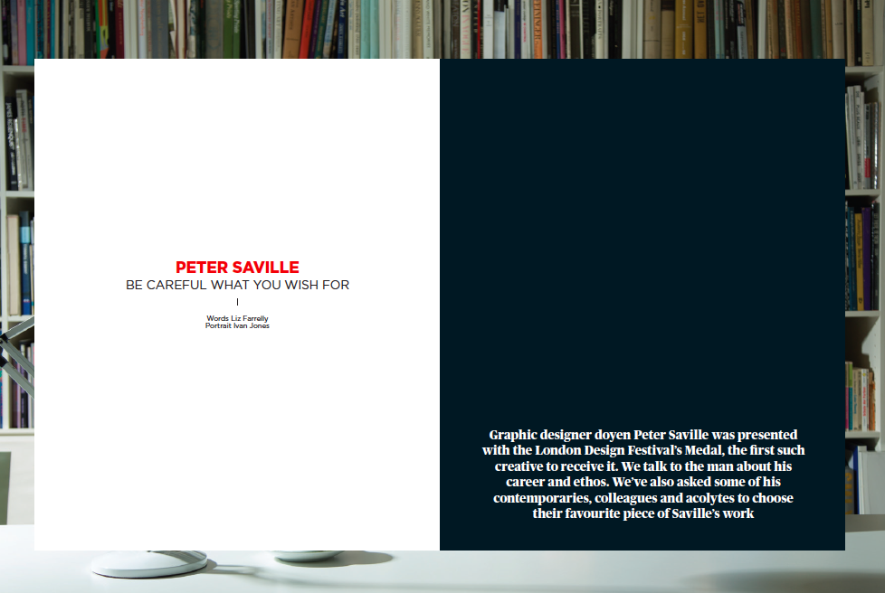
Interview: graphic design legend Peter Saville talks to Liz Farrelly
Further contribution by Paul West, Form

For as long as this interview is available on the Design/Curial website, I’ll redirect you there; after that, I’ll repost it. It was a pleasure to be commissioned by Blueprint again after a few year’s hiatus. I worked in house from 1990 to 1994 beginning as Editorial Assistant, and writing from day one; I reached the heady heights of Deputy Editor, then freelanced under every editor until about 2006. Being asked to interview Peter Saville was the bonus; this is the third time I’ve had the opportunity to conduct a long interview with Peter, as well as having a few good chats along the way. He’s a great talker and it shows in the two and half hour transcript! Peter was to be honoured with the London Design Festival’s major award, which prompted the coverage. The award spiel mentions the winner’s contribution to design in London, and I realised that Peter’s amazing affect was as an inspirtion to and an incurbator of a considerable amount of graphic design talent that has gone on to make London the most important city in the world for graphic design. So, I asked around, and got a bunch of people to talk about their favourite work by Peter. Paul West had worked for Peter, and so I’m posting his contribution here as I couldn’t get it to the magazine by the deadline. Thank you Paul for adding such a great further contribution to the story.

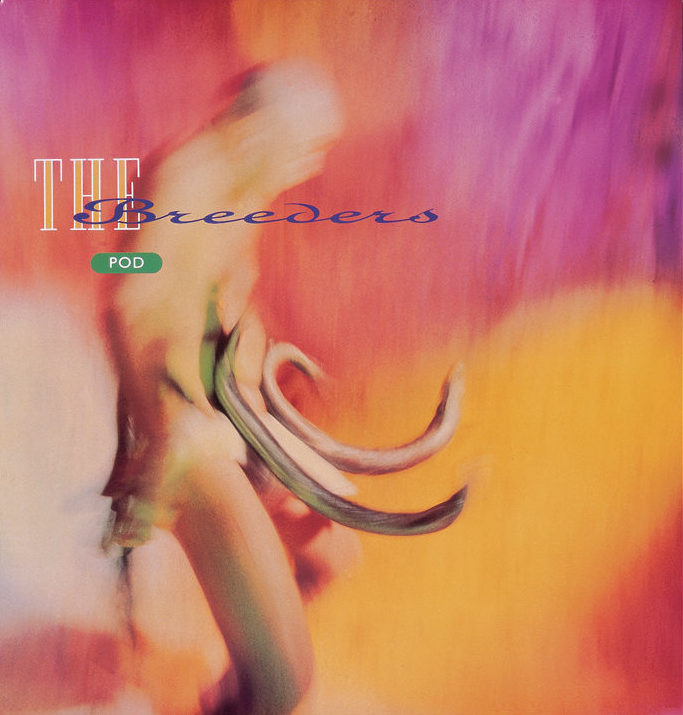
Paul West: Where to start with Peter’s output. Who can’t love FAC1; the “Unknown Pleasures” pulsar; the “Closer” tomb, photographed by Bernard Pierre Wolff with the beautiful Lapidary typography; the “Blue Monday” floppy disc, his Section 25 work — the list is endless. To even go on more is redundant, so well catalogued is his work (alongside designers including Martyn Atkins, Brett Wickens, Richard Smith to name but three) that it’s entrenched in our popular counter-culture, in turn influencing culture.

True Faith

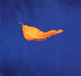
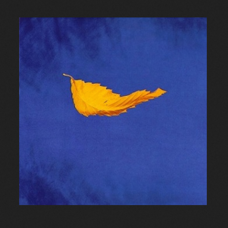
If I could name ONE piece of work I have loved above all other it is the fabulous “True Faith” 12″. This beautiful gold leaf suspended or floating on Yves Klein’s “International Klein Blue” backdrop, with the absolute minimum of information on the back cover (Name — Title / bside — Copyright — the all important Fac183 catalogue number — pre barcode!) and the way it fused art, hi-tech, independent couture, anti-couture; it feels as new now as it did then.

In 1987 I wrote my college thesis on Peter Saville Associates and Vaughan Oliver (V-23) and as a result I got through the doors and worked at PSA ’88 to ’89. I remember asking Peter about this cover and I him saying that the expanse of white on the back sleeve made the front sleeve look like an art piece, with the back cover serving as the catalogue descriptor. I loved that. It was so Warhol.

Of course so much of Peter’s great “visual” work is thanks to the genius of Trevor Key who had a studio space next door. I remember watching the exploratory work Peter and Trevor were doing for “Fine Time” and “Technique” and thinking how great it was, to be so progressive with such a spirit of discovery and invention, it was incredibly inspirational for a 20-something graduate. One day I was in Trevor’s studio talking to him about his work and looking through a massive pile of old test polaroids (including, X-Ray Spex “Germ Free Adolescents”) and I saw THE polaroid of “True Faith”. l had to ask. “Can I have it?”. “Piss off” came the reply. #legend.

From guest blogger, Paul West, Form

signature

From the Archive; PostlerFerguson’s Paper Guns

As opposition forces take control of Kiev, and statues of Lenin fall all over Ukraine, the legacy of Soviet power recedes still further. The military achievements of the USSR and its allies were undoubtedly aided and abetted by Mikhail Kalashnikov’s most innovative design, the AK47. The Russian inventor and arms dealer produced the most popular gun ever, used by armies and rebels alike. Five years after my original post on Eye Blog, Kalashnikov died, on 23 December 2013, aged 94.

Eye Blog Paper Guns

Wednesday 1:38pm, 24 December 2008
“Careful with that AK47, Mikhail”
by Liz Farrelly
Originally posted on Eye Blog

Paper assault rifles and the well crafted design of fear

Looking for the ideal holiday-time craft project, something to keep your brain from seizing up during two weeks’ house arrest. Get your Exacto knife skills up to scratch with this self-assembly paper kit 1:1 scale model of the AK47 Assault rifle, the most iconic “Death Machine” ever dreamt up by an industrial designer, the “Avtomat Kalashnikov obraztsa 1947 goda” [Kalashnikov’s automatic rifle model of year 1947].
Continue reading

signature

From the Archive; DIY Design from 2010

I wrote this review when the DIY phenomena was still new to mainstream design; as St Bride Library is quiet for the summer I thought I’d re-post it. Perhaps DIY was perceived as a trend at the time; the conference broadened and deepened the definition by focusing on diverse projects with a claim to DIY credentials. Now such notions as self-instigated briefs, ad-hoc distribution and hand-making have evolved into a productive modus operandi for designers and creatives working across disciplines and often in collaboration.

St Bride Library Conference 2010 DIY Design
St Bride Library, London
Attended 27-28 May 2010

Tucked away in a narrow alley off Fleet Street (which was once the epicentre of the UK’s newspaper industry but has now been invaded by banks and trading floors), St Bride Library inhabits a labyrinthine Victorian building, alongside a theatre, classrooms and at one time a swimming pool, installed by the philanthropic founders for the improvement of the local workers. The newspaper presses have left the neighbourhood, but its long association with the art and industry of printing and typography remains, as the library boasts an extensive collection of books, manuscripts and archives relating to graphic design, publishing, calligraphy, illustration, and of course, type.
Continue reading

signature

From the Archive; Graphic Design: Now in Production

Occasionally I will dip into my archive of reviews, written for various publications and websites, and as I’m back in New York City, visiting design exhibitions, I thought I’d re-share this review of an exhibition event.

Graphic Design: Now in Production
Cooper-Hewitt, National Design Museum
Governors Island, New York City
Visited 1 September 2012

Picture 26:9:12

4:38am, 26 September 2012
“Shake hands with the devil”
by Liz Farrelly
Originally posted on Eye Blog

The final hours of Graphic Design: Now in Production (the New York leg) provided a snapshot of contemporary practice, from the Stone Twins to Metahaven.

For the last Saturday of Cooper-Hewitt’s Graphic Design: Now in Production exhibition in New York, a student and professional crowd massed for ‘The Final Hours’. The temporary location (while the Carnegie Mansion is closed for renovation) was Governors Island, a breezy six-minute ferry ride from Lower Manhattan.

Co-curator Ellen Lupton observed that the audience was a mix of ‘die-hard graphic designers, who’ve come over repeatedly, and other visitors who’ve known nothing about design before their visit’. Walking around the show, the excitement was palpable. Enthusiastic children reported their finds to parents and cameras were clicking as visitors took photos of each other in front of favourite exhibits.
Continue reading

signature