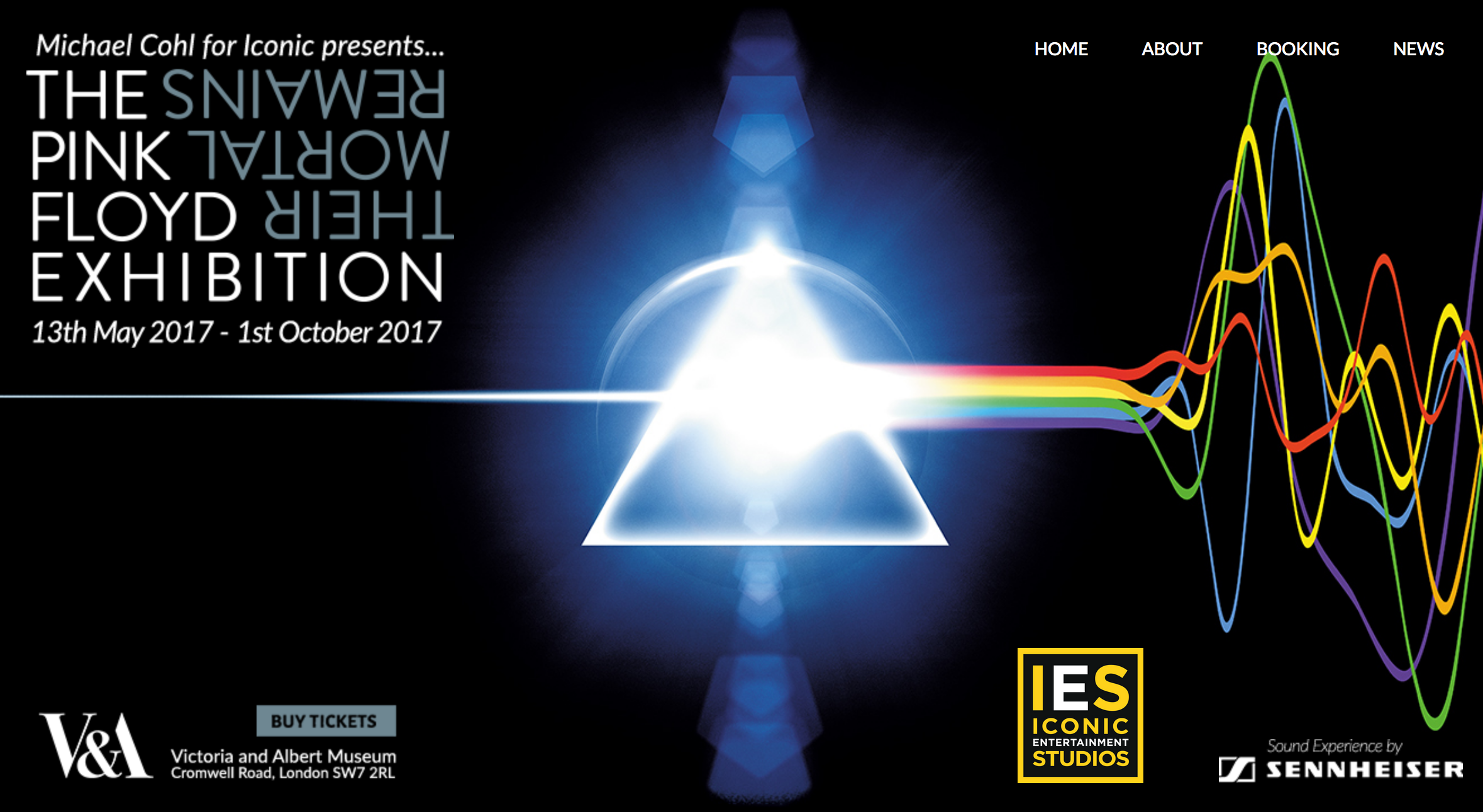
Screen Shot of Pink Floyd’s exhibition website
With the Victoria and Albert Museum staging the blockbuster exhibition, Pink Floyd: Their Mortal Remains, and an upcoming talk by Aubrey Powell titled, ‘Art of Hipgnosis and the Album Cover’ (14/9/2017), here’s an interview with the man himself. Back in 2000 I spoke with Aubrey on the phone while curating an exhibition, Sound Design, for the British Council, which featured the very best British record sleeve designs from the heyday of Rock to the rebellion of Punk, the eccentricities of New Wave and the innovations of Rave and Rare Groove.
The exhibition included extracts of interviews with all the contributing record sleeve designers but the complete interviews were not published, even though the designers gave permission for them to be compiled into a book. The publishing industry being what it was, at the time, the book didn’t fly, so look out for more interviews on this blog. My questions were quite general; the aim was to get the designers talking about what interested them. The interviews were edited from longer conversations, but I tried to keep the designer’s tone of voice, and each interviewee signed off on the final version. What’s particularly interesting is that at the time vinyl had been replaced by digital technology in the form of CDs; Web 2.0, online downloads and MP3s were still ‘experimental’ and the first Apple iPod wouldn’t be launched for another year. The implications of the Internet for the music industry were beginning to be talked about but not yet felt.
Why am I posting this interview now? To celebrate the work of Aubrey Powell and his (late) partner, colleagues and clients, and the V&A exhibition that he helped to create, which I also hope to review. For more information on the exhibition visit the band’s exhibition website and the museum’s extensive programme, here. To see masses of images check out the websites dedicated to Hipgnosis and Aubrey Powell; for the best of Hipgnosis’s work in print have a look at Aubrey’s book, Vinyl . Album . Cover . Art: The Complete Hipgnosis Catalogue, published by Thames and Hudson.
Aubrey Powell, interviewed by Liz Farrelly on 5/7/2000.
Liz Farrelly: How did you start Hipgnosis?
Aubrey Powell: We started Hipgnosis in the 1960s…It’s not what you know it’s who you know and Storm Thorgersen and I came from Cambridge and Pink Floyd originated in Cambridge – Syd Barrett, Dave Gilmore, Roger Waters – we all came to London at the same time, around 1965/66 and were all attending various art schools. Storm was at the Royal College of Art film school, and I was at the London School of Film Technique. Syd Barrett was at Hornsey Art School. And we were very together, all coming from Cambridge. We shared flats; Storm and I and then Syd and Dave had a big flat in South Kensington. Storm and I were looking to get some holiday money and we had a connection to photograph some cowboy book covers, and at the time everybody was getting stoned and dropping acid and were very drug-oriented. We were right in the middle of that psychedelic revolution. We were all part of that. Pink Floyd were doing gigs in tiny clubs like the UFO club on Tottenham Court Road and had just released their first album and were about to have a hit called See Emily play.
We were experimenting with different kinds of film stock, like infrared film, which is very psychedelic, while we were designing these book covers as a holiday job. And then Pink Floyd turned round one day and said, we need an album cover, do you think you could come up with something. We were very into Marvel comics and psychedelia and John Cage’s music and experimenting with film stock and cosmic images, and the life-force of the universe (laughs) and what it was all about, questioning social mores. So we designed an album cover and it was called Saucer full of secrets. It was the first album cover that Storm and I did, and I we got paid the grand sum of £45 for it. And then suddenly Storm and I realised, because we were in our last year of college, that this was an area we quite enjoyed; taking photographs and being part of the scene. It was 1966/7, and one day, staggering up to our flat in South Kensington, we had thought about starting a company together, and had decided to call it Consciousness Incorporate, but we weren’t allowed to because Inc. was an American business term…so that was deeply depressing. So, walking up to our flat, just as we were about to go in the front door, someone had written on the wall – HIPGNOSIS – in Biro; hip meaning groovy and gnosis meaning wise, and a pun on hypnosis, and we went, FUCK, that’s a great name for a company. Well, we asked round all our mates, because all kinds of people used to wander in and out of that flat tripping – Jagger, Marianne Faithfull, Donovan – and we thought someone we knew must have written it, but we couldn’t find anybody; no one would own up to scribbling it on our wall.
Storm and I borrowed £1,000 from our respective mums and rented two floors in Denmark Street in Soho, then called Tin Pan Alley as it was the centre of the music industry. We bought some old camera equipment, redecorated (it had been a dance studio) and Hipgnosis was on its way. We were commissioned very quickly because of the success of Saucer full of secrets, and we got a lot of work from the manager of Pink Floyd for the other bands he managed, bands like Free, and that led onto things for Island Records. So we worked for all sorts of people, like Traffic, Sandy Denny, Jethro Tull and that just escalated. By 1974, which was when Dark side of the moon was done, we were really heading places. Then we started working for the very big bands such as Led Zeppelin. We began art directing for Paul McCartney, Genesis, Bad Company and Peter Gabriel.
LF: You must have seen the complete transformation of the music industry, from friends working for friends to being a major corporate business. How did you feel about that?
AP: As far as we were concerned we were very careful about the work we did and very conscientious, in a sense that we didn’t kowtow to the norm, which is probably why Hipgnosis got a reputation from doing album covers. Pink Floyd’s Atom heart mother, which is a picture of a cow on the front of the cover with no band name, or, on Dark side of the moon or Led Zeppelin’s Presence, which is just a black object, that was considered to be outrageous by the corporate record companies. They thought, how dare you do this, we can’t possibly sell it, and the band, Pink Floyd, supported our ideas because they never contributed any ideas. They said to us, here’s our music, you come up with some ideas, and the band were very powerful in those days. Dark side of the moon sold 45 million [copies]. So you’re talking about people who have a tremendous amount of clout and can say anything to the record company.
By the mid-1970s the record companies were quite corporate and the people who worked in them were quite straight, although at the time we first broke through between 1967 and 1972, we really had an uphill struggle to get the suits out of the way and be able to foist our ideas onto them. And very rarely did Storm and I work for record companies, we nearly always worked for the artists. And the bands paid a lot more than the record companies; they’d want to pay £400 and we’d be getting £8,000 from the band. So we became a photographic, design, art house, that’s how I’d like to describe it.
LF: Did you have any other staff?
AP: George Hardie did all the graphics for our work. We liked working with him a lot and he was also present at some of the design meetings, but he primarily did the graphics because Storm and I weren’t very good at that, the typography and layouts, whereas Storm and I designed all the visual images and photographed them and put them together as montages and collages.
In 1981/2, after Hipgnosis had been going for nearly 15 years, we were at the peak of our career in our album cover history, but we were also doing a lot of advertising, which paid a lot of money. With the advent of pop video, which had happened a couple of years before, we decided that we’d better go into that, because we were bored with the 12 inch by 12 inch size of album covers. Plus our days in that area were slightly numbered because punk had changed the fortunes of many in 1977 to our style of design. Having said that, Storm still designs album covers now and is very successful at it. And so we tried to break into pop promo land and nobody wanted to know. Everyone said, you’re the guys who do album covers, we don’t care what your ideas about film are, you stick with that, we’ve got other guys to do the promos. So, we stopped Hipgnosis in 1982, deliberately, it was company policy, and we refused to do any more album covers for a year. Storm did a book. I designed stage sets for bands like Deep Purple and did all sorts of other things. We got together at the end of 1982 and each put £20,000 into a pot, got a studio in north London and said, we’re now called Greenback Films and for six months we didn’t work (laughs). And then we did our first pop promo for Paul Young, Wherever I lay my hat, which went straight to number one. And within three years we had several million pounds worth of work.
LF: What were your favourite videos?
AP: Storm’s favourite is Learning to fly for Pink Floyd, and mine is Robert Plant’s Big Log. Storm doesn’t make films anymore, he simply does album covers and music graphics and has his own studio and works for modern artists too, at the top end of the market. I’m a film director, making a lot of documentaries, I did one on Francis Bacon, and I’ve done many on bands.
The 1970s were the heady years of album cover design, not just for us but for everybody. You’ve got to remember that in the 1970s MTV didn’t exist, TV music programmes were very limited, there was no webcasting, videos didn’t exist. So the only way to create an image for a band was on an album cover, 12 inches by 12 inches, or 24 inches by 12 inches gatefold, which meant that you had a big canvas to look at. You had an object you could fill with lyrics, posters, stickers, all kinds of stuff, and in those days the more the merrier. People identified with the band and their image through the album cover. They’d play the record, get stoned and study the cover, from end to end, endlessly and read into it all kinds of connotations related to the band, and so the bigger the band the more obscure the image they projected, which was particular to Led Zeppelin and Pink Floyd, the two biggest bands we worked with. They were very conscious that the integrity of their image should always be maintained and were very much in favour of creating an atmosphere of mystery, and surrounding themselves with great art work; that’s what we were brought in to do. And since the 1970s, records have never sold as well. Albums sold in millions and millions and millions, and having an album collection was an important issue. Nowadays people buy a CD and the band comes and goes, you play it for a while, chuck it away and get another one. It wasn’t like that then; communication is much faster now.
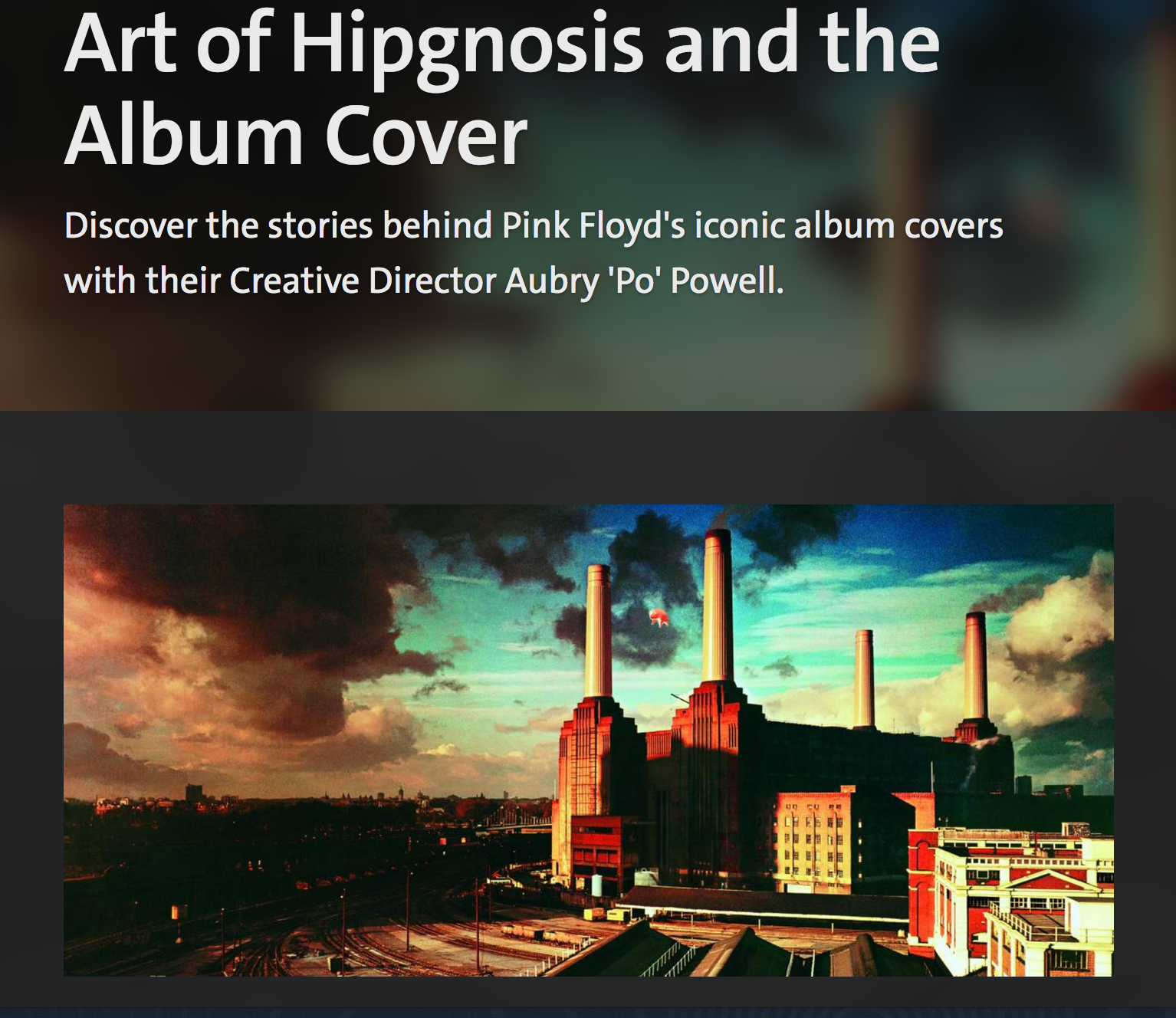
Screen Shot of the cover image of ‘Animals’ by Pink Floyd, from the V&A’s website
LF: Do you have a favourite album cover?
AP: Animals by Pink Floyd, because it was very exciting to do and I loved the action around it. I also think its very Turner-esque in its beauty, very English, using Battersea Power Station and having a pig flying over it. It appeals to my sense of humour; it’s the grandiose-ness of rock and roll to fly a pig above a power station and it became a symbol for Pink Floyd. I worked the idea out with Roger Waters. He wanted to do something with Battersea Power Station and we had the idea of putting an inflatable above it. And the story around it, about how the pig flew away and closed down Heathrow Airport…
LF: What happened?
AP: We had this massive inflatable pig built by Graf Zeppelin, the German company that built the Zeppelin. And on the first day it was really windy and the rope tethering it snapped and it flew up into the Heathrow flight path and planes had to be diverted while it was floating around, for ages. And then it disappeared. It was in all the newspapers for two or three days. Of course Storm and I were freaking out, because we were terrified it’d cause an accident and being plastic, they couldn’t locate it on radar screens, so it created chaos. And, then, about 9pm that night, we were really freaking out by now, the police had questioned us, so had air traffic control at Heathrow and Gatwick, everybody was on our case with all kinds of threats, and pilots had reported seeing it flying off the starboard wing, because it was big – a big beast – and I was in the studio and got a phone call from a farmer, a real country man down in Kent who said, have you lost a flying pig? Yes, I said. He said, well I was looking out my farmhouse window into the mist and heard a clunk on my barn and nearly had the fright of my life, a pig about 100 feet long had landed in my field…and it’s rolling around out there. He couldn’t tether it, it was too big. So we dispatched people down to Kent who found it, tethered it, deflated it, worked over night, inflated it for the next day, we constructed a new way to tether it, flew it again and this time the police insisted on having marksmen there to shoot it out of the sky if it escaped.
So we shot the pig in situ but the wind had changed direction and the pig wouldn’t stay in the right place. We photographed Battersea as a beautiful Turner-esque picture on the first day, which is the main image, without the pig, because the pig had flown away. Then we took the pig shot from the second day, when it was facing the right direction at some point, and then we put the two together. So the photograph you see was not actually shot in situ, it was shot in two pieces, at the end of all that. Nowadays you’d simply Photoshop it on the computer in 30 seconds, but in those days it was a real drama of a production, so the associations with all of that were great.
LF: What era was that?
AP: The mid-70s; those were heady years. I toured America with Pink Floyd and Led Zeppelin and McCartney (I did a book on him), and in those days it was all Learjets and limos and the money was unlimited. We had the best of it, no question, and the opportunities were there to do the kind of work we wanted to do. I think nowadays it’s kind of accepted that you can do almost anything on an album cover; in those days it wasn’t. It was hard graft to get people to be different. And Hipgnosis is acknowledged in many books on the subject as having paved the way for Malcolm Garrett and Neville Brody, and for Jamie Reid and the next generation.
Of course when Jamie Reid came up with Never mind the bollocks in 1977, it was a complete reversal of fortune, a slap in the face for Storm and I, in terms of, fuck you, you old farts with your dinosaur bands and groovy ideas, we’re going to have some bits of old newspaper stuck on something and a picture of the queen sticking two fingers up at you. Interestingly enough, behind our studio in Denmark Street was where the Sex Pistols rehearsed. So we often met them and they were charming and courteous. One day, I’ll always remember because we were photographing Hank Marvin and the Shadows, and I could hear all this gobbing out at the back and there was Sid Vicious and John Lydon spitting down into the courtyard and I said, what the fuck are you guys doing, man, be cool, I’m working with a client and they said, we’re practicing our gobbing (laughs). But it was interesting, sort of like our space being invaded by these people who changed the world yet again. From 1967 and our generation, which was peace and love and psychedelia, which all got rather ugly in the end, suddenly, exactly ten years later, 1977, bang, right on our doorstep was punk, threatening the very design studio that had created the images of the previous decade. So what goes around comes around…
LF: How do you feel about today’s marketing-led industry? Do you feel you had any part in creating that because of the intense and coherent images you constructed for your clients?
AP: No.
LF: Or have the money people taken over?
AP: Yes, the money people have taken over. It’s a completely different thing now. Basically now every record company, and to an extent the bands too, are very money conscious, about how much they spend, particularly record companies. From what I understand, from people who still do album cover design, the average budget for a CD is £1,500, and if you get £3,000 you’re lucky. Whereas I can think of covers such as House of the holy by Led Zeppelin that must have cost £20,000 in 1977, and the money was spent in a kind of exploratory, experimental way, with a great deal of bravery and bravado, like, let’s just work out and see what happens. And if it didn’t work out, people were quite happy to shelve it and say, let’s find something else; and I don’t think you get that kind of attitude at all now.
LF: No, because you can mock-up a bunch of ideas on a computer.
AP: Modern artists, like Beck or The Prodigy, their covers are like that, very experimental. Liam Howlett is somebody I really respect. They’ll come up with 20 or 30 ideas and spend money working at it to get it right and it shows in the sense that not only are they famous and successful, and their music is well-respected, but their graphics and art has a longevity to it which is not a one night stand, and the care and attention they’ve put into it is something that I think Hipgnosis did generate originally, that kind of attitude, but it certainly wasn’t restricted by suits.
Nowadays suits control everything, from the record company sense, and only the artists who are jolly famous have the freedom to be that indulgent, but the record company themselves don’t give a flying shite. And I know from experience that all the big record companies, EMI, Sony, Warner Brothers, they all want to save money, that’s all they’re interested in. Their brief from their bosses is, save money, save money, either by firing people or cutting back on the art. It’s just about getting the product done and over with. They’ve got shareholders now who want returns and all they’re interested in is money. They’re large corporations with directives. So the climate has changed, but what goes around comes around, and at the moment we’ve got these massive corporations swallowing up the indies. Creation Records was bought by Sony. They’ve all been swallowed up, so some day in the next decades somebody will pop up saying, I’m over here and two fingers to you fuckers, we’ve got a different way of doing things. It may come out of websites and someone will say, I’m going to make money and suddenly the world will be in chaos again.
Before album covers got interesting, pre-1966, they were all very bland but there were a few interesting people doing album covers. Blue Note did great ones, but by and large the Elvis, Cliff, Bachelors team was just a picture of the artist in a gold lamé suit with a swinging party in the background. That died a death and people were more interested in imaginative, provocative and intelligent pictures after 1967, but there was a very dull period musically and creatively for three to four years prior to that. Even the Beatles, just leaning over the railing at EMI, so fucking what, it might have been a [Richard] Avedon portrait, but it was still just a portrait.
Now there’s a blandness, but that will change; creativity will always change somewhere down the line, whether you like it or not. We just happened to have the golden years at that particular time and I think that’s what made album covers famous, that ability to allow ourselves to indulge and we were lucky. Storm and I knew the right people, were in the right place and had a bit of talent – starting off with Pink Floyd was a good way to start. But who knows, they could have failed and we would have failed with them, but they didn’t and it was just a great opening and we jumped in.
