First Visit; Vitra Schaudepot

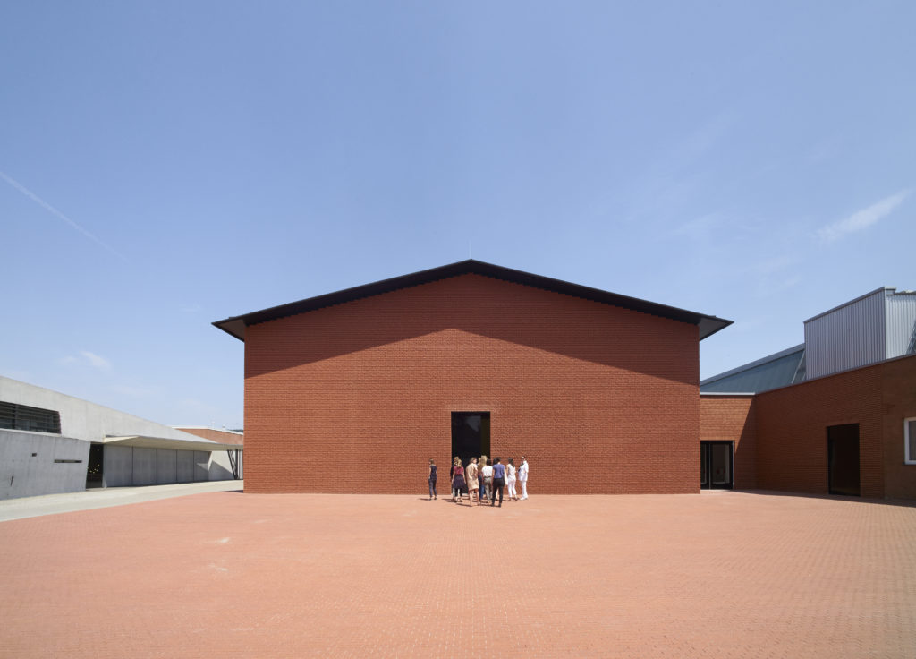
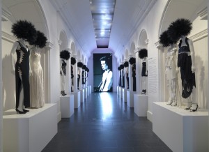
Exterior of the Vitra Schaudepot, by Herzog & de Meuron. Photo © Vitra Design Museum, Julien Lanoo

Exterior of the Vitra Schaudepot, by Herzog & de Meuron. Photo © Vitra Design Museum, Julien Lanoo

Vitra Schaudepot
Vitra Design Museum
Charles-Eames-Str. 2, Weil am Rhein, Germany
Visited, 31 May 2016

I used to go on press trips so regularly that I thought I didn’t need holidays. Travelling on planes and trains across Europe, America and further afield I visited designers, studios, factories and museums. Having swopped my peripatetic lifestyle for a more sedentary teaching gig, this press trip came out of the blue. I previously visited Vitra for a MUSCON conference (read about it, here) and marvelled at the Vitra Haus (read, here), so was aware of the upcoming addition to the extraordinary campus and keen to see the Schaudepot (Open Storage), a relatively new development in museum practice. A return visit wasn’t on my agenda though, so when this invitation popped into my inbox along with a commission to review the Vitra Collection’s new home, I was up for it! My article appeared in Blueprint magazine (no.347, p.36) and is available online at Design/Curial, here. This post adds details from the press conference and a conversation with Curator Janna Lipsky.
Continue reading

signature

From the Archive; Sagmeister’s first sabbatical

IMG_8258

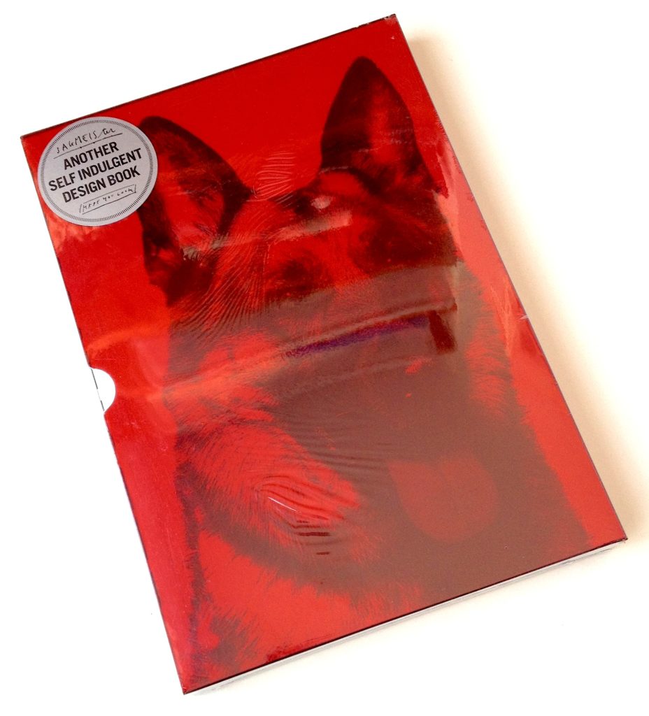
On the occasion of an earlier blog post about The Happy Film, which began as one of Stefan Sagmeister’s sabbatical projects, here’s an article I wrote when his first book, Sagmeister made you look was about to be published by Booth-Clibborn Editions, as that too was the product of a ‘year without clients’, his first in fact.

I also worked with Edward Booth-Clibborn but wasn’t involved in the editorial or production process of Sagmeister’s book, so felt that it was OK to write about it. This article appeared in the esteemed German magazine, Form, subtitled ‘The European Design Magazine’, and is presented in German and English. Scans of the article are available through the magazine’s online archive, here (access requires registration).

Reading this article reveals that even then Sagmeister would seek collaborators with complementary skills, in this case, design writer Peter Hall (for The Happy Film, he worked with co-directors Hillman Curtis and Ben Nabors). But he was wrong about one thing; that once design work is published, it’s off the agenda. A star turn like Sagmeister is always going to be known for that poster (info for AIGA Miami scratched into his skin) and that CD cover (Lou Reed’s face overwritten with lyrics). If he doesn’t show then at a lecture or talk about them in an article it’s like your favourite band refusing to play their signature tune on stage; Sagmeister’s greatest hits keep his fans happy! This article also points to the performative aspect of graphic design; not only the lure of being ‘guest speaker’ at an international conference doing your best ‘show and tell’, but also with regard to selling ideas in client presentations…a very useful skill.
Continue reading

signature

The Happy Film; graphic design on screen

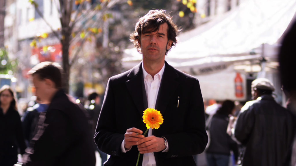
Stefan Sagmeister in ‘The Happy Film’, seeking discomfort on the streets of New York. Photograph: Ben Wolf.

Stefan Sagmeister in ‘The Happy Film’, seeking discomfort on the streets of New York. Photograph: Ben Wolf.

The Happy Film
Duke of York’s Picturehouse
Preston Road, Brighton, East Sussex
14 June 2017 at 6pm

I’m not a fan of solo cinema visits but even with my partner-in-crime currently ‘away’, I had to see this just released, much discussed film at this special screening. Right on the money, the power-couple hosts of Glug Brighton, Carl Rush of creative agency Crush, and Helen, the renowned Illustration agent and founder of Agency Rush, invited graphic-design hero (and I don’t use the term lightly) Stefan Sagmeister to show his seven-years in the making documentary, The Happy Film. Despite the lure of a glorious summer evening, Brighton’s historic Duke of York’s cinema was packed with the city’s creative community including a good number of Graphic Design and Illustration students from University of Brighton, come to see the legend in action, for after a film of thrills and spills Sagmeister stepped up for the Q&A.
Continue reading

signature

From the Archive; revisiting Norwegian design

2016-05-15 13.12.18

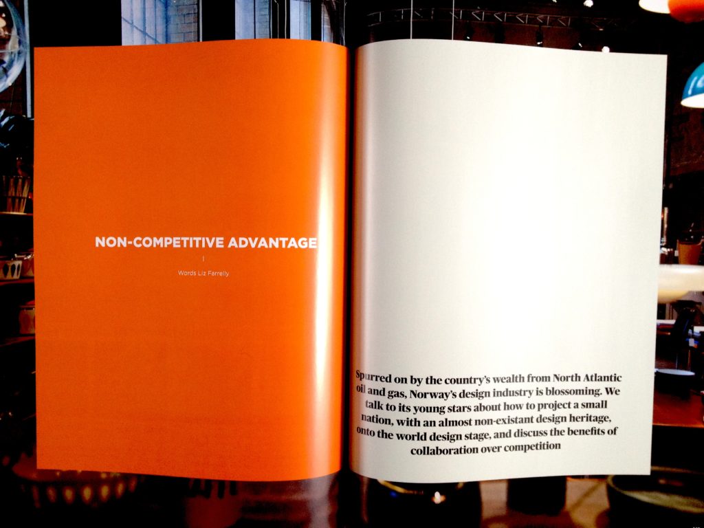
“Non-competitive Advantage”
by Liz Farrelly
Blueprint
No.336, pp.148-164

On the occasion of an exhibition promoting Norwegian design in New York, here’s an article from my archive, “Non-competitive Advantage”, available on DesignCurial. Originally published in Blueprint magazine, I wrote it after a snowy trip to Oslo in February 2014, organised by the Norwegian Embassy in London and hosted by DOGA, the Norwegian Centre for Design and Architecture. A group of European journalists met and mingled with Norwegian designers, and as well as seeing and hearing about new work the big surprise (for me) was the Norwegian government’s commitment to promoting Norway’s nascent design industry.
Continue reading

signature

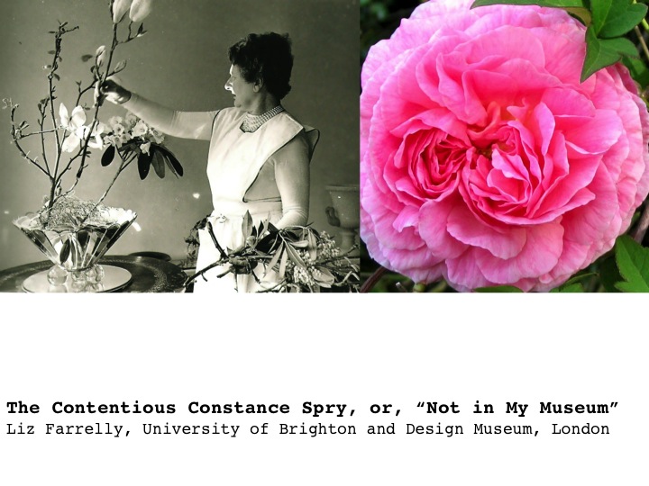
Conference Paper; The Contentious Constance Spry, or, ‘Not in My Museum!‘

I’m taking some time this summer to document activities over the last few years, including occasional academic papers delivered at conferences and workshops. Images are from PowerPoint presentations and include quotes projected so as the audience can read along with references in the text. This paper was delivered “live”, and although it’s been re-edited for the page, I decided not to include footnotes or formal citations; all documents referred to are in the Design Museum archive, which is being catalogued, and mentioned texts are listed at end. This is a work-in-progress relating to my doctoral thesis, so if it feels truncated that’s because I’m using this blog as an “ideas store”, with the intention of expanding and deepening my arguments in the thesis.

Curating Popular Art
Whitechapel Gallery
77-82 Whitechapel High Street, London E1
14 June 2013

Organised with the University of Brighton Design Archives; a study day to accompany the exhibition
Black Eyes and Lemonade: Curating Popular Art
9 March to 1 September 2013
Slide01

As the recipient of an AHRC Collaborative Doctorate Award, pairing the University of Brighton with London’s Design Museum, I’m looking at how definitions of design are produced and evolved within museums.

Good Victorian that he was, Henry Cole’s aim as founder of what is now the Victoria and Albert Museum, was to create an institution that informed manufacturers, workers and the public about the benefits of “good design”, so as to encourage the production, consumption and export of well-designed and efficiently-made “everyday” products, which would reinvigorate British industry. Jump to 1917, and Hubert Llewellyn Smith, Head of the Board of Trade and an early advocate for design education and design promotion suggested that a new museum of industrial design would help this cause. (The Board of Trade went on to set up the Council of Industrial Design, later the Design Council, and administrated the Victoria and Albert Museum up until the early 1980s). Such rhetoric around design promotes a series of promises; that “good design” will facilitate economic development, cultural innovation and social improvement. This discourse of design promotion has been central to the growth of institutions dedicated to the collection and display of designed objects. I’d suggest that now there is a more pressing need to present a truly comprehensive vision of the role and benefits of design; instead of “good design” might we consider “design for good”? But are design museums still fixating on Cole’s vision? Promoting individual designers and showcasing “the best” products of the year may fulfil the aims of a design museum, but explaining the design process and its multifarious activities and outcomes – showing design to be a tool for engagement and change – would more closely demonstrate “what design is now”. So, when it comes to design in museums, we are on the cusp of change.
Continue reading

signature

From the Archive; Design Criticism in New York

This post was originally published on Eye Blog. I’m reposting it because I recently added a separate post about Fiona Raby’s talk at this conference, which provides background to the Dunne & Raby exhibition, “United Micro Kingdoms: A Design Fiction”, reviewed here.

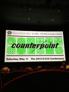
Counterpoint
The 2013 D-Crit Conference, School of Visual Arts, New York City
Attended 11 May 2013

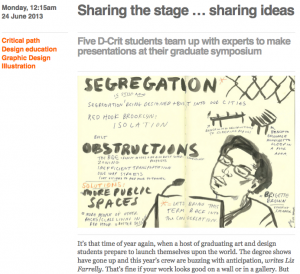
Brigette Brown argues that segregation is alive. Drawing by Nina Frankel.

Brigette Brown argues that segregation is alive. Drawing by Nina Frankel.

Monday 12:15am, 24 June 2013
“Sharing the stage…sharing ideas”
by Liz Farrelly
Originally published on Eye Blog

Five D-Crit students team up with experts to make presentations at their graduate symposium

It’s that time of year again, when a host of graduating art and design students prepare to launch themselves upon the world. The degree shows have gone up and this year’s crew are buzzing with anticipation. That’s fine if your work looks good on a wall or in a gallery. But what about the new breed of design critics on Masters courses on both sides of the Atlantic? Just how do writers make their mark?
Continue reading

signature

Fiona Raby tells it like it could be

Fiona Raby speaks at Counterpoint
The 2013 D-Crit Conference, School of Visual Arts, New York City
Attended 11 May 2013

View from the stalls.

View from the stalls.

Before hearing Fiona Raby’s talk at this Design Criticism conference in New York City, I had already visited Dunne & Raby’s new exhibition, “United Micro Kingdoms: A Design Fiction”, staged at London’s Design Museum, but the majority of the audience hadn’t. Fiona, however, gave such an insightful explanation of the show that, thanks to my notes from the day, this account of her talk might supplement my previous post about the exhibition, here. Following this is an Archive post from Eye Blog, reporting on the conference.

Fiona describes her practice (Dunne & Raby, est. 1994 in partnership with Anthony Dunne) as dealing with emerging technologies and imagined behaviours. She defines design as “a tool for collective imagining” and designers as “making it tangible”, the aim being to broaden our worldview.
Continue reading

signature

à la mode in New York

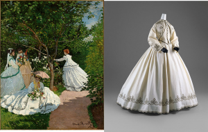
Claude Monet. Women in the Garden, 1866. Courtesy of Musée, d’Orsay, Paris. Alongside embellished white dress from the exhibition

Claude Monet. Women in the Garden, 1866. Courtesy of Musée d’Orsay, Paris. Alongside embellished white dress from the exhibition

Impressionism, Fashion, and Modernity
The Metropolitan Museum of Art, New York City
26 February to 27 May 2013
Visited 12 May 2013

From PUNK to the sublime; the next-door exhibition, on that Sunday morning, was one I’d just missed at the Musée d’Orsay in Paris back in January, where tantalizingly the entrance banner was still up but the show had closed. So I was excited to see this joint venture (between museums in Paris, New York and Chicago) in its second incarnation, enjoying spacious galleries and perfect lighting that happily accommodated both paintings and textiles.

Even though my main professional interest is contemporary design in the context of design museums, as an avid gallery-goer I’m drawn to an exhibition such as this, which presents a sure-fire art-historical hit (there’s no better crowd pleaser than Impressionism) in a new light. And, from the point of view of Museum Studies this is an interesting show; mixing over 80 major figure paintings by Impressionists and their fashionable contemporaries, with historical artefacts and garments – the clothes and accessories depicted in paint on canvas – demonstrates a newly collaborative approach to exhibition curation.
Continue reading

signature

PUNK, but not as I knew it

The DIY Gallery at PUNK: Chaos to Couture at the Metropolitan Museum of Art, featuring its “designationed punk”, Sid Vicious

The DIY Gallery at PUNK: Chaos to Couture at the Metropolitan Museum of Art, featuring its “designationed punk hero”, Sid Vicious

PUNK: Chaos to Couture
The Costume Institute of The Metropolitan Museum of Art, New York City.
9 May to 14 August 2013
Visited 12 May 2013

What’s to be said about a “blockbuster exhibition”? Having reached saturation point due to blanket press coverage, you’ll dutifully add it to your list of “things to do this summer”, remembering to avoid weekends, bank holidays and school half-term…

If it’s the Metropolitan Museum’s annual summer exhibition, you’ve probably also ogled the fabulous frocks and wardrobe malfunctions that clad celebrities (from Aye to Zee) at the Met Ball (proper title, the Costume Institute Gala). We have Diana Vreeland as “special consultant” to thank for kicking off the exhibit-themed frivolities back in 1971 (the film, Diana Vreeland: The Eye Has to Travel investigates Vreeland’s role at the museum). Now the Met Ball is run by Vogue and raises millions of dollars annually for the museum.
Continue reading

signature

From the Archive; Graphic Design: Now in Production

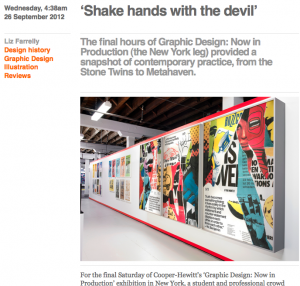
Occasionally I will dip into my archive of reviews, written for various publications and websites, and as I’m back in New York City, visiting design exhibitions, I thought I’d re-share this review of an exhibition event.

Graphic Design: Now in Production
Cooper-Hewitt, National Design Museum
Governors Island, New York City
Visited 1 September 2012

Picture 26:9:12

4:38am, 26 September 2012
“Shake hands with the devil”
by Liz Farrelly
Originally posted on Eye Blog

The final hours of Graphic Design: Now in Production (the New York leg) provided a snapshot of contemporary practice, from the Stone Twins to Metahaven.

For the last Saturday of Cooper-Hewitt’s Graphic Design: Now in Production exhibition in New York, a student and professional crowd massed for ‘The Final Hours’. The temporary location (while the Carnegie Mansion is closed for renovation) was Governors Island, a breezy six-minute ferry ride from Lower Manhattan.

Co-curator Ellen Lupton observed that the audience was a mix of ‘die-hard graphic designers, who’ve come over repeatedly, and other visitors who’ve known nothing about design before their visit’. Walking around the show, the excitement was palpable. Enthusiastic children reported their finds to parents and cameras were clicking as visitors took photos of each other in front of favourite exhibits.
Continue reading

signature