Pick Me Up: Contemporary Graphic Arts Fair
Somerset House, London WC1
24 April to 5 May 2014
Five years in and Pick Me Up is now a headline event in London’s creative calendar; undoubtedly it’s evolved and mutated, and much discussion has been generated about how it reflects and influences the graphic arts in London, the UK and beyond. But more of that later, when I visit this year’s PMU. Also, watch this space for an archival re-post of a PMU debate that I chaired in 2012, here.
Meanwhile, here’s guest blogger John O’Reilly, editor of Varoom, the magazine of the Association of Illustrators, with a long-form review of the very first Pick Me Up, back in 2010. I commissioned this for étapes magazine; it was published in “issue zero”, an experimental, white-cover experiment intended to rehearse the redesign/relaunch in the form of a quarterly “bookazine”. John explored the widest implications of PMU, as an expression of zeitgeist and as a reinvention of the exhibition/artfair.
Nobrow’s nook, Pick Me Up, 2010
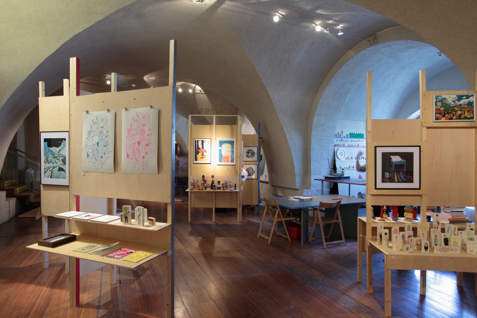
Peepshow Collective’s DIY installation, Pick Me Up, 2010
Photography: © Sylvain Deleu
Courtesy: Somerset House
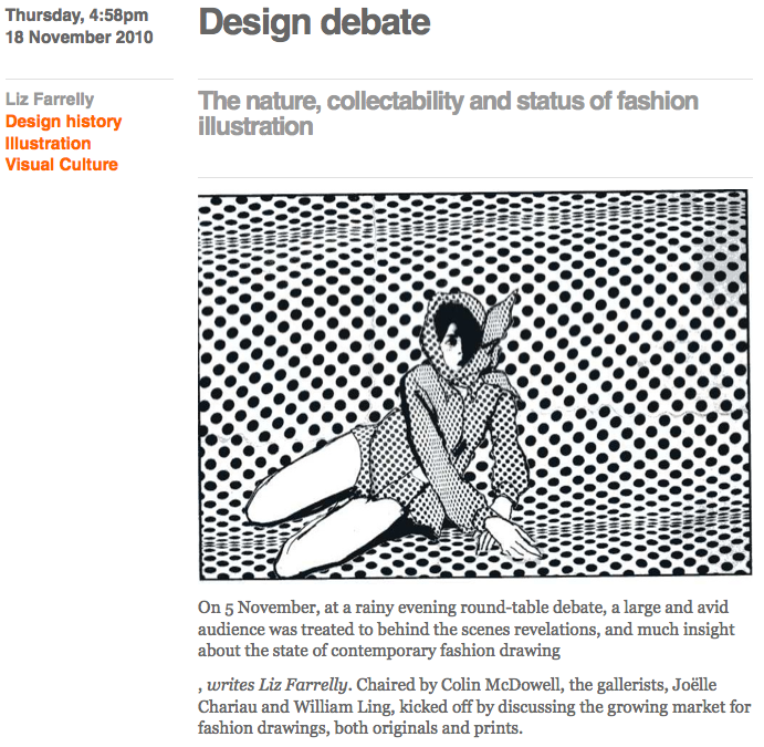
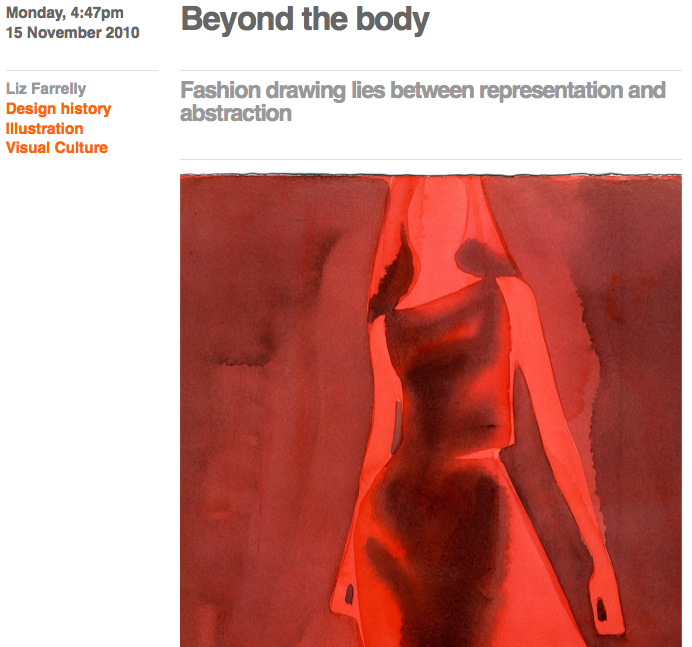
Review of Pick Me Up 2010 by John O’Reilly
23 April to 3 May 2010
Two exhibitions bookend transition moments in recent British visual culture. Back in the late 1980s a young art student took over an empty building in London’s docklands and put on an exhibition that would shape the Art World over the next two decades. Born in a recession, Damien Hirst’s show, “Freeze”, introduced the general public to a type of brash, spectacular art, and over time these Young British Artists (YBAs) combined the two-fingered, anti-establishment sensibility of their roots with a growing awareness of big-budget, Art World thrills. It evolved into brash, boom-time art, and whereas artist Robert Patterson described the YBA tag as “a kind of licence to show tits and arse more than anything”, with this second exhibition, the invitation implied in the informality of “Pick Me Up”, of a cultural cheap date, is ideologically, temperamentally and aesthetically very different.
Continue reading