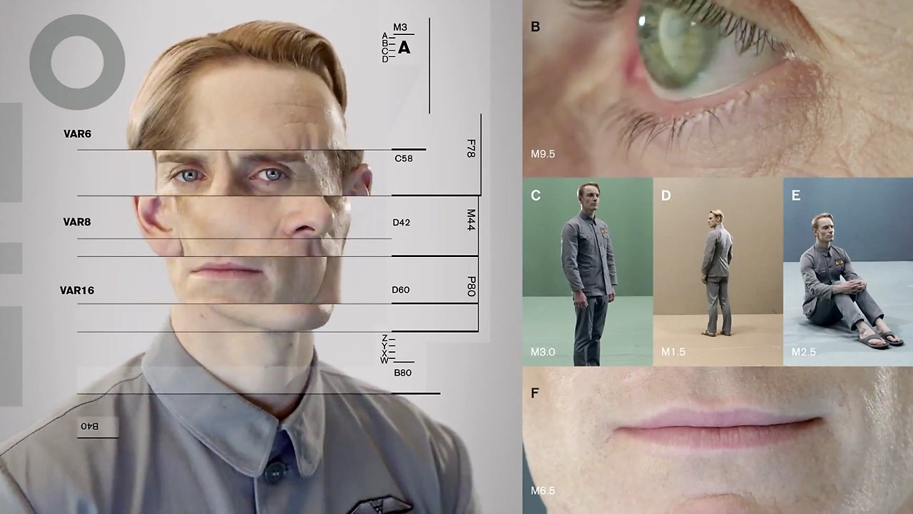
Michael Fassbender in David Promo, by Johnny Hardstaff (RSA Films)
Johnny Hardstaff and Liz Farrelly
Interview, 13 December 2013
A shorter version of this article appears in étapes 218, translated into French; the issue is themed, Fiction and Anticipation, published March 2014.
A director and designer who includes the title “modern storyteller” in his biography, Johnny Hardstaff studied Graphic Design at St. Martins School of Art (now called Central Saint Martins College of Art and Design), graduating in the early 1990s and going on to teach design and illustration at Camberwell College of Arts (both are part of University of the Arts London). Hardstaff’s exploration of graphic imagery and use of drawing within his practice are prompted by a desire to build fantastical but believable on-screen worlds; two early short films, “History of Gaming” and “Future of Gaming” suggest that the concepts of utopia and dystopia are inextricably linked. Whether working with commercial clients (Sony, Smirnoff) the entertainment industry (often in collaboration with filmmaker, Ridley Scott) or cultural institutions (Tate, Victoria and Albert Museum), Hardstaff aims to imagine the future.
Liz Farrelly: How do you imagine the graphic language of the future? Do you see other designers trying this too?
Johnny Hardstaff: I used to think that I worked in a cultural vacuum and it was a positive thing. I was adhering to the principle that you don’t have heroes, don’t look at other designers’ work. Instead, you look at interesting triggers and stimuli that are erratic, and fuse them together in a postmodern way. When I try to help students to be original, I say, take two things that do not belong together and see what happens when they implode.
LF: Like the quote by the 19th-century poet, Lautréamont: “As beautiful as the chance meeting on a dissecting-table of a sewing-machine and an umbrella”.
JH: That’s absolutely the principle. I love thumbnails of things that you can’t quite see, images that are so broken you don’t know what they are, so you have to decide what they are.
LF: Like an inkblot test; by deciding what an image is, you are interpreting those half-formed marks, and that comes straight out of your head.
JH: And it’s a trigger. I like industrial languages and detailing on cars, things that already exist, but then you mess with them. They already have cultural resonance, but you remake it. It comes down to monsters; I like the idea of weird cultural monstrosities.
Continue reading