So an email arrived inviting me to the launch of Punk.London at Oxford Street’s 100 Club, and I have to admit it didn’t totally intrigue me. Instead in gushed cloudy memories of a dark, sweaty cellar and an uncomfortable din, which I must have endured (it feels like) a hundred times over a couple of decades. But a closer look at the invite revealed this to be an occasion for nostalgia, a celebration of a 40-year anniversary marking London’s punk moment and the start of a movement, a subculture in fact, the long-tail of which has affected both attire and attitude.
Screen Shot from Punk.London website, designed by Brody Associates, inviting D-I-Y participation in a city-wide cultural event
“Subversive Culture” is the strapline (pardon the bondage-tinged pun), which it is claimed has fuelled creativity (now the Creative Industries) ever since. Over the coming year a host of venues will stage events big and small, backed by the Greater London Authority (GLA); shouting about London’s past punk credentials must have tourist-attracting potential. With an identity and online hub branded by Neville Brody (still demonstrating punk attitude by being “notoriously abrasive”, according to Digital Arts), for me the most innovative element is an prompt to organise your own event; tagged “D.I.Y.” the page offers links to branding and fundraising advice, via the Heritage Lottery Fund (HLF).
Regardless of designated anniversaries punk is perennial, and it doesn’t need much of an excuse to hit the headlines. In 1998 I reviewed an exhibition, Destroy: Punk Graphic Design in Britain, and because it isn’t available on the magazine’s website I’m re-posting it, see below. Yes it was cheeky of me to declare punk to be the only “memorable cultural event in the 1970s”, but that’s a clue to my age. I may have been “witness” to the “heyday of punk” but only just; the article is unapologetically London-centric, too, hardly surprising as I was still at school and London was home. What isn’t mentioned is that I was a lender to the show too, having amassed a substantial collection of vinyl due to a fascination with indie record shops. I sold most of the best bits (the vultures were already circling at the Private View) as I became nomadic, leaving London in April 1998, and had neither the means (no turntable) nor inclination (changing musical tastes) to listen again.
Looking back at Destroy it was obvious that punk clichés were quickly played out and replaced by more sophisticated experiments with graphic language and communication; Rick Poynor makes this point in his review “Uneasy Listening”, Frieze (no.40 May 1998). Definitions are slippery but with the luxury of hindsight it might be suggested that punk provided the initial energy, a media blast, while New (not Neu) Wave evolved into a more deliberate exploration of media manipulation. Eye also reviewed the show (no.28 1998) and then published a longer article, “Punk uncovered: an unofficial history of provincial opposition” by Ian Noble and Russell Bestley (no.33 1999), which investigated this aesthetic evolution in the context of connection and distance (both ideological and physical) from London. It mentions The Cartel, a crucial economic facilitator of the independent circulation of new musical product.
And the bandwagon rolled on…I missed this exhibition but a blogged review of Someday All The Adults Will Die: Punk Graphics 1971-1984 featured snaps of the installation utilising the same display method as in Destroy, where fragile paper exhibits were sandwiched within clear plastic. A wide-ranging show of diverse memorabilia staged in the Hayward Gallery (2012), SATAWD redefined punk by tracing roots to earlier oppositional stirrings therefore extending both the “moment and movement” beyond the influence and reach of an individual Svengali or a single band and its fans. Curator and author, Jon Savage, followed it up with the encyclopaedic Punk 45: The Singles Cover Art of Punk 1976-80, which despite a very specific title extends the definition further thanks to a wide range of examples; reviewed in The Guardian, here.
And while my review, in typical journalistic fashion, takes some liberties, e.g. pointing out Dick Hebdige’s “failure” to acknowledge the emerging network of indie labels as an alternative business model, and presumes punk’s upbeat legacy, it also points to contradictions and implications within the graphic design arena, music industry and media. The most prescient comments were provided by Malcolm Garrett, future gazing the D-I-Y potential of the Internet. And although Malcolm no longer spends the majority of his time designing for music, his expertise regarding branding and communication in the digital realm have given him insight into how the music business is evolving and innovating, which he shared a few years ago during a panel discussion at Pick Me Up, reviewed here.
And while, as a design historian, the material traces of that historical moment of punk and subsequent innovation of graphic products and practices is of great interest, this other, more ambiguous legacy of punk as the kickstarter of creative practice that, it could be said, has come full circle and is manifest as “D-I-Y activism”, can also be examined via actual events. Such seismic shifts and transitions can be traced through the cultural products that keep them in the public consciousness, such as exhibitions, festivals, books and articles. To that end…
Destroy: Punk Graphic Design in Britain
Royal Festival Hall
South Bank Centre, London SE1
2 February to 16 March 1998
“All the rage”
by Liz Farrelly
Design Week
6 February 1998, pp.16-19
Standfirst: Think Seventies, think punk. Liz Farrelly puts on her bondage trousers and pogos down to the Royal Festival Hall to check out an exhibition of punk graphics [Proof that journalists don’t write their intros…I’ve never worn “bondage trousers”]
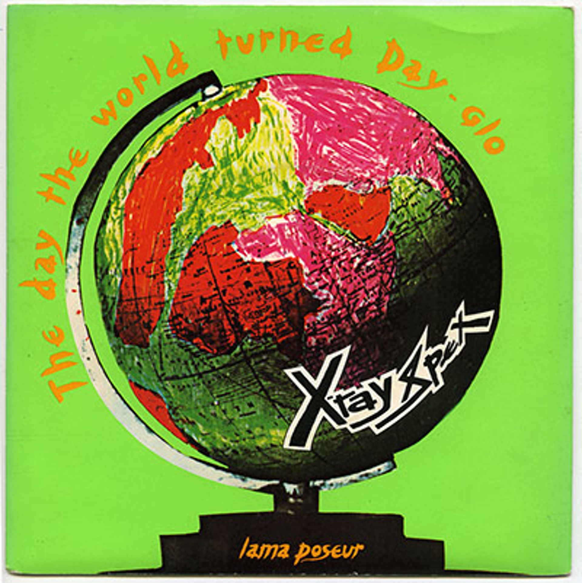
X-Ray Spex, The day the world turned day-glo (1978), sleeve design: Cooke Key, concept: Poly-styrene / Falcon Stuart [Original Caption]
An exhibition of punk record graphics held in that hallowed hall of musical taste, the Royal Festival Hall? Unlikely…but true. Opening tomorrow, Destroy: Punk Graphic Design in Britain is the Seventies instalment of the Royal Festival Hall’s “All that glitters…”, a series of annual exhibitions which, decade by decade, counts down to the millennium.
Destroy comes as less of a surprise if you take into account the South Bank Centre’s refreshingly left-field curatorial policy, and that punk was the only memorable cultural event of the Seventies. What is a shock though, is just how good the stuff looks. All this innovative design, and not a Mac [Apple] in sight.
First seen hot off the presses and on the racks of such essential Saturday cruising spots as the Virgin Records (the New Oxford Street shop), Portobello’s Rough Trade and Small Wonder Records in deepest Walthamstow. Last seen dog-eared and discarded, under a layer of dust. Viewing these sleeves today, en masse and seductively encased in clear PVC, brings back a flood of memories, for I’m old enough to have witnessed the heyday of punk.
Add that dollop of nostalgia to the fact that curators, Paul Khera and Maria Beddoes, have assembled an aesthetically diverse selection of seven- and 12-inch singles, LPs and posters, ranging from ripped ‘n’ torn to neo-conceptual. I’ll hazard a guess that the Royal Festival Hall will be inundated with both musical and designer trainspotters, cooing over collectable artefacts and surreptitiously plundering ideas into sketchbooks.
The selection does indeed include some real gems; the Peter Saville-designed Factory sampler (stolen, without fail, whenever it is exhibited), Barney Bubbles’ origami-esque Armed Forces cover for Elvis Costello, and Terry Jones’ newspaper facsimile for John Lydon’s first release as Public Image Limited.
Destroy grew out of a rambling conversation graphic designer Khera had with his South Bank Centre clients over the proposed Seventies exhibition. “I was saying that I’d grown up with these sleeves, which taught me more about graphics than any college project, because I was more interested in music than in re-designing packs of frozen peas. For the first time I saw how design could represent content – the music – and I remembered that my local record shop in Manchester was like a public art gallery. I thought I’d better shut up, but then they asked me to write a proposal”.
This may be ancient history but to recap, Jon Savage, in his comprehensive tome of the proceedings, England’s Dreaming, Sex Pistols and Punk Rock (Faber and Faber, 1991), names the decisive moment: “In the autumn of 1975, British Punk had begun at 430 King’s Road”. The movement emanated from Sex, Malcolm McLaren’s revamped retail headquarters. By the following spring the antics of his musical protégés, the Sex Pistols, were making headline news by annoying the likes of the Linder (Sterling, montage artist) introduced me to her friends, the Buzzcocks”.
“Their manager, Richard Boon, had just graduated from Fine Art at Reading University. Together we plotted their graphic direction. You can’t do good work for a client who doesn’t want it, but I had a client who did. I wanted to work with clients who were the content providers, not merely the distributors”.
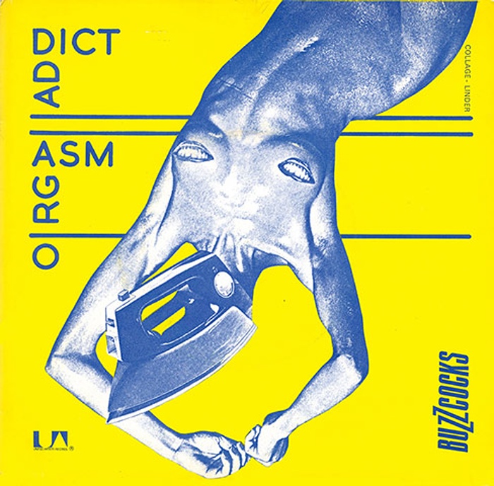
Buzzcocks, Orgasm Addict (1977), sleeve design: Malcolm Garrett, montage: Linder [Original Caption]
Unselfconsciously quoting radical art movements, seizing the means of production, remaining proudly regional, and never compromising, even when major record companies came begging for their services, these graphic designers were a new breed. Mark Higenbottam, who went straight from college to Town and Country Planning in 1982, admits to only ever being into music: “Martyn Atkins, who I worked with, was like a ‘professional friend’, the fifth member of the band, he knew everything about music, and everybody”. With graphic designers mimicking the antics of pop stars, the industry was never going to be the same again. The idea that designers and clients could share attitudes and values recast design, in the eyes of the public and clients alike, as a means of creative communication rather than simply a humble commercial service.
Town and Country Planning was responsible for early Echo and the Bunnymen sleeves. Higenbottam recalls: “We worked really closely with their manager Bill Drummond (later to become a pop star himself, half of KLF), to take a simple idea to a logical limit. Everything related to everything else, so that when you walked into a shop you immediately spotted the Bunnymen record”. The idea of the band as brand had been born and the anonymous corporate designers were doomed. “Within four years of punk”, recalls Garrett, “all the in-house design departments were dead. Now the majors are trying to replicate the punk model by teaming their current in-house designers with young bands”.
In Garrett’s opinion, “…the legacy of punk will be revisited on the Internet. It’s a logical extension of what punk tried to do, giving control to the content creators”. For Higenbottam the current resurgence of “little” labels and new bands, “is a reaction to ‘manufactured’ dance music; the best new music is a cross-over though, and it’s still underground”. He’s seen punk’s spirit literally come full-circle. Working with Naked Records, Higenbottam is honing style books for new signing which he regularly sees gig on London’s club circuit. Why Destroy, why now? Isn’t it obvious?
[Additional record sleeves illustrated in the article; Original Captions]
The Clash, White Riot (1977), sleeve design: Sebastian Conran, photo: Caroline Coon. Sony Music (UK)
The Fall, Grotesque (1980), sleeve design: Suzanne Smith. Receiver Records
Elvis Costello and the Attractions, Armed Forces (1979), design: Barney Bubbles. Demon Records
XTC, Making Plans for Nigel (1979), sleeve design: Cooke Key, illustration: Steve Shotter. Virgin
Metal Urbain, Paris Marquis (1978). Rough Trade Records
