Welcome to Sound Design: UK Music and Graphic Design, an exhibition from 2000. Staged on the cusp of the digital communications revolution it has no online presence and is therefore “invisible”. This post is an attempt at digital reparation, an experiment in creating a “trace” for a long-gone temporary exhibition by providing details of the exhibition-making process. The idea for an exhibition on the graphic design of popular music came from David Elliott, then Head of Arts at the British Council in Japan and a keen vinyl collector. I was asked to pitch a concept that would fit the brief and then employed as curator. The exhibition was designed and organised in the UK by the British Council and toured Asia and Australia. Sometimes in a venue for just a few days, it proved extremely popular, surpassed all expectations and toured for nearly three years; before opening in Tokyo it was already booked into venues in Sydney, Thailand, Malaysia and the Philippines. However, there is no British press coverage, probably because the exhibition wasn’t shown in the UK. Masses of media was generated in Asian and a pile of clippings probably resides in the Tokyo office; I saw the fast-growing folder, and recently found a review in The Japan Times (“The cutting edge of sound and vision”, by Jennifer Purvis, 3/12/2000). (Eventually the British Council realised it was missing a trick and started to give touring shows a short run in the UK, with a Press and Private View to provoke media interest).
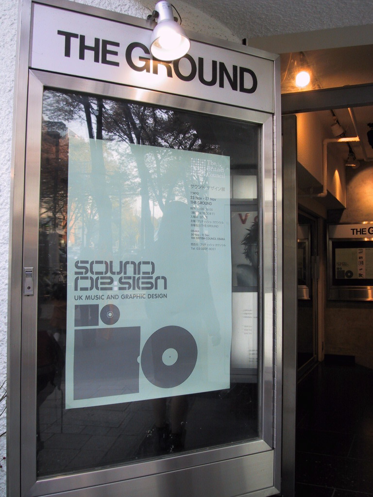
This is the poster, in situ, displayed at the entrance to the Tokyo venue, The Ground. Instead of installing the exhibition at the British Council headquarters, it opened in this concrete-lined bunker (not the easiest place to hang a show) close to the epicentre of Japanese trendiness (between Harajuku and Meiji-Dori). However, in some correspondence The Spiral is named as venue, which would have been an even bigger deal! David’s brief called for an exhibition of UK music graphics; from the golden years of vinyl when British designers helped to invent the genre of “album sleeve art”, to recent annexation of the aesthetic high ground by indie labels and various subcultures. The aim was to come right up to date with examples of ingenious CD packaging.
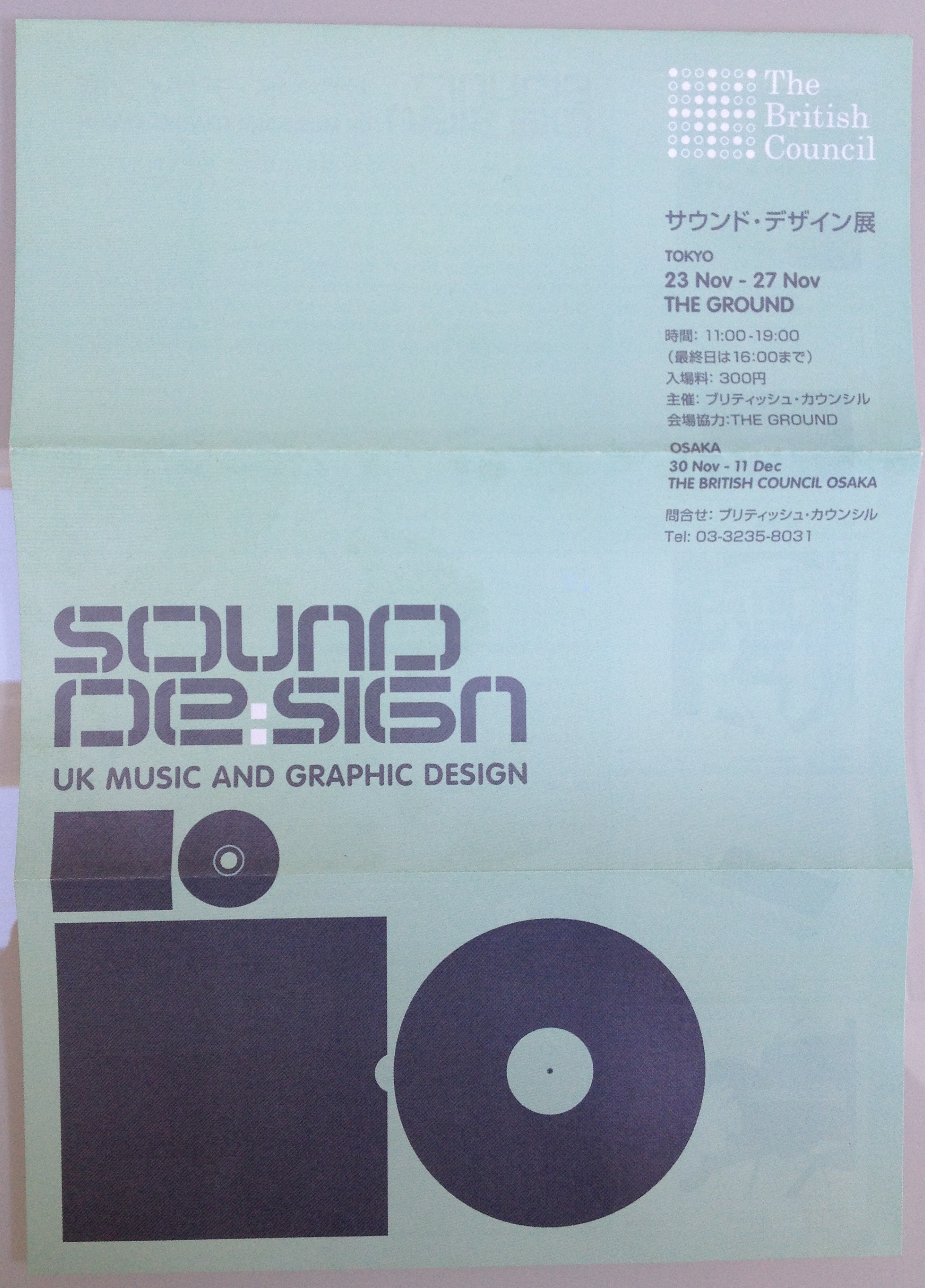
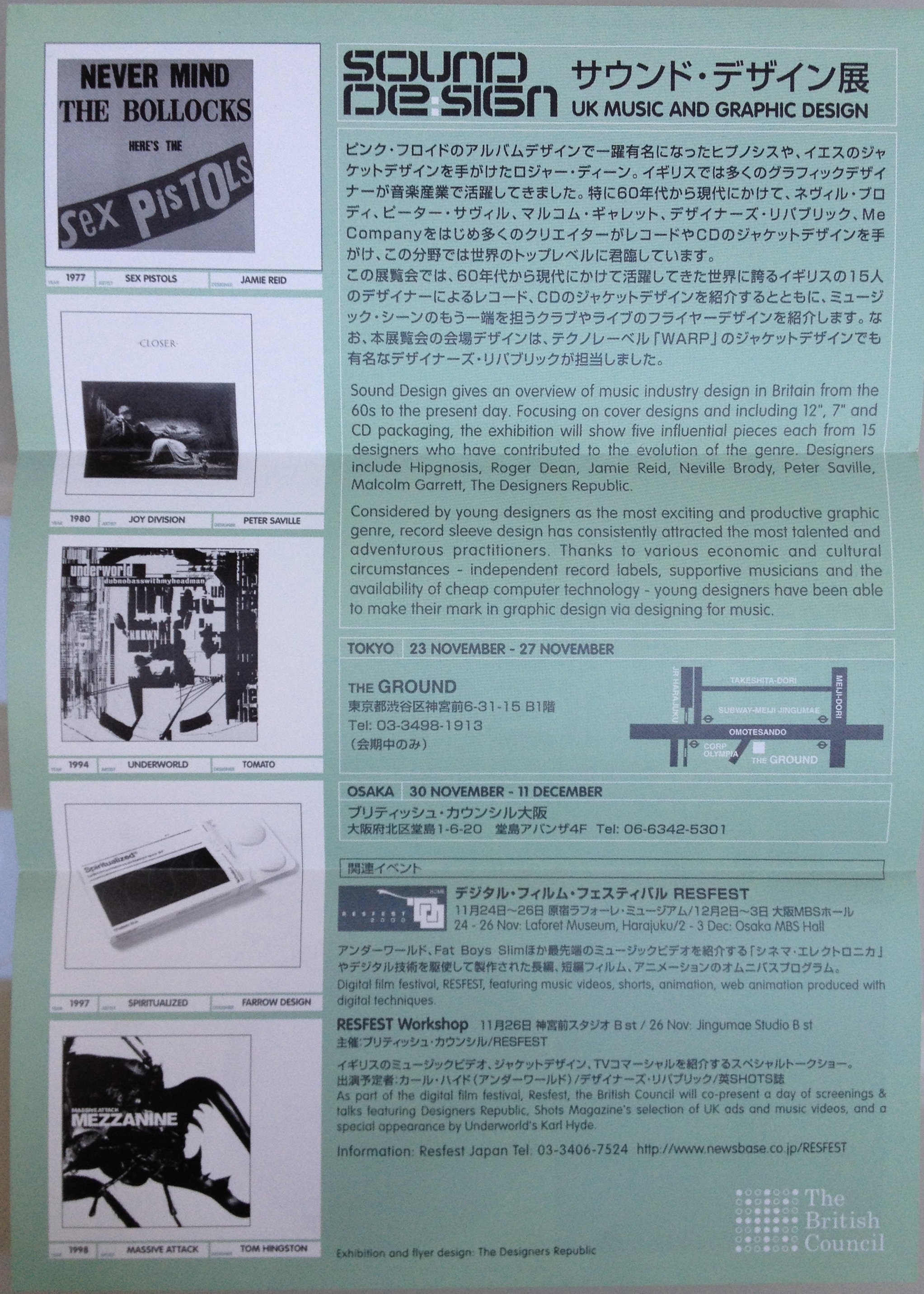
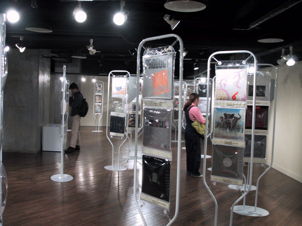
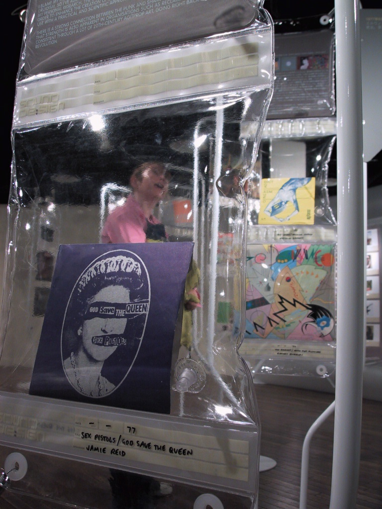
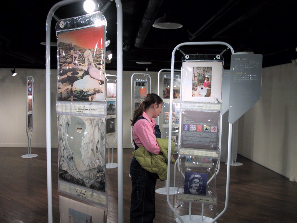
This is the flyer, front and back, for the Japanese tour; note the absence of URLs for the British Council and the venues, and no exhibition “microsite” either. Initially the exhibition was planned for October, but the reschedule meant it coincided with the digital film festival, RESFest (that did have a website); the festival included a day of music video screenings and a talk by Ian Anderson of the Designers Republic, the team behind the exhibition design. The flyer also shows a schematic of how the exhibits would be displayed and captioned (date, artist, designer). Transporting the show was made easy because of the display device/protective packaging devised by Inflate, in collaboration with the Designers Republic. The transparent, air-cushioned plastic bags were hung from either freestanding frames or walls and ceiling depending on the venue, and were then stacked in packing cases for shipping – a lightweight, compact solution.
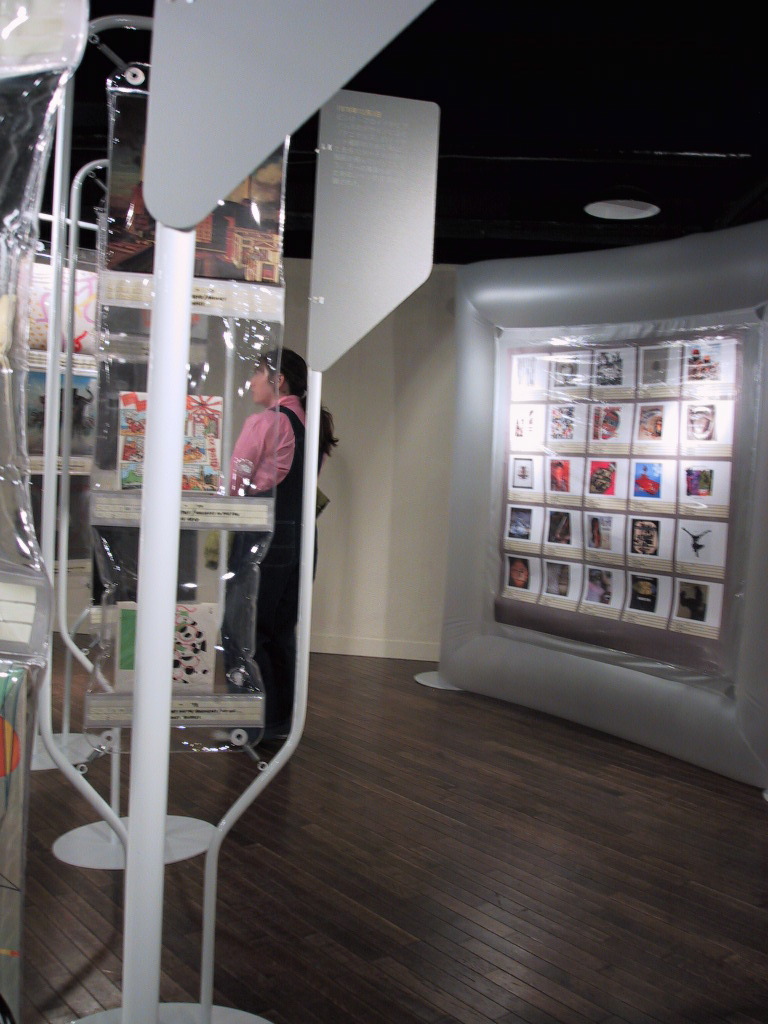
Recently I found a back-up disc with a computer folder of documents and photos relating to this project; it was a nice surprise as my Millennium-era laptop came to an untimely end when it was struck by lightening(!). These photos were taken at The Ground by Gregg Virostek (husband) using a Powershot S20 (my first and only digital camera); that’s me in the pink shirt. We were on a round-the-world trip researching book ideas and flew in from Mumbai the evening before the exhibition opened on 23 November 2000. As I wasn’t involved in the install this was my first sight of the content, display and graphics. Assessing the evidence reveals that some of the computer documents are in unknown formats, they may have been faxes sent direct from my computer using a fax software and a plug-in telephone line (an alternative to dial-up Internet). I also had an email address and my invoices list expenses for Internet Cafes, so some of the documents may have been cut and paste from email messages. I also found my diary for 2000; at the time I was leading a nomadic existence, moving between Vancouver, Canada, various US and European cities (more research trips) and London, where I occupied friend’s spare rooms or house/cat-sat and freelanced on book projects for Booth-Clibborn Editions as well as writing for design magazines. It was an incredibly busy year and I worked on this project in both London and Canada.
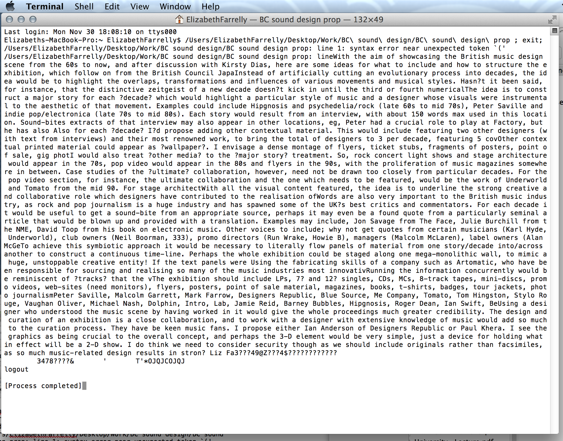
On 14 April I met with Kirsty Dias, Design Promotion Project Manager, at the British Council office at 11 Portland Place. I knew Kirsty from the Barbican Art Gallery where we worked on Jam: Style+Music+Media in 1995-6, so it was great to work together again. Kirsty made the show happen, liaising with the commissioning office in Tokyo, the designers in Sheffield and myself (wherever I happened to be). In my diary, next to that meeting, I wrote a list of designers and most of them ended up in the show. Here’s my initial proposal, which looks as if it may have been rescued from a corrupted email; did I write this in an Internet Cafe?
On 2 May we met again and “title” is written next to that entry; we had to name the show to have it scheduled and although “Sound Design” was always referred to as the working title we didn’t come up with anything better! On 2 June I met David and Ian (the Designers Republic), who I’d suggested as designer. Then, after some initial phone calls, I contacted contributors in writing, sending a synopsis of the idea, a break down of what we’d need from them and in some cases tentative questions. This is the “standard version” of that fax…
START
The exhibition aims to give an overview of music industry design, in Britain, from the 70s to the present day.
Focusing on cover designs, and including 12″, 7″ and CD packaging, the idea is to show 5 seminal pieces each from up to 15 designers who have contributed to the evolution of the genre. The aim is to get an even spread of designers working from the 70s to the 90s.
Each designer will be interviewed by me about their long-term contribution, or about a particular project, which ever is considered more relevant. The edited text will be incorporated into both the exhibition and a short catalogue. [DID THIS HAPPEN?]
To contextualise the selection there will be more covers from a wider range of designers grouped by decade from the 19602-70s to the present day.
Adding another layer of context will be walls of music-generated ephemera — tickets, posters, invites etc. — and large-scale panels depicting key dates and events.
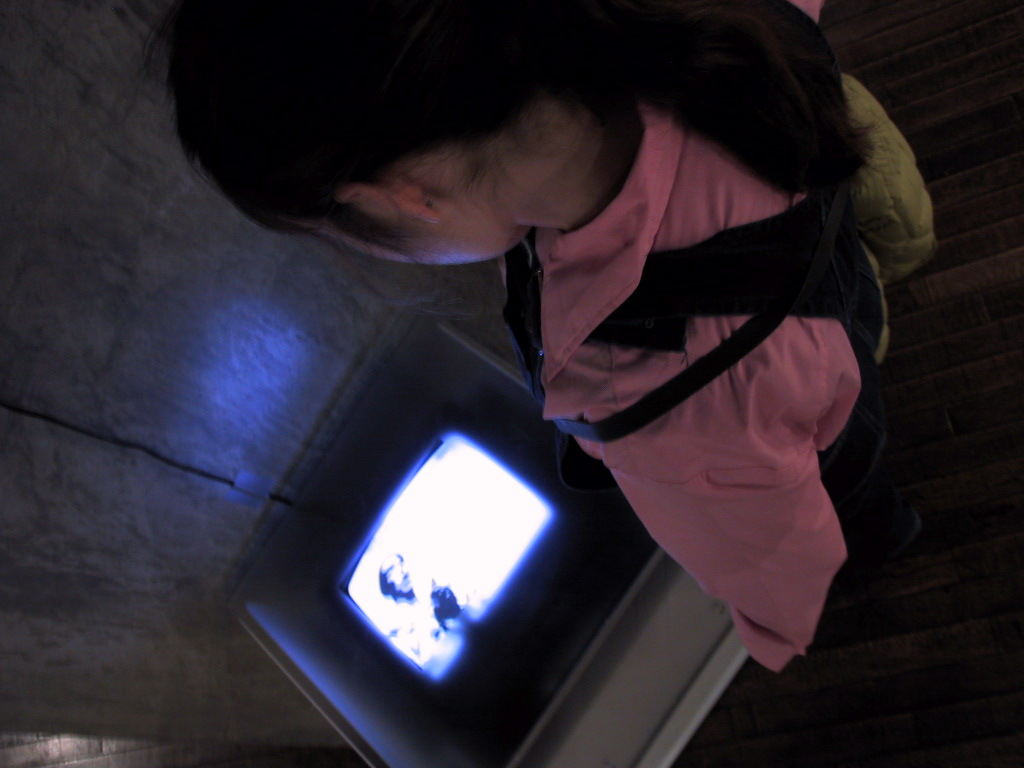
Also, on a couple of monitors will be a selection of videos and another selection of 100 flyers from one decade, 1988-1998.
Opening in Tokyo in November, we need all visual material and completed text by the end of July. The British Council are aiming to tour the show for at least a year. All exhibits will be insured and displayed in tamper-proof, sealed display boxes. Transportation is by air freight. Exhibition design is by The Designers Republic.
END
According to the diary, by July I was scheduling interviews and requesting exhibits. I interviewed all the featured designers (or it may be more accurate to call them art directors); there were no women on the list, which reflected the situation in the UK industry at that time. Some interviews were by phone (dates and times of these pre-arranged calls are in the diary), others face-to-face and they were taped and transcribed, only one appears to have been sent either by email or fax. Short extracts were used in the exhibition and the long-form interviews remain unpublished. Later I sent another round of letters to contributors about the possibility of collating the interviews into a book and proposed the idea to Booth-Clibborn Editions and August Media (Stephen Coates and Nick Barley), but neither worked out.
Most of the featured sleeves were sourced with the help of the designers and their contacts at record labels. Context around the main content was added with a further selection of record sleeves and CD packaging sourced from specialist record shops, some of which were in inflatable covers, others constituted a “mood board”. The photos show a large, inflatable frame with clear pockets that could hold exhibits that could be easily updated. A select of flyers, taken from the two Booth-Clibborn Edition books that I edited, High Flyers: clubravepartyart and Nocturnal, were intended to be shown in an AV (and I have a list of the flyers chosen). Curating the video selection required an extra degree of expertise and we worked with a specialist researcher to obtain permissions and assemble the showreel. There’s not much chatter about deadlines in the messages, so those demands were probably made by phone, but the exhibition was rescheduled from an initial opening planned for October. On 26 September, I’m in LA and a note in my diary says, “Kinkos – Brit Council!”; was I still working on copy? Another document from my archived file, an additional invoice dated a year later, shows that I was tasked with making a supplementary selecting of new sleeves as the exhibition travelled.
Below: the text supplied to Kirsty, which was then subbed and translated; the list of sleeves from featured designers; a partial list of the extras, the mood board sleeves and contemporary sleeves that added a wider context; and the wish list of videos.
START
Introduction
Welcome to design in a bubble. Fifteen of the UK’s best known record sleeve designers from the past 30 years have each contributed five sleeves to this exhibition; these 75 milestones represent a history of graphic design’s most popular genre. From hand-drawn psychedelia to slick photo-images; from instant cut-ups to computer-generated perfection; these designs have aided the growth and dissemination of wave after wave of new sounds and attitudes, via technologies and techniques that exploded previous aesthetics. Beginning in the late-1960s, young, independent designers (the first to earn a living solely from music) redefined the genre by putting ideas, rather than simply portraits, onto sleeves. Hand in hand with the proliferation of Rock music, the 1970s were a golden era for the art and its makers; big budgets lavished on ambitious concepts sold millions of albums. Punk kicked in and ripped up the rule-book, yelling do-it-yourself on a Xerox machine; later in the 1980s designers and musicians mined every trick, pastiching styles for a booming Pop industry. Enter the CD, and the canvas shrinks, but the possibilities for imaginative packaging multiply; now the box is a desirable, lifestyle accessory. What next? Will free internet music kill off cardboard/plastic covered discs and the art that makes the pretty package? Could the bubble burst…?
Designers’ texts (extracted from longer interviews)
Aubrey Powell/Hipgnosis
“It’s not what you know it’s who you know. Myself and Storm Thorgerson started Hipgnosis in 1968. We came from Cambridge and so did Pink Floyd, and we all moved to London together to go to college. At the time everyone was getting stoned and dropping acid; we were right in the middle of that psychedelic revolution. So when Pink Floyd needed an album cover, we designed it. We were into Marvel comics, John Cage music, experimenting with film stock, cosmic images and the life force of the universe…it was about questioning social mores. The 1970s were heady years for record sleeve design. There was no MTV so the only way to create an image for a band was on a cover, 12 inches by 12 inches. And people identified with the band through studying the cover and endlessly reading into it all kinds of connotations. So the bigger the band, the more obscure the image they projected. Pink Floyd and Led Zeppelin were the two biggest and very conscious of always maintaining the integrity of their images. So they surrounded themselves with an atmosphere of mystery and with great art work. That’s what we were brought in to do, and those albums sold in millions.”
Roger Dean
“When working with Yes became an ongoing relationship several possibilities occurred to me. One was that I could create a narrative, through the album covers, of a visual story and a fantasy world. The cover was the world and the graphics and music were the culture produced in that world. Secondly, I looked at the band’s complete identity. I think of myself as being equally an artist and a designer and the process of designing a logo for Yes or Virgin, for me is very similar to laying out Ronnie Scott’s Jazz Club or designing a stage set and merchandise for Yes; it’s a question of making an aesthetic pattern out of chaos and accommodating all the given elements, like a Chinese puzzle. But working with Yes brought out the other side to an equal amount; it was a chance to paint landscapes. The philosophy behind my early work was that I was making a window into another world and I wanted that window to be as discreet as possible, so it was painstakingly drawn. But when I started painting I wanted to explore the surface so it’s a thing in its own right, and a reminder of our world’s materiality.”
Barney Bubbles (AKA Colin Fulcher)
One of the very few record sleeve designers to have crossed the (supposedly) vast ideological divide between Hippie and Punk, Barney Bubbles has been lauded by fellow designers and keen fans and greatly missed since his early death in 1983. Barney took his first steps into the music world in 1967 creating liquid light shows at counter-culture venues including the legendary London Roundhouse. Giving up his daytime job at Conran Design he worked on covers for underground magazines, Friends and Oz, and created elaborate gothic/sci-fi sleeves for Hawkwind, most notably, In search of space. Reinvigorated by Punk, Barney worked with innovative artists, such as The Damned, Elvis Costello, Ian Dury and Billy Bragg, and with ground-breaking labels, Stiff, Radar and F-Beat. He turned out a massive amount of visual material, from label identities to backstage passes, some land-mark covers – see Elvis Costello’s Armed Forces – and the no-nonsense masthead of the muso’s bible, the NME. Barney’s real trademark, however, was his love of constant experimentation, taking inspiration from sources as varied as Russian Constructivism and the telephone directory, trying ideas, recombining them and playfully inventing. He has undoubtedly been an inspiration to younger designers over the past 30 years, and will continue to be.
Jamie Reid
“Everyone asks me about the Sex Pistols, but I’ve always worked in different styles, which is why I don’t fit into any of the art categories. And I don’t work for record companies. If I’m working on a sleeve I get closely involved with the band. I met Afro Celt Sound System at the Strong Room, an independent recording studio in London, which I designed the interiors for. The originators of ACSS really responded to the space, phoned to say thanks, and directly out of that we created ACSS. I blame my parents really!!! I was brought up in a family that was closely involved with Druidism, so I’ve always understood the symbols, but I’ve also recreated them through a lot of research. They are druidic-based and linked to astrology in order to enhance the creation of sound. For me it’s very important to put magic to use in a practical and scientific approach, and it seems to work. There is a strong connection between the punk and shamanic imagery that I’ve created. That strength is also apparent in organisations such as Reclaim the Streets. It’s consistent through a lot of 20th-century agitprop art, going right back to the Russian Revolution.”
Malcolm Garrett
“I designed the Buzzocks’ first album sleeve while at college. I wanted to make something that wasn’t just a piece of cardboard and that also subverted corporate graphics, and my flatmate inspired me to put the album in its own carrier bag. Even though Punk was about destroying the music industry we still relied on the distribution network. This way you could buy the record in HMV, but you didn’t have to advertise it. I put ‘product’ on one side to be tongue-in-check. And the catalogue number on the other side refers to the fact that the industry cares about efficient distribution more than music. Fundamentally, I considered the sleeve as information rather than art. My aesthetic was about combining elements from disparate sources in new ways to create something fresh and eclectic. I often shared the same starting point with my college-friend Peter Saville, but his aesthetic was more reductionist. Later I had a company called Assorted Images, and from 1980 to 1986 controlled the entire visual environment of Duran Duran, except the videos. At that time there was such a lack of awareness; pop stars weren’t bothered who did their graphics, and, ultimately I knew I had to get out of the music industry.”
Peter Saville
“I persuaded my school friend Malcolm Garrett to join me at art college in Manchester. He had a reading list of 20th-century graphic design history, and discovering the dynamic energy of El Lissitzky, Herbert Bayer and Piet Zwart, us budding young stylists saw the pertinence of it for the cultural event we rated over all others. We were looking for a graphic metaphor for the post-punk New Wave, so we mixed them with Pop Art and came up with Pop Constructivism. I was hanging around waiting for an opportunity and it came courtesy of Tony Wilson. He started a club and record label, Factory, and I had a vision of a youth-cult label with an identity system as coherent as a multi-national corporation, with the bands as sub-sets of the corporation. And every part of the package had to relate together – the label, the back cover, the poster – so people perceived it as an object and became very respectful of Factory graphics. It worked too because the music was relatively unknown and you wanted to own these releases as they were lovely things. The problem was that as soon as it was applied to a record that wasn’t very good, you blew it.”
Neville Brody
“Ever since college I’ve pursued a no-compromise approach policy of deep experimentation, whether there is a client involved or not. It comes from my belief that graphic design is an extremely vital tool for expression and for exploring language in the public arena, as opposed to art which is very elitist. And in 1979, when I left the London College of Printing, the freedom allowed in record cover design was huge because of the sudden growth of independent labels, sometimes just pressing up to 200 copies of a release. Without that vehicle, not only myself, but Peter Saville and Malcolm Garrett would not have surfaced. I got to meet 23 Skidoo because the singer lived in the same squat as me, and with Cabaret Voltaire, I was a fan and wrote asking if I could show them my work and we hit it off immediately. The Cabs’ philosophy needed imagery that was ambiguous and disturbing as it was about the loss of the human voice in modern society, so elements were hidden behind video textures or barely discernible through repeat patterns. 23 Skidoo were getting back to a more humanistic culture and that was expressed using primitive markings, carvings and moulding with clay.”
Keith Breeden
“I went to school with Malcolm Garrett and he remembered that I would spend hours just drawing. So, when he was art director at Radar Records he asked me to help out. My first ads and sleeves were Letraset and hand-drawn as I didn’t know anything about typesetting, but Malcolm taught me and I went on from there. I set up my own studio and by 1986 I was winning categories in the Music Week Awards. Working with Greene, who was Scritti Politti, essentially he had the same attitude to his music as I had to my graphics, which is fussy, it has got to be right! We were trying to get a sensuous feeling of quality. I’m not analytical, I worked very intuitively and liked to use ordinary things but make them beautiful. The Cupid and Psyche album cover is made of screen-printing test pieces, scraps of paper held together with masking tape and a bit of lettering, embossed, with block foil, and it’s the way you stick it on. Somehow that changed a tatty piece of paper into something high quality. And that’s a definition of art; transforming something into something else so that the original material doesn’t exist anymore.”
Vaughan Oliver/V23
“Music graphics combines my twin passions, music and the visual arts. A college tutor said it was no job for a grown man, but my best friend from school, photographer Nigel Grierson, organised his placement with Hipgnosis, so we discovered that you could get a job doing record sleeves. In 1980 I bumped into Ivo Watts-Russell, the guy who started 4AD. That was an opportune moment of which I’ve taken full advantage! I kept pestering him and Ivo got an office and said, come and work. There was only him and me, so he was really splashing out on this full-time record sleeve designer because he believed the packaging should reflect the music in a qualitative fashion. He was putting out music for his own record collection and wanted it packaged in a way he was going to be happy with. We were both music obsessives; he understood what I was doing and generally gave way. There was a corporate identity, but it grew organically. Essentially a look developed because the designs came from one desk, until Chris Biggs joined in 1987. And there were visual links – a love of texture – that inform you about the music, because I was trying to reflect the feel of it.”
Paul White/Me Company
“In 1985 some friends were setting up a record label, One Little Indian, and asked if I would be the company director who controlled the visuals. They were a bunch of ex-anarchists (with affiliations to Crass) with egalitarian views on how things should be done, so it was more like a collective and very hands-on. We signed the Sugar Cubes, who had also been part of the anarcho-punk scene, and were looking to release their first single in the UK. A practical consideration was to produce two-colour sleeves for singles, to keep costs down. It was a restriction, but also a freedom, because for a while I wanted to do pared-down, colour work, and on Life’s too good, their first album, there was a lot of hand-drawn and photocopied stuff. It was all pre-Mac. When Björk left the Sugar Cubes it was her idea to carry on working with me, and there’s this weird synergy in the way we both stay on target with how we think she should look. All the depictions of her on sleeves are characters, as if a part of her has been extracted, blown-up and focused-in on to bring out a different persona for each release.”
Ian Anderson/The Designers Republic
“We’ve been designing record sleeves for about fourteen years, but Kiss by Age of Chance was the first cover that really got us noticed. Essentially, there wasn’t anything like it before. For us it was the first time that we played with the idea of a sleeve working in parallel with the music to give the audience more information – it contains a lot of William Burroughs-inspired cutting and pasting of emotive images and phrases – not just the usual liner notes. I wanted the bands we worked with to have something to say, an attitude, like The Clash did, and in this sleeve there are politically-influenced references back to the Anti-Nazi League of the late-1970s. The design was a collision of everything we liked, and musically, for the band it was a collision of styles, all thrown into a pot without much prejudice. And that’s still how we work; there is no hierarchy of influence so it all seems to fit. This was pre-computers, we were blissfully naive, and the design was just done, instant. Stylistically we’ve grown and progressed, but in a lot of ways, on a political level, this sleeve still pretty much sums up our attitude.”
Mark Farrow/Mark Farrow Associates
“When the 12 inch album became a 5 inch CD obviously the image was weakened by the size. So we went about designing it another way and started playing with the actual forms as opposed to the content, out of the sheer boredom of dealing with the normal solutions. We wanted to make each release look as unlike a record sleeve as we could. But it’s increasingly difficult to work with record companies and do anything interesting because marketing is stifling creativity. With the Pet Shop Boys’ Very, they came up with the idea of doing something totally different and had a lot of clout at the time. Jason Pierce from Spiritualised has always put out stuff that is different, and Ladies and gentleman we are floating in space came about because in the first meeting he said, music is medication for the soul. Plus, we had a good client at Dedicated who allocated his marketing spend on production, instead of advertising, because he knew our solution would be featured in every magazine. With Dave Clarke’s Archive One the idea came from the title. I said I wanted the kind of packaging you tear a strip off, and just drew it.”
Adrian Shaughnessy/Intro
“I started designing sleeves at the old Decca record company in the 1970s. I didn’t go to art school, but was taken on as a trainee. Because I loved music and design, it was a heavenly time. When the other designers went to the pub at lunch time, I’d go rooting through store cupboards and find original artwork for classic Rolling Stones’ albums. In the late-1980s, I set up Intro with my partner, Katy Richardson, and we grew by doing small, oddball projects that grabbed attention. One was Blood and Fire, a small Manchester label putting classic Dub albums on CD; people like King Tubby, Horace Andy, Burning Spear. Mat Cook at Intro designed a series of enigmatically beautiful covers for Blood and Fire, which attracted attention from bands who liked the vibe! Primal Scream were big fans and we’ve done their last two albums. Intro is a bit strange. We do three things in the music industry; design sleeves and promotional campaigns; make websites for bands and labels; and shoot music videos. Sometimes we get to do all three at once and then we’re really happy. But videos are rarely commissioned by the same people who commission sleeves and the labels miss a trick by ignoring that tie-in.”
David James
To come (don’t have the short text archived, but do have a long-form interview).
Ben Drury
“I started working with Will Bankhead at St. Martin’s College. I would design type and logos and, in conjunction with his photographic techniques, we would create something different. Then we hung about in record shops – Fat Cat Records in Covent Garden was a kind of information exchange – and met people who were making music and running labels. It was a case of, can you do us a label, which we did for Global Communications, Irdial and others. In 1994 we met James Lavelle who had just started MoWax Records. He wanted a new visual direction and we took over doing everything, as he expanded the number of formats and range of artists. It was a very steep learning curve. And we were renegades, there was no one to control us. If we wanted to do a totally impossible format, a double 10 inch promo printed on both sides of the cardboard, we’d do it. We quickly became known as interesting packaging designers. Since 1997 I’ve been art director on my own and MoWax has a new parent company. Now I have to justify myself much more because the market is shrinking, and there’s a lot of pressure to sell more records.”
Flyer text
There have been hand-bills ever since printing presses first advertised whatever entertainment was hot back then. So what makes a club flyer different from other printed matter handed out on the street? Flyers offer coded information to a particular culture. If you crack the code, welcome to the party! Back in the late-1980s the flyer began life as an cheap, portable form of advertising a new type of entertainment, which was to evolve into the major musical genre now known as Dance. When young promoters set up one-night parties (in night clubs, warehouses or fields), to play their favourite music to friends, they wanted to let just the right people know about it. Flyers were the perfect means. Simply hand one to whoever you like the look of. Easy. After the basic data – when, where, what’s on offer and how much – the rest of the flyer is for art. Plus, the visuals explain what to expect in terms of style and attitude, but only if you can read the code. Psychedelic fantasy worlds; slick, photographic glamour; cartoon cute characters; mysterious techno beasts; it all means something…if you learn to read. Here’s something to practice on; 100 flyers from a decade of clubbing.
Ephemera text
Alongside high profile record sleeves, graphic designers working in the music industry produce other stuff – a vast range of ephemera that isn’t usually as treasured as our favourite albums. All the visual information needed and sold by the industry – from the promotional poster and point of sale material to the stage set, t-shirt, concert ticket and button badge – is all designed. In some cases performers choose one designer to co-ordinate their entire image; that’s considered to be the optimum way of working to produce a totally cohesive visual statement. But that necessitates the designer having a wide range of skills and being employed full-time by the performer. More often, the record company will ask a designer to create certain bits of the puzzle, while other elements are farmed out to other companies and professionals who specialise in the smallest details (the badges and tickets), or the larger-scale elements of the image (stage sets and videos). There is also design work to do for record labels, venues and radio stations. A light show won’t be the same twice; a concert ticket gets washed in the pocket of your jeans; the stuff disappears so enjoy this selection while you can.
Video text
A recent study in America identified that 10-year-old children recognise music videos to be “advertisements” for songs. Since the launch of MTV in the early 1980s, music videos or “pop promos” as they’re also called, have become the prime means of marketing and selling Pop music in what is one of the world’s most cut-throat commercial environments. Coinciding with the new MTV was the blossoming of a UK-based musical genre for which image was as importance as sound. The British New Romantics were the first sub-culture to dominate the small screen, and the reputation of British promo directors, many of whom brought with them the sensibilities of their previous professions as photographers, graphic designers and fashion stylists, was set. The power of the music video is certainly beyond doubt, and that importance is under-scored by the budget spent (on average £100,000) and the fact that budding, young filmmakers start out making videos (Spike Lee, Hal Hartley, Alex McDowell and Julian Temple among others). Videos are crucial to both musicians and filmmakers because they’re a great medium for experimentation as they’re quick to make. Plus they earn world-wide exposure by being shown on music-based cable stations (MTV, VH1), national TV chart shows, jukeboxes in stores, bars and clubs, and through are on sale in record stores.
Timeline
4 March 1966
John Lennon of the Beatles is quoted as saying; “We’re more popular than Jesus now”.
31 July 1966
Citizens of Birmingham, Alabama, burn Beatles’ records and memorabilia.
11 August 1066
Lennon apologies.
6 December 1969
The Rolling Stones hire Hells Angels as security at the Altamont Festival, California. One fan is stabbed to death. The peace and love era is over.
9 April 1970
The Beatles split up.
1 December 1976
The Sex Pistols are the first guests to ever swear on a British TV chat show.
12 January 1977
Their record label, EMI, dumps the Sex Pistols. The band keep the £40,000 advance.
3 December 1976
A 40-feet-long inflatable pig flies away during the shoot for Pink Floyd’s Animals record sleeve, designed by Hipgnosis. To avoid an accident, air traffic control closes London’s airports.
16 August 1977
Elvis dies, aged 42.
18 August 1981
At 12.01am MTV broadcasts its first video; Video killed the radio star by Buggles.
1983
Philips launch the Compact Disc.
13 July 1985
Ex-Boomtown Rat, Bob Geldof, hosts Live Aid, which is watched on TV by 2 billion people in 22 countries. It raises $70 million for famine relief.
12 July 1986
Boy George of Culture Club is arrested when a friend dies of a drugs overdose in his home. He’s charged with possession of marijuana and admits to being a heroin addict.
May 1992
For five days 50,000 people rave in a field, for free, at the illegal Castlemoreton Festival in rural England.
1994
The British Government retaliates, by passing the Criminal Justice and Public Order Act, which outlaws outdoor parties playing repetitive beats.
19 February 1996
Jarvis Cocker of Pulp moons to the cameras during Michael Jackson’s set at the Brit Awards. He is arrested but not charged.
6 May 1998
The Spice Girls are named “World’s best-selling Pop artists of the year” at the annual World Music Awards.
8 February 1999
Spice World, the Spice Girls’ movie, is nominated for the Golden Raspberry Award as the “Worst film of the year”.
END
So, what covers, ephemera and videos were in the show; here are some lists from my correspondence, although I’m not sure what finally made it in…
START
List of sleeves for “bubbles”
1. AP: Pink Floyd-Dark side of the moon-Wish you were here-Animals/Led Zepplin-House of the Holy-Presence
2. RD: Yes-Tales from Topographic oceans-Relayer-Yellow City Yes box set/Anderson Bruford Wakeman Howe-ABWH/Pink Floyd-Symphonic Dragons Garden
3. BB: Elvis Costello-Armed Forces/Ian Dury-Do it yourself (more than one version?)-Hit me with your rhythm stick7”/The Damned-Music for Pleasure/Hawkwind-In search of space
4. JR: Sex Pistols-God Save the Queen-Holiday in the Sun/Boy George-No Clause 28/Fraser Clark-Shamanarchy in the UK/Afro Celt Sound System-vol 1
5. MG: Buzzcocks-first album inside “Product” carrier bag-Orgasm Addict/BEF (British electric foundation) vol 2/Magazine-The Correct Use of Soap/Duran Duran-Rio
6. PS: Joy Division-Unknown Pleasures-Closer/New Order-Republic (as CD)-Blue Monday (12 inch single)/OMD-first album
7: KB: Scritti Politti-Cupid and Psyche-Oh Patty (12 inch single)-SP with Shabba Ranks-She’s a Woman (single)/ABC-How to be a Zillionaire/Ellis Beggs and Howard Homer-album/The Mission-Carved in sand
8. NB: Last Testament compilation, Fetish Records/23 Skidoo-The Gospel, or The Gospel comes to New Guinea-7 songs/Cabaret Voltaire-Faith would be the one
9: VO: Clan of Xymox-Clan of Xymox/Ultra vivid scene-Ultra vivid scene/Lonely is an eyesore-compilation/Pixies-Doolittle/Ft.Lake-His Name is Alive
10: MF: Pet Shop Boys-Very CD (orange)/David Clarke-Archive/Spiritualised-Ladies and Gentlemen we are floating in space (6 x CD in pill box)-Music Masters-Decon flouro box
11: DJ?
12: AS/Intro: Primal Scream-Exterminator (Creation)/Depeche Mode-Singles 86-98/Broadcast-Noise Made By People/Stereolab-Dots and Loops/Heart of the Congos-The Congos
13: IA/The Designers Republic: Age of Chance-Kiss/Pop will eat itself-This is the Day/Autechre-Chiastic Slide/Satoshi Tomiie-Full Lick/Sun Electric-O’Locco
14: PW/Me Company: Sugar Cubes-Life’s too good/Bjork-Post-Bachalorette/Shaman-Entact/Carl Cox-Fact one
15: Ben Drury/MoWax: Money Mark-Push the button (12 inch album)/Divine Styler-Wordpower 2 (12 inch album)/Attica Blues-promo album/Liquid-Liquid promo album/DJ Mike for Journey-The Journey
END
START
Mood board sleeves
Cream “Disreali Gears” Atco 1967 d. Martin Sharp
The Who “My Generation” Virgin 1965 / “The Who sell out” Decca 1967 d. David King and Roger Law ph. David Montgomery
The Beatles “Revolver” 1966 d. Klaus Voorman
The Jimi Hendrix Experience “Electric Ladyland” 1968 d. David King ph. David Montgomery
Jethro Tull “This was” 1969 / “Reprise” 1971 painting Burton Silverman
John Lennon and the Plastic Ono Band “Live Peace in Toronto 1968” Apple 1970
King Crimson “In the court of the crimson king” 1969 d. Barry Godber
Mott the Hoople “Mott the Hoople” 1970 drawing by MC Escher
Quatermass “Quatermass” Harvest 1970 d. Hipgnosis
Robert Palmer “Pressure Drop” Island 1975 d. Graham Hughes
Osibisa “Osibisa” Decca 1971 d. Roger Dean
Traffic “The low spark of high heeled boys” Island 1971 / “Shoot out at the fantasy factory” Island 1973 d. Tony Wright
Queen “Queen Jazz” Elecktra 1978 d. Cream (insert of naked bicycle race)
Roxy Music “For your pleasure” Island 1973 / “Stranded” a.d. Nicholas De Ville ph. Karl Stoeker
UFO “Phenomenon” Chrysalis 1974, d. Hipgnosis, painting Maurice Tate
The Pretty Things “Silk Torpedo” 1974 d. Hipgnosis
Sparks “Progaganda” Island 1974 ph. Monty Coles / “Indiscreet” Island 1975 ph. Richard Creamer / “Kimomo My Heart” Island 1974 a.d. Nicholas De Ville ph. Karl Stoeker
Eddie and the Hotrods “Teenage Depression” Island 1977 d. Michael Beal
Echo and the Bunnymen “Crocodiles” Korova 1980 ph. Brian Griffin / “Heaven up here” Sire 1981 / “Porcupine” Sire 1983 / “Ocean Rain” Sire 1984 d. Martyn Atkins ph. Brian Griffin
Pet Shop Boys “Introspective” EMI 1988 d. Mark Farrow @ 3 Associates
Duran Duran “Rio” 1982 d. Malcolm Garrett
Simple Minds “Life in a day” Virgin 1987 d. Malcolm Garrett
The Farm “Spartacus” 1991 d. Design Shed
The Prodigy “Music for the jilted generation” XL Recordings 1994 ph. Stuart Haygarth
Blur “Parklife” 1994 ph. Brunshill/Bob Thomas
END
START
New sleeves 2000-2001
Aubrey, Unscrambled memories, Shady Acorns
Blur, The Best of Blur, Julian Opie (artist)
Garbage, Beautiful, Mushroom Records
Muse, Origin of symmetry, Mushroom Records
Muse, Bliss, d. Darren Watkins
Spiritualised, Let it come down, d. Farrow Design
Orbital, The Altogether, d. Farrow Design
Mr Bongo Recording, Bazeado, d. Red Design
Brothomstates, Chaos, Warp Records d. The Designers Republic
Deep Dish, Yoshieque Two, React Music d. The Designers Republic
Zero7, Destiny d. Blue Source
Hydrogen Dukebox Records, Infused d. Yacht Design
Haven, Let it live
Basement Jaxx, Rooty, xl-recordings / Beggars Banquet d. Mat Maitland & Gerard Saint at Big Active
Hefner, Dead Media d. Darren Hayman
Death in Vegas, The Contino Sessions d. Richard Fearless and Will Bankhead
Aphex Twin, Leftfield, Warp Records
END
START
Videos
The Beatles – Yellow Submarine
Queen – Bohemian Rapsody
Sex pistols – God Save the Queen
New Order – True faith
The Cure – Close to me
KLF – Mu Mu
Frankie goes to Hollywood – Pleasure Dome/Two Tribes
Elvis Costello – Accidents will happen
Rolling Stones – Love is Strong
Pink Floyd – The Wall
David Bowie – Ashes to Ashes
Peter Gabriel – Sledghammer
Ultravox – Vienna
Adam and the ants – Stand and Deliver
Japan – Nightporter
Coil – Tainted love
Caberet Voltaire – anything
David Sylvian – Ghosts
Duran Duran – Rio/Girls on film
Robert Palmer – Addicted to Love
Wham – Club Tropicano
Eurythmics – Sweet Dreams
The Specials – Ghost Town
Madness – Our House
Bauhaus – Bella the Ghost is Dead
Echo and the Bunnymen – The Cutter/Porcupine
Teardrop explodes – Reward
The Jam – Down in the tube station at midnight
Happy Mondays – Kinky Afro/Wrote for luck
Housemartins – Happy Hour
Beats international – Dub be good to me
Fatboy Slim – Praise you/Right here, right now
Soul II Soul – Back to Life
Oasis – with helicopters, or the Beatles-like animation
Blur – Park life/Country house/Song 2
Pulp – Common People
Portishead – Only you
Supergrass – Alright/Pumping on the stereo
Prodigy – Firestarter/Smack your bitch up/Breathe
Leftfield – Africa Shox
Chemical brothers – Let forever be
Bjork – Human behaviour/Big time sensuality
Death in Vegas – Dirt
Underworld – Mmm skyscraper
Massive attack – Daydreaming/Teardrop/Unfinished sympathy
Radiohead – Just/Karma police/Street spirit
Artificial intelligence – a Warp compilation
Orbital (or is The Orb) – Fluffy white clouds
Silver bullet – 20 seconds to comply
The Verve – Bittersweet symphony
Stone Roses – Fools Gold
Jamiroquai – Virtual Insanity
Aphex Twin – Windowlicker/Come to daddy
Squarepusher – Come on my Selector
Mansun – Tax Loss
UNKLE – Rabbit in the Headlights
END
Forgive the lack of cohesive formatting but I’ve left the texts (more or less) as found. And I haven’t listed the 100 flyers and all the ephemera as I’m not sure what was actually used. Looking at this mass of material it amazes me how much I suggested and collected, for what was considered to be a small show, even though the square footage varied from venue to venue. It was a lot of research, working with minimal (if any) Internet access or digital image searches. The material presented here, from my own archive, does not fully describe or confirm the actual contents of this exhibition; ironically, they may still exist somewhere, boxed up in a British Council store. Hopefully, though, by adding this information to the universal (but partial) digital archive that we call the Internet, this post will go some way to documenting an exhibition that was seen by many people in a lot of places.
Photographs of Sound Design ©Gregg Virostek 2000

