Phil Ashcroft and Liz Farrelly
Interview, 26 June 2013
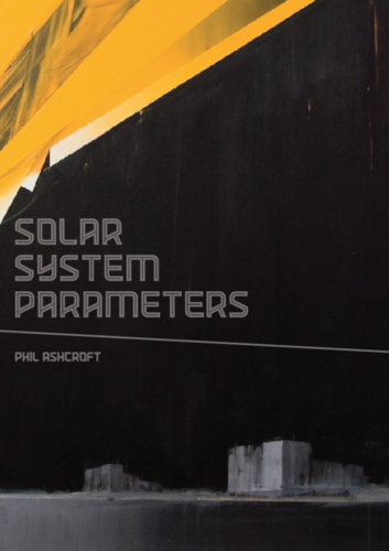
Last summer, I met Phil Ashcroft to talk about his upcoming, limited-edition monograph, Solar System Parameters (published by Gamma Proforma, with an essay by my CSM colleague, Simon Hollington) and an exhibition, “Galácticos”, at Gamma Transport Division, Edinburgh; now both are up and out — the exhibition runs until 6 March 2014. We talked about his diverse work practices, and his career, which spans fine art and design; here’s the interview.
LF: How do you describe yourself?
PA: I’m a painter and a graphic artist.
LF: What materials do you use?
PA: Acrylic on canvas, tape; I use my hands, brushes and sponges for mark-making.
LF: And those mark-making techniques, how have they progressed and changed?
PA: I used to be quite messy and loose, up until 2000, and then I started using a computer to work things out and I’d make paintings based on what I did, decisions I made on the computer, very crisp and planned, and painted that. But it got a bit boring, a bit flat, and I thought, why am I bothering to paint it? So, I’ve mixed it up; a combination of hard-edged and loose mark-making, more organic marks that are only possible with painting.
LF: Painting directly onto the canvas?
PA: Yes. In the studio, I take photos of the piece as it develops and date it at each stage, make notes on it, put it in my sketchbook. And, I have some paintings that started from a reference, a still life, and I make it more abstract. I might sharpen it up, and then add looser elements on top.
LF: Do you define the palette before you start?
PA: I limit the palette to three or four colours, just because it’s one less thing to think about. I try to limit the decisions; so it’s a flat plane, it’s 2D, I choose the height and the width, and limit the colour palette. And I take it from there. There’s a painter, Bert Irvin, who I met while at college, and he prepares his canvas in one colour, red or blue, and works away from that colour.
LF: Do you start like that too?
PA: I work from that idea, but I prepare a ground, a gradient background that might have a couple of colours in it and white, and work on top of that.
LF: Are these paintings abstract, or do they refer to something?
PA: They have a feeling; quite abstract but they reference something. I might be thinking about “Miami Vice” when I’m painting. It might be the colours, or the feeling; it might have a 1980s aesthetic to it. Another painting might have a horizon in it, which grounds it or gives it a sense of scale.
LF: So there may be a sky?
PA: Yes. I look at Robert Motherwell’s paintings from the 1950s and 1960s, the Elegy to the Spanish Republic, which is a series of over one hundred works, and he also did an Open series, and for both it was variations on the same theme. So for some of these works, I’ve been re-painting almost the same composition because I like the idea of seeing a range of variations.
LF: What does a series achieve?
PA: I’m trying to wear out an idea. Once I’ve worn it out, I can move on. But I always have a couple of things going on at the same time, an abstract thing, and at the same time, a totally opposite painting.
LF: Do you go into the studio with a plan?
PA: Yes. Some of the painting is quite quick; I go into the studio and I might add a little strip here, that takes a minute, but I have to leave it to dry, so I work on something else. If I spend longer on a painting, a whole evening, it’s not always productive. I think about it before I go, because my time in the studio is limited.
LF: When you think about your work, how do you describe your aim?
PA: I’m trying to create new compositions within a limited device – a 2D, flat image – and come up with something dynamic that I find interesting to look at, that I haven’t seen, that might have some personal reference to painting in the past.
LF: So your work is in a trajectory of previous paintings?
PA: Yes, I look at work by a lot of painters, all the time. It’s quite a traditional medium but I want it to be contemporary, of now. There’s loads of good painting going on. I really like Phillip Allen’s new paintings, which are quite graphic; and Stuart Cumberland, they’re both represented by The approach. I liked the Roy Lichtenstein show at Tate Modern; there were a lot of his abstract paintings showing the scale and the various themes he worked on.
LF: So you’re marrying a traditional medium with a search for a contemporary visual language? You’re developing your own visual language that feels relevant to you, dynamic, not derivative, not copying. That’s a really difficult task.
PA: I’m looking at traditional painters who might not be particularly fashionable or well known, who might just be dealing with shape and colour, and they might be looking at Matisse; they might be seventy years old. They’ve developed their work over a period of time. And it’s not about fashion, they’re not thinking, I have to do this to do the right thing. They’ve stuck with their route and I admire that. I just want to keep going.
LF: Do you feel that your audience understands that aspect of your work, or does that matter? Or do you think your audience might see your work in a different way, and bring different references to it?
PA: Some people who like my work think of me in terms of Street Art, and I’ve had a lot of positive interest because of that.
LF: So Street Art is part of your work?
PA: Growing up I was interested in hip-hop and graffiti and breakdancing, the whole scene. When I was on my foundation course, I was painting on walls, because I liked the idea of painting loosely. It was illustrative, but on a big scale.
LF: So, perhaps it’s a mixture of scale and urbanism that links you back to Street Art. You live in South London, and I see the city in your work.
PA: It’s urban; architects like my work. I see architectural shapes and it’s quite masculine; but I try and soften it up with pinks and peachy colours.
LF: To add balance?
PA: Yeah, otherwise it would be too macho (laughs). Actually a lot of women like my work; it’s not all blokes!
LF: Tell me about the yeti? Is he an alter ego?
PA: Partly. It was based on the Wampa in “Empire Strikes Back”. The yeti is just one project, but it’s a bit like Alan Partridge and Steve Coogan; he keeps returning to that character. The first time I painted a yeti was in 1998 for a show in Bedford Hill Gallery in Borough. I thought, I’m going to paint what they don’t want. They wanted these abstract paintings, but it was a big gallery, so I painted all these monsters too. They weren’t too keen on them, but I’d been working on a lot of illustration and I thought, I’ve just got to try this out. Then for Ric Blackshaw’s Scrawl Collective “All the People We Like Are Dead” show, in 2004, I put the yeti in Tokyo, referencing the Japanese printmaker Hokusai’s 100 Views of Mount Fuji, particularly the aesthetic of graduating colour. For the scale I was also looking at The Fantastic Four, and referenced the character of Galactus, “the destroyer of planets” and The Fantastic Four’s archenemy. For the yeti in the landscape (from the Pastoral series, 2000-2002), I was referencing Matisse in his Fauvist period. So it was a combination of all those things. And, I was playing around in Adobe Illustrator, just making it from scratch on the computer.
LF: And having worked as an illustrator, you didn’t want a gallery to tell you want to do?
PA: But now it’s come back round, and art directors come to me because they want what I paint, and want to use it. I suppose it takes a few years for people to come round to what you’re doing. Same with these abstract paintings. I first showed them in Los Angeles, in 2008 at Scion Space in Culver City, with Scrawl Collective. It was the first time I did a really big piece on the wall, which was a new development for me. I showed a couple of abstracts too, but being new, people thought they were a bit odd, or wondered why I was doing it.
LF: So, you have to wait for your audience to catch up. And, by then you’ve made a large body of work, and progressed the idea too. How do you think the different projects and the paintings of different scales will look together in this book?
PA: I’d like to see pictures of different scale next to each other.
LF: I think it’s important to make that point, because you work at such a range of scale. And in the flesh the materiality of your painting is very seductive, because of how you use paint in so many different ways.
PA: I look at a lot of painters’ monographs and books. I remember when I worked at Booth-Clibborn Editions, and we published the Christopher Le Brun book, and at the time I thought it was so boring and dull, but I look at it now, and even though it’s quite traditional, I really like the way it was designed by John Morgan, to show the edges of the canvas and the paper. I also like Futura, designed by Ben Drury, which shows the back of the canvases. And, at Tate Modern’s Rothko exhibition, a work was framed so that you could see the back of the canvas.
LF: So, it’s important for you to think of the artwork as an object and not just an image. You mentioned that you work in your studio at night. Do you think that affects your work?
PA: It’s an old listed library building, so it’s a bit spooky at night and virtually empty. There are fifty studios, but usually I’m the only one there.
LF: Does your studio have windows?
PA: It does, it’s like a greenhouse, but it’s nighttime, so maybe that affects what I paint.
LF: I think it does.
PA: Because it used to be important for me to paint in daylight, but I haven’t done that for some time.
LF: So has your palette changed?
PA: A lot of dayglo fluorescents and black and white, so that’s probably part of it; and limiting the palette too. I used to paint and be disappointed with how something might dry because you can’t always judge how colour is going to dry.
LF: But if you limit the palette, you get a better idea.
PA: Yes. And painting at night I always have music on.
LF: Has your musical taste changed?
PA: I used to play more hip-hop but now it’s techno, atmospheric, soundtracks, with beats. Carl Craig, the Detroit producer, is someone I listen to a lot, or the soundtrack to Drive, and Prince. When I listen I think, the people who made this music are just making the music they wanted to make. So, if they’re thinking like that…
LF: Is the idea of not compromising important to you? Where does that come from?
PA: I suppose it comes from the idea that I’m doing this for myself and if I’m not happy with it then why bother. I’m not painting for someone else. So I have to make sure I’m happy with it. Because if I stop painting, if I don’t make any more paintings, no one is going to be bothered, so I’m painting for myself. I think, I’m an average person, so if I like it, someone else will find it interesting. But in the end I’m doing it for myself.
LF: Do you look at a painting and decide, that one isn’t working? Do you paint over it?
PA: Yes, I over paint a lot of things. I’ve done a lot of painting, and there’s a lot of hit and miss, but I’ve done enough to know. And sometimes I think, have I still got that one? But I’ve painted over it! There’s usually a few pieces a year that I’m happy with. I want to do a couple of key pieces a year that are almost like a diary, that mark my year, so I can see my progression.
LF: So there’s a lot of process and progress actually on the canvas. Do you know which is the best one in a series?
PA: Yes.
LF: When you identify that painting, does that mean that series is over, ended, that’s as far as you can go with that idea, and you then start something new?
PA: Perhaps, but then I start moving different elements from one series to another.
LF: The ideas populate each other?
PA: I’m always thinking, do I put a landscape in, or leave it out. And in a series, I might have a landscape in one, but not in another.
LF: So you could do the same painting, one with and one without and see what happens?
PA: It’s knowing when to stop that’s difficult!
LF: In your sketchbook, I saw that you’re working from a photograph of a still life. When did you start that?
PA: Just a couple of months ago. I hadn’t done that before, but I felt it was getting too abstract and I had to root it in something.
LF: Another set of restrictions?
PA: I wanted to start with yellow and I had a photo of daffodils.
LF: It’s gone a long way…
PA: I decided to turn it into a graphic, and that was quite a good way.
LF: It’s created a new form, a new iteration of your visual language.
PA: Yes, I think it helped. But I don’t know what next, because the paintings I’m doing now are quite abstract. And I’m leaving the drips in.
LF: What would you usually do with those drips?
PA: I’d paint over them; make it quite crisp. In this case the black felt too shut off, so I ran paint into it, and I like that looseness. It’s something that can only be done with a painting. There’s an element of risk, because I might spend a long time painting something with crisp areas, which takes me hours to paint. And then I get a sponge with paint on it, and go all over it. And because it’s acrylic, it can dry in a couple of minutes so I have to decide there and then, do I keep it. Often they are the best bits and only take twenty seconds. That’s when the interesting mistakes and accidents happen.
LF: There are a lot of different methods of applying paint within one artwork. Some of your mark-making is about painstaking precision, and then, wham bam, a gesture! When did you start developing that mix, using different styles of painting?
PA: At the LA show, because there was a big area, a four-metre wall, and I had to fill that surface quickly. It was looking a bit flat; it needed texture. I got a car cleaning sponge and used that. It added some risk and I actually enjoyed it. That was a contrast to the paintings that I had made for the show that were shipped to LA, which were very crisp. I’d actually drawn lines to look like drips.
LF: That was moving away from the light boxes. What does the light box format bring that paint can’t?
PA: It doesn’t have to be a light box, it could be a computer screen, as long as it is backlit. But the light boxes were quite meticulous, like architectural drawings.
LF: So they felt more like design, visualising a dystopian future? Are you influenced by sci-fi movies?
PA: Yes, but the older ones, because the technology was more limited; going back to the early 1980s, the “Robocop” vision of the future had such clean lines. Working on the computer, I was getting so detailed, adding more and more elements, and not knowing when to stop. I did a series of destroyed buildings and wastelands, the failed modernist dream. But now I have an idea about new utopias, because there are so many new builds everywhere. London is beginning to look like 2000AD and I can imagine it in fifty years’ time…
