Sound Design UK Music and Graphic Design; reconstructing an exhibition

Welcome to Sound Design: UK Music and Graphic Design, an exhibition from 2000. Staged on the cusp of the digital communications revolution it has no online presence and is therefore “invisible”. This post is an attempt at digital reparation, an experiment in creating a “trace” for a long-gone temporary exhibition by providing details of the exhibition-making process. The idea for an exhibition on the graphic design of popular music came from David Elliott, then Head of Arts at the British Council in Japan and a keen vinyl collector. I was asked to pitch a concept that would fit the brief and then employed as curator. The exhibition was designed and organised in the UK by the British Council and toured Asia and Australia. Sometimes in a venue for just a few days, it proved extremely popular, surpassed all expectations and toured for nearly three years; before opening in Tokyo it was already booked into venues in Sydney, Thailand, Malaysia and the Philippines. However, there is no British press coverage, probably because the exhibition wasn’t shown in the UK. Masses of media was generated in Asian and a pile of clippings probably resides in the Tokyo office; I saw the fast-growing folder, and recently found a review in The Japan Times (“The cutting edge of sound and vision”, by Jennifer Purvis, 3/12/2000). (Eventually the British Council realised it was missing a trick and started to give touring shows a short run in the UK, with a Press and Private View to provoke media interest).

119-1963_IMG

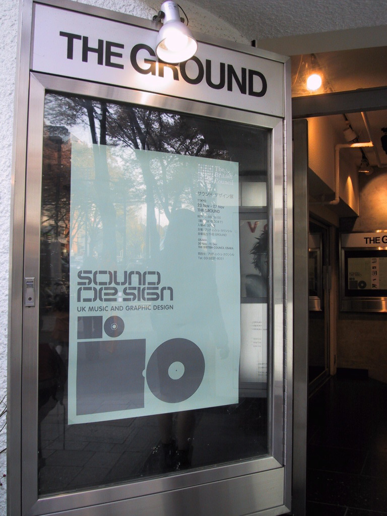
This is the poster, in situ, displayed at the entrance to the Tokyo venue, The Ground. Instead of installing the exhibition at the British Council headquarters, it opened in this concrete-lined bunker (not the easiest place to hang a show) close to the epicentre of Japanese trendiness (between Harajuku and Meiji-Dori). However, in some correspondence The Spiral is named as venue, which would have been an even bigger deal! David’s brief called for an exhibition of UK music graphics; from the golden years of vinyl when British designers helped to invent the genre of “album sleeve art”, to recent annexation of the aesthetic high ground by indie labels and various subcultures. The aim was to come right up to date with examples of ingenious CD packaging.
Continue reading

signature

From the Archive (& now); a moment of manga

Manga is a popular choice for museum exhibitions and displays: with boundless variations in content and style, it’s accessible but (still) culturally exotic; it mixes scholarly research with contemporary collecting; and whether PG-rated or not, attracts a diverse audience of geeks and gawkers of all ages. Not for the first time, the British Museum gives over the high profile Room 3 (can’t miss it, first stop on the right) to a manga-moment with Manga now: three generations, which features new and specially commissioned work by Chiba Tetsuya, Hoshino Yukinobu and Nakamura Hikaru. I’ll pop in to inspect it next time I’m on the hallowed ground.

Manga now, three generations
The Asahi Shimbun Displays, Objects in Focus
British Museum
Great Russell Street, London WC1
www.britishmuseum.org
3 September to 15 November 2015

Screen Shot from the British Museum’s website; three manga artists

Screen Shot from the British Museum’s website; three manga artists

Previously the same gallery featured the stunning display, Manga, Professor Munakata’s British Museum adventure (5/11/09-3/1/10), by Hoshino Yukinobu. Jane Cheng reviewed that show on Eye, here: “The juxtaposition of hugely enlarged with minutely detailed asks visitors both to lean in closer and to step back”. Jane’s post features great images of the life-sized cut-outs in situ – like walking through a giant pop-up book — and she highlights the interactive nature of illustration exhibitions (something I recognised too at the V&A’s Memory Palace show, and featured in a conference paper, here). Loving a museum-based-mystery, especially one that showcases perfectly rendered images of museum objects (and hat’s off, what a tie-in, when’s the movie?), I ordered said graphic novel from the BM’s online shop having received a timely email reminding me of the publication on the same morning that the new show opened; now that’s what I call museum marketing. The online shop also tells customers, “Every purchase supports the Museum” (rather than Amazon).
Continue reading

signature

From the Archive; five curators interviewed

As a contributor to Design Week in its print form, I worked with Lynda Relph-Knight and her editorial team for fifteen years; she was the first editor to commission me as when I became a freelancer writre in 1994. Until recently it was possible to search the entire DW print run, via its website, and find “full text” of years and years of design journalism, so I could access my back catalogue of articles including a regular column. Not only was this a useful research tool (with a search box), but it also functioned as a (stop-gap) personal archive too. However, a recent website redesign has adopted a sub-Instagram interface that displays just a handful of results, which can neither be saved nor downloaded, and, mysteriously, DW has cut years off its age!

Scrabbling around at home, I found “some” (but not all) tear sheets of articles and this particular one seemed relevant to share. In early 1999 I interviewed five curators who were producing design exhibitions, and we talked about their current shows. To foreground the curators’ voices I edited our conversations into monologues (the interviews were taped). Each curator also discussed the nascent field of design curating, which was evidently flourishing. Design was in the air during the build-up to the opening of the Millennium Dome (big party 31/12/99, cue Prince); the press was full of stories about architects and designers as controversy surrounded the various exhibits planned for the Dome. Stephen Bayley, ex-Design Museum Director, had been in charge but by the end of 1997 he was ex-Millennium Dome too; he resigned. See Chapter 6 on the Dome, in The Trojan Horse: The Growth of Commercial Sponsorship by Deborah Philips and Garry Whannel (Bloomsbury, 2013).

At the time the prospect of a “Millennium Bug” melting down our PCs was freaking people out but the world was still on the cusp of digital connectivity; the Internet was dial-up and mass adoption of websites by business and government was still to come. So this design-curating activity and these exhibitions remain under-documented online – just try searching for them. When I’ve found “traces” I’ve added links, but it appears that some of the exhibitions have nudged off “past projects” pages (if the curators have a website). I’ve also included links to information on individuals to show their subsequent career paths. The catalogue cover images are from my own copies.

“Display cases”
by Liz Farrelly
Design Week
26 March 1999, pp.41-48

Standfirst: Five curators describe, in their own words, their experiences and the highs and lows of managing and producing an exhibition. Liz Farrelly acts as custodian.
Continue reading

signature

Johnny Hardstaff imagines the future; interview

Michael Fassbender in David Promo, by Johnny Hardstaff (RSA Films)

Michael Fassbender in David Promo, by Johnny Hardstaff (RSA Films)

Johnny Hardstaff and Liz Farrelly
Interview, 13 December 2013

A shorter version of this article appears in étapes 218, translated into French; the issue is themed, Fiction and Anticipation, published March 2014.

A director and designer who includes the title “modern storyteller” in his biography, Johnny Hardstaff studied Graphic Design at St. Martins School of Art (now called Central Saint Martins College of Art and Design), graduating in the early 1990s and going on to teach design and illustration at Camberwell College of Arts (both are part of University of the Arts London). Hardstaff’s exploration of graphic imagery and use of drawing within his practice are prompted by a desire to build fantastical but believable on-screen worlds; two early short films, “History of Gaming” and “Future of Gaming” suggest that the concepts of utopia and dystopia are inextricably linked. Whether working with commercial clients (Sony, Smirnoff) the entertainment industry (often in collaboration with filmmaker, Ridley Scott) or cultural institutions (Tate, Victoria and Albert Museum), Hardstaff aims to imagine the future.

Liz Farrelly: How do you imagine the graphic language of the future? Do you see other designers trying this too?
Johnny Hardstaff: I used to think that I worked in a cultural vacuum and it was a positive thing. I was adhering to the principle that you don’t have heroes, don’t look at other designers’ work. Instead, you look at interesting triggers and stimuli that are erratic, and fuse them together in a postmodern way. When I try to help students to be original, I say, take two things that do not belong together and see what happens when they implode.
LF: Like the quote by the 19th-century poet, Lautréamont: “As beautiful as the chance meeting on a dissecting-table of a sewing-machine and an umbrella”.
JH: That’s absolutely the principle. I love thumbnails of things that you can’t quite see, images that are so broken you don’t know what they are, so you have to decide what they are.
LF: Like an inkblot test; by deciding what an image is, you are interpreting those half-formed marks, and that comes straight out of your head.
JH: And it’s a trigger. I like industrial languages and detailing on cars, things that already exist, but then you mess with them. They already have cultural resonance, but you remake it. It comes down to monsters; I like the idea of weird cultural monstrosities.
Continue reading

signature