Conference Paper; The Contentious Constance Spry, or, ‘Not in My Museum!‘

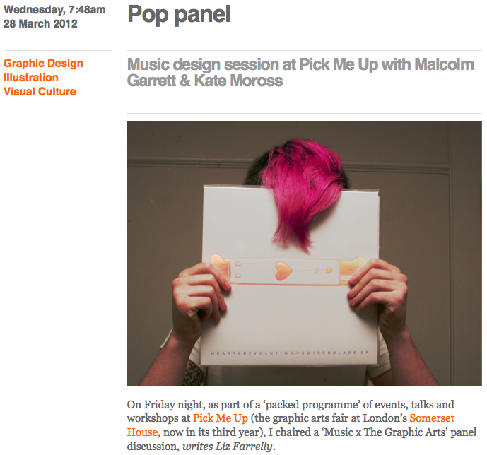
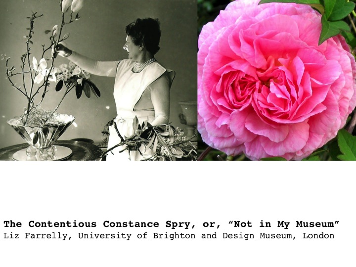
I’m taking some time this summer to document activities over the last few years, including occasional academic papers delivered at conferences and workshops. Images are from PowerPoint presentations and include quotes projected so as the audience can read along with references in the text. This paper was delivered “live”, and although it’s been re-edited for the page, I decided not to include footnotes or formal citations; all documents referred to are in the Design Museum archive, which is being catalogued, and mentioned texts are listed at end. This is a work-in-progress relating to my doctoral thesis, so if it feels truncated that’s because I’m using this blog as an “ideas store”, with the intention of expanding and deepening my arguments in the thesis.

Curating Popular Art
Whitechapel Gallery
77-82 Whitechapel High Street, London E1
14 June 2013

Organised with the University of Brighton Design Archives; a study day to accompany the exhibition
Black Eyes and Lemonade: Curating Popular Art
9 March to 1 September 2013

Slide01

As the recipient of an AHRC Collaborative Doctorate Award, pairing the University of Brighton with London’s Design Museum, I’m looking at how definitions of design are produced and evolved within museums.

Good Victorian that he was, Henry Cole’s aim as founder of what is now the Victoria and Albert Museum, was to create an institution that informed manufacturers, workers and the public about the benefits of “good design”, so as to encourage the production, consumption and export of well-designed and efficiently-made “everyday” products, which would reinvigorate British industry. Jump to 1917, and Hubert Llewellyn Smith, Head of the Board of Trade and an early advocate for design education and design promotion suggested that a new museum of industrial design would help this cause. (The Board of Trade went on to set up the Council of Industrial Design, later the Design Council, and administrated the Victoria and Albert Museum up until the early 1980s). Such rhetoric around design promotes a series of promises; that “good design” will facilitate economic development, cultural innovation and social improvement. This discourse of design promotion has been central to the growth of institutions dedicated to the collection and display of designed objects. I’d suggest that now there is a more pressing need to present a truly comprehensive vision of the role and benefits of design; instead of “good design” might we consider “design for good”? But are design museums still fixating on Cole’s vision? Promoting individual designers and showcasing “the best” products of the year may fulfil the aims of a design museum, but explaining the design process and its multifarious activities and outcomes – showing design to be a tool for engagement and change – would more closely demonstrate “what design is now”. So, when it comes to design in museums, we are on the cusp of change.
Continue reading

signature

From the Archive; Pop Panel at Pick Me Up (version three)

Pick Me Up: Contemporary Graphic Arts Fair
Somerset House, London WC1
24 April to 5 May 2014
Review of Music x The Graphic Arts panel discussion at Pick Me Up 2012
23 March 2012

Over the years at Pick Me Up, the importance of getting visitors involved in workshops and events has become more and more central to the whole project. By Pick Me Up 2010, Somerset House Curator, Sarah Mann, had responsibility for programming the vast and varied offering, from academic conference to kid’s weekend. She invited me to co-organise and chair a panel discussion examining the role of Illustration and Graphic Design in the music industry, tackling such issues as how the packaging and branding of music and bands has changed as digital delivery rocks the edifice of corporate control and a DIY spirit emerges. The speakers brought a range of expertise to the discussion, drawing on their experience working with music, from the late-1970s to now. The review below first appeared on Eye Blog.

Screen shot 2014-05-02 at 08.18.09

Wednesday 7:48am, 28 March 2012
Pop panel
Originally published on Eye Blog

Music design session at Pick Me Up with Malcolm Garrett & Kate Moross

On Friday night, as part of a “packed programme” of events, talks and workshops at Pick Me Up (the graphic arts fair at London’s Somerset House, now in its third year), I chaired a “Music x The Graphic Arts” panel discussion. Since the digital revolution of the 1980s, the music industry has undergone radical changes in formats, distribution, style and substance.

The panel: designer Malcolm Garrett (Buzzcocks, Duran Duran); critic (and Varoom editor) John O’Reilly; the prolific Kate Moross; and Tom Oldham (label boss at No Pain in Pop and Berserker, an online music/comics magazine).

Malcolm kicked off with his schoolboy Hawkwind obsession, which led him to Barney Bubbles. Highlighting the polarised nature of Britain’s tribal counter-cultures in the 1960s and 70s (naming IT and Oz magazines as “the birth of blogging”), he suggested that with Punk, “it all changed”. Later, in the 1980s, the zeitgeist was celebratory; the music industry sold lifestyles, with video and “merch” paramount, and the first sponsored tour was by Duran Duran, brought to you by Coca-Cola.
Continue reading

signature

Guest blogger; revisiting Pick Me Up (version one)

Pick Me Up: Contemporary Graphic Arts Fair
Somerset House, London WC1
24 April to 5 May 2014

Five years in and Pick Me Up is now a headline event in London’s creative calendar; undoubtedly it’s evolved and mutated, and much discussion has been generated about how it reflects and influences the graphic arts in London, the UK and beyond. But more of that later, when I visit this year’s PMU. Also, watch this space for an archival re-post of a PMU debate that I chaired in 2012, here.

Meanwhile, here’s guest blogger John O’Reilly, editor of Varoom, the magazine of the Association of Illustrators, with a long-form review of the very first Pick Me Up, back in 2010. I commissioned this for étapes magazine; it was published in “issue zero”, an experimental, white-cover experiment intended to rehearse the redesign/relaunch in the form of a quarterly “bookazine”. John explored the widest implications of PMU, as an expression of zeitgeist and as a reinvention of the exhibition/artfair.

Nobrow’s nook, Pick Me Up, 2010

Nobrow’s nook, Pick Me Up, 2010

Peepshow Collective’s DIY installation, Pick Me Up, 2010

Peepshow Collective’s DIY installation, Pick Me Up, 2010

Photography: © Sylvain Deleu
Courtesy: Somerset House

Review of Pick Me Up 2010 by John O’Reilly
23 April to 3 May 2010

Two exhibitions bookend transition moments in recent British visual culture. Back in the late 1980s a young art student took over an empty building in London’s docklands and put on an exhibition that would shape the Art World over the next two decades. Born in a recession, Damien Hirst’s show, “Freeze”, introduced the general public to a type of brash, spectacular art, and over time these Young British Artists (YBAs) combined the two-fingered, anti-establishment sensibility of their roots with a growing awareness of big-budget, Art World thrills. It evolved into brash, boom-time art, and whereas artist Robert Patterson described the YBA tag as “a kind of licence to show tits and arse more than anything”, with this second exhibition, the invitation implied in the informality of “Pick Me Up”, of a cultural cheap date, is ideologically, temperamentally and aesthetically very different.
Continue reading

signature

Conference; Drawing the Future

4th International Illustration Symposium
Oxford University Museum of Natural History (OUMNH)
Parks Road, Oxford
7-8 November 2013

At this symposium, not only did I hear Johnny Hardstaff deliver a keynote address, which prompted me to request an interview (we talked about imagining a graphic language of the future), but I also delivered a paper. Here’s a summary, and some slides.

Drawing the Future: Exhibiting Illustration

In the Spring semester I deliver a series of lectures on the “future” to Graphic Design and Illustration students (Level 5/2nd Year) at University of Brighton, and start with a couple of definitions so as to debunk such notions as, the future isn’t really anything to do with us right now, and, it’s all just science-fiction anyway.

“The ‘Future’ is everything that happens from [beat] now (…as they say in the movies…)” …is my playful opener; then I hit them with Tony Fry’s definition (from Design Futuring: sustainability, ethics and new practice, 2009); “The future is not presented here as an objective reality independent of our existence, but rather, and anthropocentrically, as what divides ‘now’ from our finitude. In other words, we exist in the medium of time as finite beings (individually and as a species) in a finite world; how long we now exist — the event of our being — is determined by either an unexpected cataclysmic event (like our plant being hit by a massive meteorite) or by our finding ways to curb our currently auto-destructive, world-destroying nature and conduct.”
…and that’s how I began this talk too.

I set out to show that perhaps by way of a heightened familiarity with drawn and animated futures peopled with cute and cuddly characters, used to entertain and promote (everything from breakfast cereals to banking services), a more positive, friendly, utopian version of the future is being proliferated. In comparison, the “scary”, sci-fi, dystopia future of apocalyptic blockbuster movies seems worn out; not so much because we can “see the wires”, but because we’ve developed “explosion fatigue”; such gargantuan, special-effects-driven destruction just doesn’t “feel real” anymore.
Continue reading

signature

Johnny Hardstaff imagines the future; interview

Michael Fassbender in David Promo, by Johnny Hardstaff (RSA Films)

Michael Fassbender in David Promo, by Johnny Hardstaff (RSA Films)

Johnny Hardstaff and Liz Farrelly
Interview, 13 December 2013

A shorter version of this article appears in étapes 218, translated into French; the issue is themed, Fiction and Anticipation, published March 2014.

A director and designer who includes the title “modern storyteller” in his biography, Johnny Hardstaff studied Graphic Design at St. Martins School of Art (now called Central Saint Martins College of Art and Design), graduating in the early 1990s and going on to teach design and illustration at Camberwell College of Arts (both are part of University of the Arts London). Hardstaff’s exploration of graphic imagery and use of drawing within his practice are prompted by a desire to build fantastical but believable on-screen worlds; two early short films, “History of Gaming” and “Future of Gaming” suggest that the concepts of utopia and dystopia are inextricably linked. Whether working with commercial clients (Sony, Smirnoff) the entertainment industry (often in collaboration with filmmaker, Ridley Scott) or cultural institutions (Tate, Victoria and Albert Museum), Hardstaff aims to imagine the future.

Liz Farrelly: How do you imagine the graphic language of the future? Do you see other designers trying this too?
Johnny Hardstaff: I used to think that I worked in a cultural vacuum and it was a positive thing. I was adhering to the principle that you don’t have heroes, don’t look at other designers’ work. Instead, you look at interesting triggers and stimuli that are erratic, and fuse them together in a postmodern way. When I try to help students to be original, I say, take two things that do not belong together and see what happens when they implode.
LF: Like the quote by the 19th-century poet, Lautréamont: “As beautiful as the chance meeting on a dissecting-table of a sewing-machine and an umbrella”.
JH: That’s absolutely the principle. I love thumbnails of things that you can’t quite see, images that are so broken you don’t know what they are, so you have to decide what they are.
LF: Like an inkblot test; by deciding what an image is, you are interpreting those half-formed marks, and that comes straight out of your head.
JH: And it’s a trigger. I like industrial languages and detailing on cars, things that already exist, but then you mess with them. They already have cultural resonance, but you remake it. It comes down to monsters; I like the idea of weird cultural monstrosities.
Continue reading

signature

Guest blogger; assessing Peter Saville, legend

Peter Saville Blueprint spread

Interview, 13 September 2013
Published, Blueprint, issue 331, 10 December 2013
Interview: graphic design legend Peter Saville talks to Liz Farrelly
Further contribution by Paul West, Form

For as long as this interview is available on the Design/Curial website, I’ll redirect you there; after that, I’ll repost it. It was a pleasure to be commissioned by Blueprint again after a few year’s hiatus. I worked in house from 1990 to 1994 beginning as Editorial Assistant, and writing from day one; I reached the heady heights of Deputy Editor, then freelanced under every editor until about 2006. Being asked to interview Peter Saville was the bonus; this is the third time I’ve had the opportunity to conduct a long interview with Peter, as well as having a few good chats along the way. He’s a great talker and it shows in the two and half hour transcript! Peter was to be honoured with the London Design Festival’s major award, which prompted the coverage. The award spiel mentions the winner’s contribution to design in London, and I realised that Peter’s amazing affect was as an inspirtion to and an incurbator of a considerable amount of graphic design talent that has gone on to make London the most important city in the world for graphic design. So, I asked around, and got a bunch of people to talk about their favourite work by Peter. Paul West had worked for Peter, and so I’m posting his contribution here as I couldn’t get it to the magazine by the deadline. Thank you Paul for adding such a great further contribution to the story.

Paul West: Where to start with Peter’s output. Who can’t love FAC1; the “Unknown Pleasures” pulsar; the “Closer” tomb, photographed by Bernard Pierre Wolff with the beautiful Lapidary typography; the “Blue Monday” floppy disc, his Section 25 work — the list is endless. To even go on more is redundant, so well catalogued is his work (alongside designers including Martyn Atkins, Brett Wickens, Richard Smith to name but three) that it’s entrenched in our popular counter-culture, in turn influencing culture.

True Faith

If I could name ONE piece of work I have loved above all other it is the fabulous “True Faith” 12″. This beautiful gold leaf suspended or floating on Yves Klein’s “International Klein Blue” backdrop, with the absolute minimum of information on the back cover (Name — Title / bside — Copyright — the all important Fac183 catalogue number — pre barcode!) and the way it fused art, hi-tech, independent couture, anti-couture; it feels as new now as it did then.

In 1987 I wrote my college thesis on Peter Saville Associates and Vaughan Oliver (V-23) and as a result I got through the doors and worked at PSA ’88 to ’89. I remember asking Peter about this cover and I him saying that the expanse of white on the back sleeve made the front sleeve look like an art piece, with the back cover serving as the catalogue descriptor. I loved that. It was so Warhol.

Of course so much of Peter’s great “visual” work is thanks to the genius of Trevor Key who had a studio space next door. I remember watching the exploratory work Peter and Trevor were doing for “Fine Time” and “Technique” and thinking how great it was, to be so progressive with such a spirit of discovery and invention, it was incredibly inspirational for a 20-something graduate. One day I was in Trevor’s studio talking to him about his work and looking through a massive pile of old test polaroids (including, X-Ray Spex “Germ Free Adolescents”) and I saw THE polaroid of “True Faith”. l had to ask. “Can I have it?”. “Piss off” came the reply. #legend.

From guest blogger, Paul West, Form

signature

Club to Catwalk, legacy or nostalgia?

Club to Catwalk poster

Club to Catwalk: London Fashion in the 1980s
Victoria and Albert Museum, London
10 July 2013 to 16 February 2014
Visited 18 August and 20 September 2013

This long running exhibition was hotly anticipated, but it was not without its flaws, which became more obvious, as I made two extended visits to the show, and thanks to my V&A Membership Card, countless quick pop-ins. Each visit brought more to my attention, and also made me wish for more…like a kid in a candy shop. I lived through this time and as a young Londoner was a regular at a wide range of night clubs from the rockabilly Gaz’s Rocking Blues to the proto-rave of Delirium (I even worked at The Wag). I also shopped like it was going out of style (of course, it wasn’t) and owned garments by many of the featured designers, picked up in their tiny Covent Garden shops, at Kensington Market on a Saturday and Camden on a Sunday, at Jones and Browns, and up and down the Kings Road. Most of those treasures are long gone as I gave piles of clothes away before going on a long trip in the late 1990s, and sold some of the choicer pieces. There are just a few frocks still carefully preserved… One of my students asked me what from my early 20s (her age) am I nostalgic about, and mostly it is these garments, as I try to recall particular outfits and what I might have looked like. Back then we didn’t walk around with camera phones and there are so few photos of those nights out.

About the show…
Continue reading

signature

From the Archive; Raymond Pettibon in London

Having just discovered Raymond Pettibon on Twitter (am marvelling at his word games, but can’t decipher them), I thought I’d repost this exhibition review, written for Eye Blog.

Eye Blog Pettibon

Sadie Coles HQ
69 South Audley Street, London W1
3 October to 17 November 2012
Visited 5 October 2012

Thursday 5:00am, 11 October 2012
“Don’t explain”
by Liz Farrelly
Originally posted on Eye Blog

@the artist; Courtesy Sadie Coles HQ, London

@the artist; Courtesy Sadie Coles HQ, London

Raymond Pettibon straddles the high / low culture divide, adding his seductive scrawl to the white cube of a London gallery

Raymond Pettibon’s latest series of drawings investigates recurrent themes around American pop culture, film noir and baseball, and are currently on show at Sadie Coles HQ. This mid-sized, commercial gallery, a two-floor white cube, was well populated for a rainy Friday afternoon – it is a treat to see these drawings (loosely termed) in the flesh.
Continue reading

signature