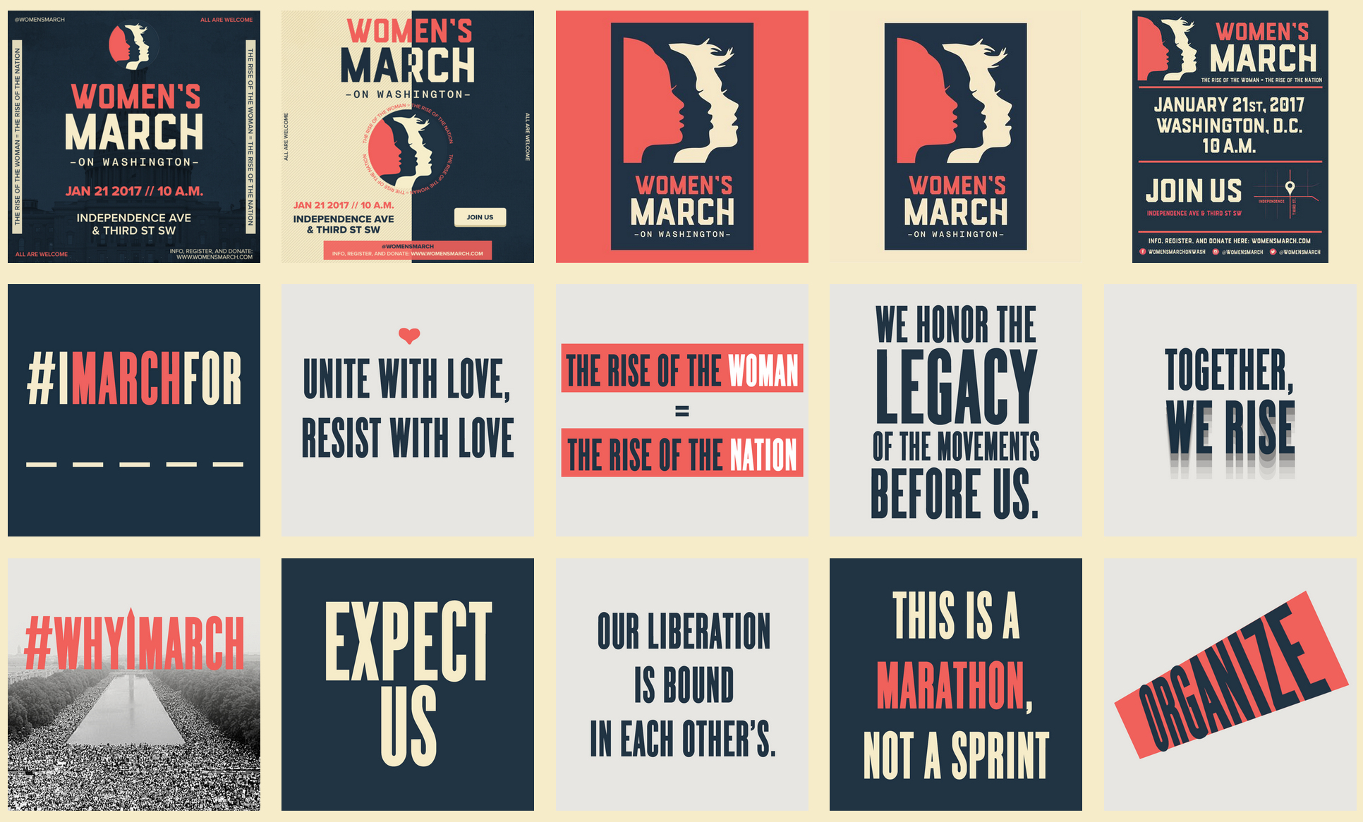
Screen Shot from Women’s March on Washington webpage of downloadable graphics.
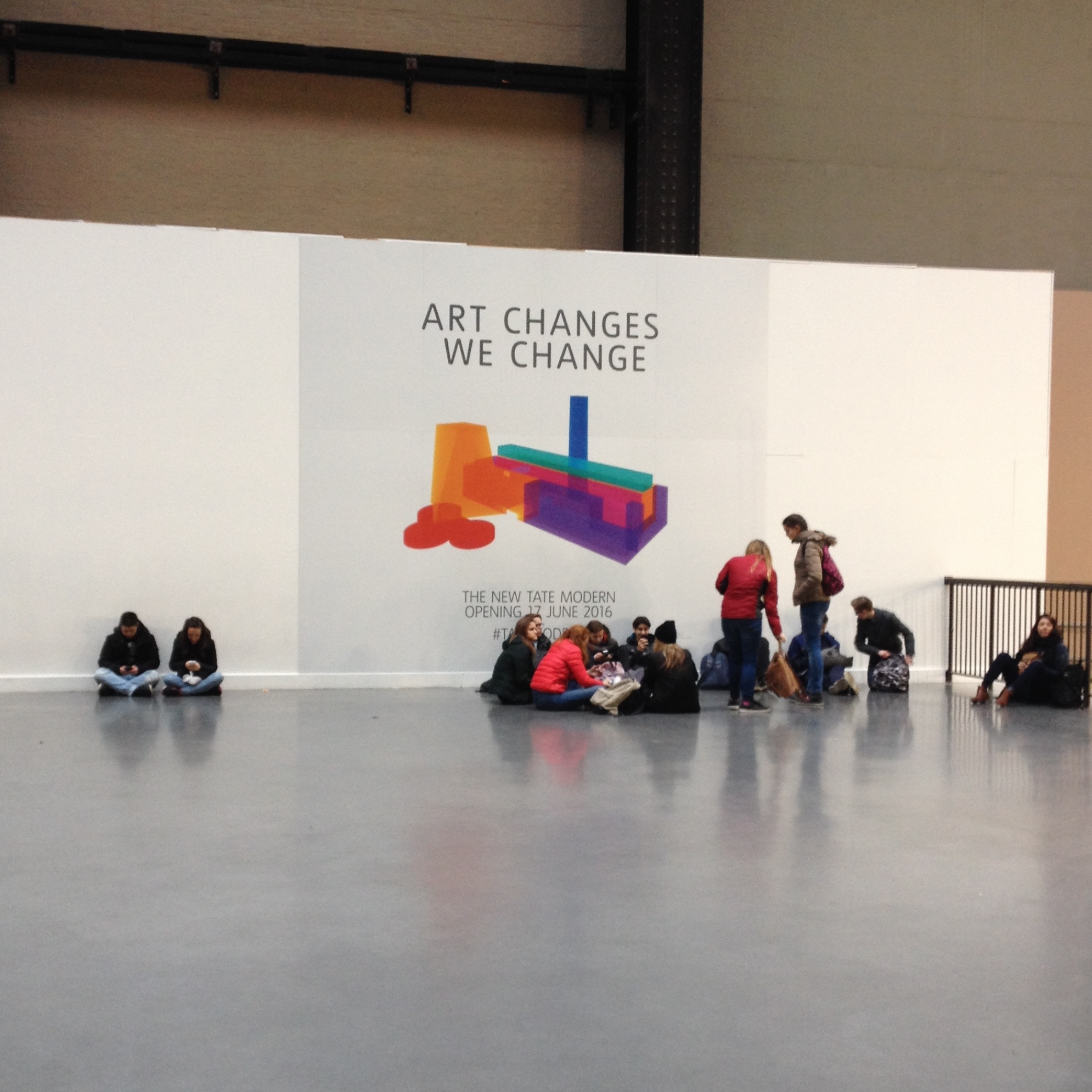
Last weekend women the world over took to the streets to protest, making themselves visible and their voices heard, as they waved an array of protest signs. Hand-made, humorous, strident and strong, the signs were seen in Instagram feeds, shared via Twitter, broadcast on television and pictured in newspapers. The importance of graphic design to protest cannot be over stressed; multiples of engaging graphics will communicate and amplify your message. To that end the Women’s March on Washington website contains a page of downloadable graphics offering slogans and images to be used for free as posters, placards, t-shirt graphics, wherever and however.
That vision of graphic protest was anticipated in a recent a seminar text read with Level 4 Graphic Design and Illustration students at University of Brighton. Teal Trigg’s chapter on “Graphic Design” in Feminist Visual Culture (edited by Fiona Carson and Claire Pajaczkowska) contained a quote from Eye magazine about the activist group she co-founded: “They [WD+RU] aim to talk to women in all walks of life, but the first step is to initiate a debate that will politicise designers and prompt them to address gender issues through their work’ (p.157).
Continue reading