As a contributor to Design Week in its print form, I worked with Lynda Relph-Knight and her editorial team for fifteen years; she was the first editor to commission me as when I became a freelancer writre in 1994. Until recently it was possible to search the entire DW print run, via its website, and find “full text” of years and years of design journalism, so I could access my back catalogue of articles including a regular column. Not only was this a useful research tool (with a search box), but it also functioned as a (stop-gap) personal archive too. However, a recent website redesign has adopted a sub-Instagram interface that displays just a handful of results, which can neither be saved nor downloaded, and, mysteriously, DW has cut years off its age!
Scrabbling around at home, I found “some” (but not all) tear sheets of articles and this particular one seemed relevant to share. In early 1999 I interviewed five curators who were producing design exhibitions, and we talked about their current shows. To foreground the curators’ voices I edited our conversations into monologues (the interviews were taped). Each curator also discussed the nascent field of design curating, which was evidently flourishing. Design was in the air during the build-up to the opening of the Millennium Dome (big party 31/12/99, cue Prince); the press was full of stories about architects and designers as controversy surrounded the various exhibits planned for the Dome. Stephen Bayley, ex-Design Museum Director, had been in charge but by the end of 1997 he was ex-Millennium Dome too; he resigned. See Chapter 6 on the Dome, in The Trojan Horse: The Growth of Commercial Sponsorship by Deborah Philips and Garry Whannel (Bloomsbury, 2013).
At the time the prospect of a “Millennium Bug” melting down our PCs was freaking people out but the world was still on the cusp of digital connectivity; the Internet was dial-up and mass adoption of websites by business and government was still to come. So this design-curating activity and these exhibitions remain under-documented online – just try searching for them. When I’ve found “traces” I’ve added links, but it appears that some of the exhibitions have nudged off “past projects” pages (if the curators have a website). I’ve also included links to information on individuals to show their subsequent career paths. The catalogue cover images are from my own copies.
“Display cases”
by Liz Farrelly
Design Week
26 March 1999, pp.41-48
Standfirst: Five curators describe, in their own words, their experiences and the highs and lows of managing and producing an exhibition. Liz Farrelly acts as custodian.
Exhibition catalogue designed by Graphic Thought Facility.
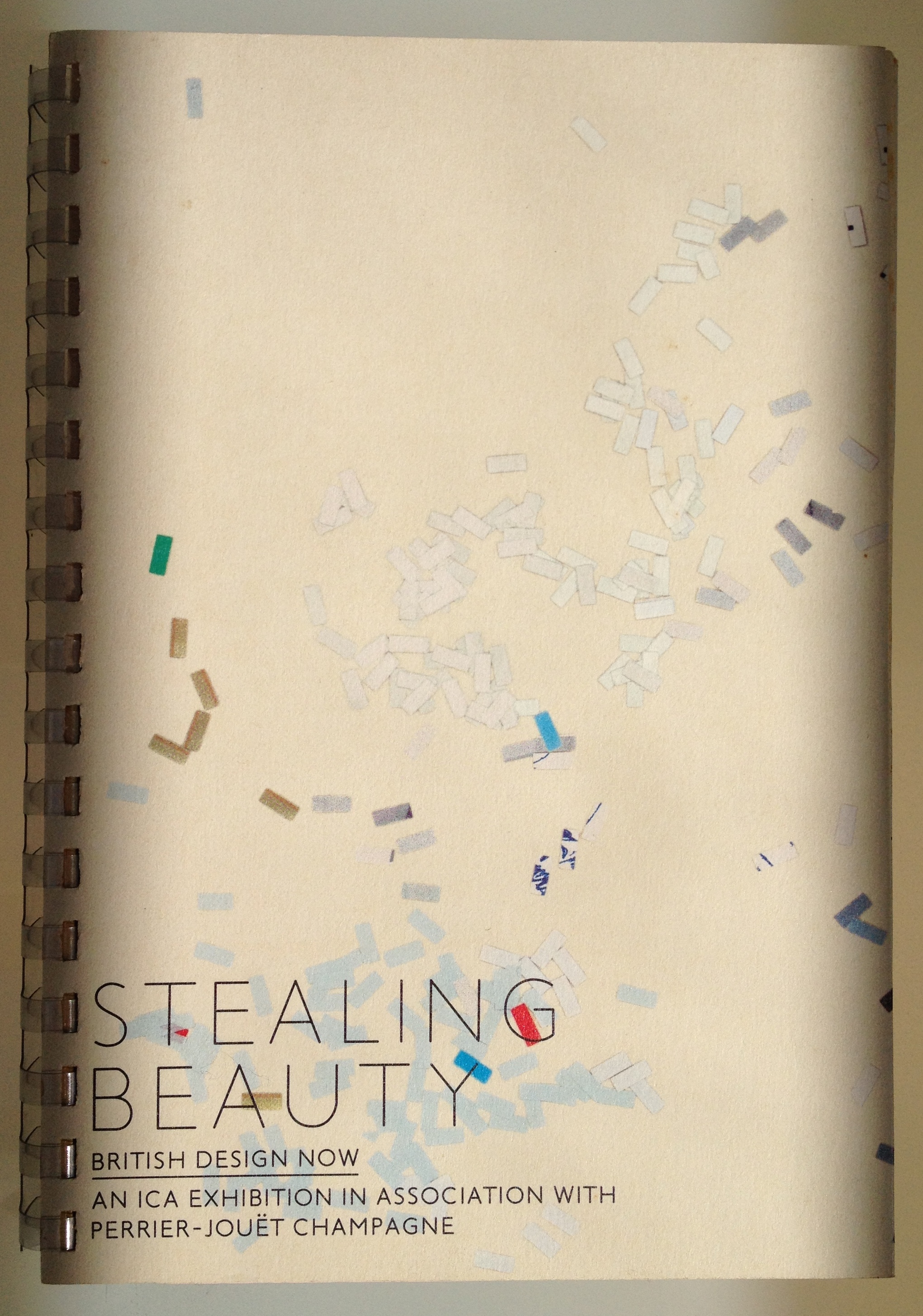
Claire Catterall on Stealing Beauty
“I’ve got an exhibition opening at the ICA, Stealing Beauty, and although it’s a heart-felt one, I have had to compromise because I don’t think anyone, apart from the people working on it, understands it. Michael Horsham wrote an essay; Graphic Thought Facility is designing the graphics and catalogue; and Urban Salon isn’t so much designing the show, because it’s such a small budget, as making sure all the exhibits get installed. But I’ve had much worse experiences.
The ICA is being great. The problem isn’t that the people there don’t know what a design exhibition is, rather they’re just anxious that it is a design exhibition. I remember reading an article where ICA Director, Philip Dodd, said he wanted to be promiscuous with art, and do architecture and design shows, so the motives are good. But there’s nowhere else doing good design exhibitions, and that’s because design isn’t treated seriously.
Design is becoming more like art. That’s because of the designers and their motivations. The boundaries are blurring, but designers want their work to be used by people and are more inclusive. So, I think design is ultimately more exciting. I’ve got real problems with design historians who are more interested in being academics and don’t have any passion for design itself…But I’m hoping Stealing Beauty will spark a renaissance of design shows which provide a platform for debate.
Stealing Beauty is about using the ordinary and the everyday as a palette from which to draw on, but not through direct lifts or recycling. And the stuff is beautiful. The way the exhibition happened is a long story. Back at the end of 1997, the visual arts department at the British Council asked me to curate an exhibition of new stuff. But along the way it lost confidence and asked four independent advisers to look at the project. They didn’t know the exhibitors and said it wasn’t encompassing enough. I had done the groundwork, and by that stage the ICA had got involved as an adviser, and it wanted the exhibition. So Stealing Beauty is a very unusual show. Normally, you get a brief, and you give the client back your idea, which is what happened with the Department of Trade and Industry’s powerhouse::uk show. But this exhibition came from me rather than being a response to any client. I briefed the exhibition and graphic designers, they totally understand the concept and we’re a team.
Budget-wise we didn’t get any sponsorship until last December (1998) and the opening date is 3 April (1999). There was £20,000 to pay for everything, so I really had to focus down the list of exhibitors. The ICA is letting us – myself, Urban Salon and GTF – tell it how to spend the money! Because I’d already curated the content, knew who would be in it, and how much work the design teams had to do, I gave them decent fees out of that amount. Basically, I think I’m an outsider, an observer, but I’m really interested in what other people do. I also have a network of friends who let me know what’s going on and send me interesting people and work. And I love shops.”
Clare Cumberlidge on True Stories
“I did a Museums postgraduate course at Manchester University, which was vocational and very rigorous. In the design world there’s a lack of awareness about what curation is, and an assumption that if somebody knows their subject they can do an exhibition.
These days, organisations like the British Council and the Department of Trade and Industry are going straight to design groups and expecting them to find curators, whereas previously they’d have gone to a curator for an idea. I think that because of my curatorial experience and because the team at Ben Kelly Design works so well (I’ve been collaborating with it since the Science Museum basement project), we win the exhibitions that we pitch on.
For me, curating is about exploring ideas, either in conjunction with artists or a design team. After that exchange, the curator works out how to communicate those ideas. Design objects weren’t conceived to engage on a contemplative level, which is why you need to tell a story through various media which change the rhythm of the information on show. You have to be as clear about knowing your audience as about the subject you’re investigating. Because you have to manipulate how the audience engages with a show by way of the marketing, display and contextualizing information.
Working as part of a collaborative team, such as we had with True Stories, the curator was responsible for the overall vision, concept and content of the show and the design team was responsible for the environment. Originally, Ben Kelly Design was sent an all-encompassing brief by the British Council, to develop a touring exhibition as part of a year-long festival, UK98, to appeal to Japanese people, between the ages of 18 and 30 living outside Tokyo, whose idea of Britain was heritage-based. We had to update that view by communicating a vision of contemporary life.
I developed the concept of the show being “people to people”, by selecting seven young people from different locations around Britain, building in a balance of age, sex, career and ethnicity. Then I put the curatorial team together, adding a writer-researcher, Liz Farrelly [yes, me], and an exhibition organizer, Kate Fowle. It was a real strength that we worked as a team and contributed ideas to each others areas. The curators had to find the people and devise the format for the information we collected. We asked each individual, what would they show a young Japanese visitor about their life and hometown in 24 hours. The researcher went along with Richard Blurton, one of the design team, who shot the film and photography. Then we collected objects that related to those people’s lives. The curators looked at the objects from a design point of view, but also as a way of illustrating personalities.
I was responsible for the content of information (video, photography, questionnaires, interviews, local listings) and objects being produced on time and to budget. I see information as a commodity in an exhibition, just like objects are, and you can buy in information like you loan objects. You don’t need the curator to generate information when you can commission a researcher. But that’s what most people mistakenly think a curator does. I also fed that material to the graphic designers, Paul Khera and Maria Beddoes, who were designing the exhibition graphics which included a CD-ROM for each person’s module, and a website. The project manager, Richard Greenwood, had overall responsibility for the budget. You need a professional within the exhibition team to look after installation and shipping. It saves the design team a lot of time and energy and things run much more smoothly.
The exhibition got a fantastic reaction and loads of press. It also toured to Tokyo and attracted about 10,000 visitors per day. The British Council wrote us a letter saying they thought it was the best British Council-funded exhibition they’d ever seen. Because it worked so well True Stories has given us a blueprint for organizing exhibitions, and we’ve used a similar structure for an exhibition portraying London commissioned by the DTI for Korea.”
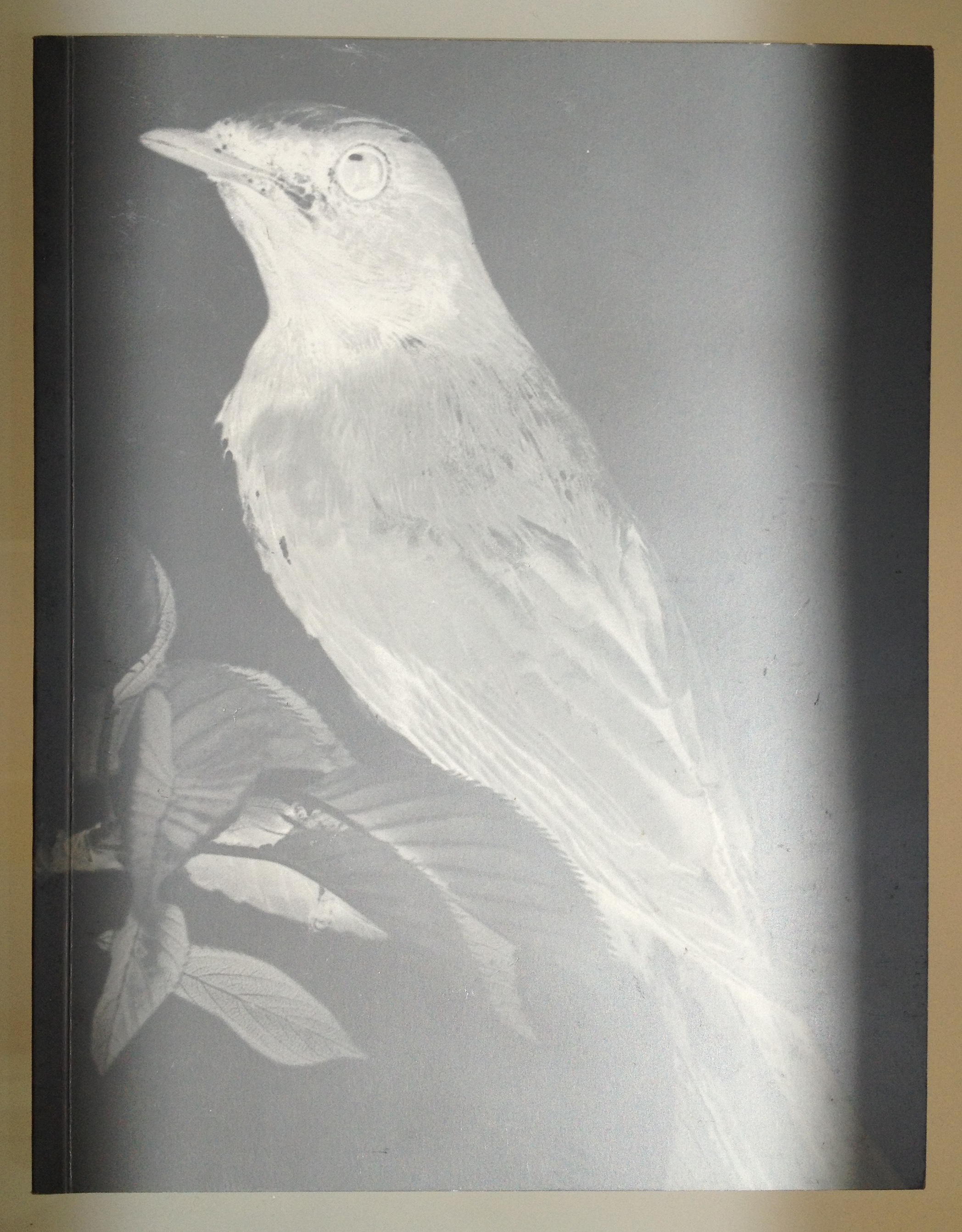
Exhibition catalogue designed by Angus Hyland, Pentagram.
Louise Taylor on No Picnic
“Before coming to the Crafts Council in 1996, I worked for five years with Craftspace Touring, an independent organization based in Birmingham. I learnt to create a programme of shows, to get new work seen, about audience development and helping that audience understand craft and design. And that’s also a starting point at the Crafts Council; our remit is constantly developing but as Director of Exhibitions and Collections I’ve been fortunate enough to work without interference in terms of the organization of my programme. In putting on exhibitions there are areas where you need a real specialist. But I find that in relation to issues of understanding, which can take an entire programme to a new level, then, as artistic director, it’s up to me to see what needs doing. So I might commission a curator or set up a new way of working as a co-curator.
In an institution, if you only ever commission projects from outside curators, there’s no heart to the programme. So I’m trying to give it some coherence as well as bringing in different perspectives. In the past there’s been a really small network of independent curators who are specialists in crafts, but I think because the world is changing we need more approaches. After an intense period of programme planning back in 1997, which included bringing together a 20-strong exhibitions advisory group, a new sense of direction emerged. Tord Boontje, a project designer/maker, was in the group and we kept exchanging ideas and came up with No Picnic. He’s passionate about extending people’s understanding, and his attitude helped to shake things up.
One of the key issues of No Picnic was about practitioners starting businesses in order to make things for use, which are more available than art pieces. So the idea was to show the networks these people operate within, to ask when is a product commercial or not, and why put ideas into objects…is craft just a commodity or does it have more to it? And how do these makers define themselves?
A big issue for me in this field is that so much interesting work is hardly ever seen. I just can’t find it in magazines. That was another reason for No Picnic. Objects appear in shops, but rarely do you see them in a gallery space, which is more provocative. We did a massive amount of research. Kate Day from Manchester City Art Gallery worked on a placement. We phoned around, talked to Regional Arts Boards, other curators, and did lots of studio visits. We brought in jeweller, Christoph Zellweger, as a co-selector. He’s been involved in shows in Europe and had a broader perspective. I prefer to work with a team. You can quickly cover ground in new territory, it keeps things fresh and builds links between insiders and outsiders. In some instances it takes more effort, because those new curators need guidance.
The design elements of that team often relate to the initial vision you have for a show. It’s fascinating to work with a designer who comes with an idea of the exhibition, and extends it into their own work, but can also give you what you need in terms of presentation. With David Adjaye and William Russell, who designed No Picnic, you could see how the idea touched a nerve in another discipline, in a completely new way. They knew exactly what I was talking about. Similarly, Angus Hyland at Pentagram Design, who designs our printed publicity, did a great job on the catalogue.
We bring new people into the field of exhibition design, and their first show will be a massive learning curve. Then you see their working methods develop. But we also work with very experienced designers, and that choice takes its cue from the nature of the exhibition. The point is to be balanced. While there are margins, there’s also the mainstream, and we can do a lot in representing and picking out ideas from familiar work. The Crafts Council gallery also has the structure behind it that can take the risk out of showing emerging work. Ultimately, I’m happy if the expertise that I offer to a co-curating situation is knowing about exhibitions.”
Sue Andrew on Winning
“My background is in Fine Art, but I did a post-graduate degree in Arts Management. Most people don’t know what curating, the “c-word” as it’s been called, is all about. The Oxford Dictionary definition – a keeper or custodian – does not bear much resemblance to what I do, and the museum I worked in for ten years, the Design Museum, wasn’t about caring for a collection.
Now museums are more interested in being experiences. Most commissioning clients want a one-stop show, a design and curation package because managing disparate elements becomes an organizational nightmare. For the Glasgow 1999 exhibition on sport, Winning, I was one element of a team that included Ron Arad Associates in London and Javier Mariscal, who designed the graphics, from Barcelona.
Glasgow 1999 Director, Deyan Sudjic, Nicole Bellamy (Exhibitions Director) and their team wanted a series of exhibitions to attract new audiences, which they called Design for the Real World. Sudjic knew I’d been involved in the Sport 90 show at the Design Museum so he asked me what I thought about a sport and design exhibition, and I said, good one for bums on seats. Then we ran a competition to find a designer and Arad’s approach just stood out. He said it won’t be the sort of exhibition design that fades into the background. So it’s the antithesis of displaying objects in showcases. These huge white spheres literally inhabit the classically proportioned rooms (in the McLellan Galleries), as if they’ve just bounced in from the set of “The Prisoner”. Nothing touches the walls, it’s an exhibition that’s been beamed down, and in a very difficult space. I think it works.
I broke the exhibition into eight themes. It’s not chronological, more like slices of stuff. The sections are; Why Sport, Why Now, Hard Sell, which is about sport and advertising and was projected onto an Inflate inflatable. Then there’s a section called Survival of the Fittest, with Chris Bonnington collating the equipment he uses for an expedition. Another section is called, On Your Own, which is about equipment and the individual. The next is, It’s Only a Game, about equipment for team-based sports. Another called Footprints features footwear. Speed, shows a Formula One car, a racing dingy and a bicycle. And Play Safe, is about protection. There’s over 400 exhibits and we had a year to get it together.
On this project no one was wholly responsible for any part of it, because it was a team effort. Like on a film, you can’t separate one element from the other. What irritates me as a curator is the lack of understanding on the part of reviewers of how a team works. I wanted the exhibition to be an experience and an installation, and that’s why I was keen to work with a designer like Ron Arad. Working in a team you look to the qualities of your collaborators, and in this case those qualities helped make an incredible environment. Some things didn’t get resolved until we were on site because you can’t work out the juxtaposition of objects on a computer screen. It’s always a challenge to get architects and designers to take on board the needs of the exhibits. Numerous people I’ve worked with have said, that object doesn’t fit this space, so we can’t show it! And I’m saying it’s crucial to the narrative! You have to be prepared to be a cow, but at the end of the day it’s give and take.
With Winning we did leave things out, because, being a visual person I realize how important the look is. I’m not interested in taking an overly didactic approach, but one of the biggest problems I came across was convincing manufacturers to lend objects and tell us who had designed them. Most objects were designed in-house and that says a lot about the role of design in sport and secrecy. Some of the lenders didn’t even want to be in the same room as their.
I realized at the end of the creative process that Winning is, in fact, an old-fashioned exhibition, in that it encourages visitors to look.”
Michael Horsham on London <=> Tokyo
“Back in 1996, we were approached by the Ginza Art Space, which is run by the Corporate Culture division of Shiseido, to put together a retrospective on Tomato, but we thought that would be dull. So Simon Taylor, Jason Kedgley, Rick Smith, Karl Hyde and I came up with a fresh idea…that Tokyo is greater than, less than and equal to London, which can be drawn as a mathematical symbol: <=>. It implies a cross-fertilisation, with the symbol being us, and that was the title. So we built a room for people to visit which had no particular story to tell, no didactic purpose, where visitors could read, watch projections and listen to music. We did think that the idea, to equate two huge cities, may be impossible to realize in any meaningful way. But we came up with six themes that we thought were central to the urban experience: money, transit, communication, food, sex and religion.
Input came from all the individuals in that team. And there were some strong conversations about the form and content, particularly about whether we should include religion. The point was raised that you can’t simply represent religion in a film clip. We came to the conclusion that you understand the power of religion through gestures, which explain a set of circumstances, and they were like the signs you come across in an urban-scape. So, we went out in London and found exemplars of all those themes. For religion we filmed the vicar at St. James’s church. We filmed a sausage vendor in Oxford Street. For the transit segment we drove around a roundabout under the Westway, with a camera stuck out the window, to create a looped animation. We used a DVC camera to collate the images while Karl Hyde collected conversations in a notebook and on a tape machine. We were all involved in writing the text, most of which came from a dinner with some Japanese friends when we had a great night, and Karl taped that.
We filmed all sorts of stuff and then went to Tokyo to do the same. Our take on London was instinctual, and in Tokyo we had leads into the city. For example, we found a Buddhist monk through a painter called Yuri who lives in New York. He was her family priest. Going to his temple and seeing his devotions, meeting great people, for me that was a big part of why this project was so interesting and effecting.
Then we amalgamated everything in the installation. It was like tuning into a number of frequencies broadcasting images that described our approach to urban life. We chose elements, looped them, and put the Japanese loop next to the English one so a weird interaction was going on. Jason set the words and output the text as plastic letters, which we stuck onto plate-glass. We’d been publishing texts on windows in London, Prague, Paris, and had worked out an easy way of making something big and intriguing in a street. It’s cheap, but it’s publishing.
The budget was £5,000 for travel and £5,000 for production, so we pulled in a lot of favours. But when it came to doing the installation, we specified sand-blasted plate-glass and 12 miniature video projectors. The exhibition was on for a month and 13,000 people saw it, which is more than they’ve ever had for a show in that gallery. And they sent us the visitor books with responses, which were great, really honest. We’ve collated some of the comments and they’ll be in the next Tomato book. It’s like a poem by 13,000 people.
The whole project was really direct stimulus that took me to a completely alien city and culture and I learnt a lot through doing it. We couldn’t be precious about the exhibition; we didn’t have a chance to be. It wasn’t really curating…but, interestingly enough, we are now being approached by museums and galleries who want to tell sound-bite-ish stories. But the best exhibitions I’ve seen go much further, dealing with history rather than contemporary stuff…which is just like going shopping!”
