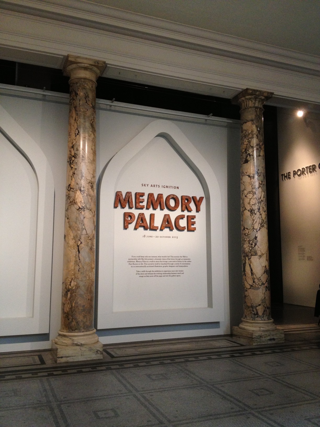
Entrance to “Memory Palace”, Porter Gallery, Victoria and Albert Museum.
Sky Arts Ignition: Memory Palace
Victoria and Albert Museum
Cromwell Road, London SW7
18 June to 20 October 2013
Visited 26 June and 15 August 2013
The V&A’s Porter Gallery is, for me, the most engaging space within this behemoth of an institution, site of contemporary design exhibitions that continue to redefine the genre. Adjacent to the main entrance and information desk, it’s perfectly placed for quick-fix visits and the right size to accommodate an exhibition that is immersive but not overwhelming. The icing on the cake would be if all the groundbreaking temporary shows here could be free, so that more visitors might experience the V&A’s cutting edge of curatorship and exhibition design, without a second thought.
Visiting the current show, Memory Palace, the gallery was quiet, not empty, but not teaming like some rooms during the Bowie-Daze and while school was out. The visitors were a diverse bunch though; old, young, locals, tourists, and all very engaged. I asked a guard who confirmed; ”yes, people are reading”.
Disclaimer: If you haven’t seen the exhibition, go see it and don’t bother reading on, as these observations won’t make much sense until you’ve experienced the actual event.
An exhibition where people read, about a dystopian, post-apocalyptical future? Doesn’t sound like a winning formula. But this summer Memory Palace isn’t the only exhibition about futures, imaged and real; something’s in the air. Tapping into a zeitgeist is what curators who keep their fingers on the creative pulse, and museums that are redefining their social and educational role, can and should do, and this exhibition ticks both boxes.
That the creative and design disciplines of graphic design, illustration, typography, advertising, interface design, the graphic novel and fiction writing, are the means by which this story (commissioned from Hari Kunzru) is told, is also significant. Museums (of art, design, decorative arts), which are full of objects, are often reluctant to feature two-dimensional and word-based artworks (apart from painting) in major exhibitions. These flat, ephemeral, non-precious objects don’t tempt us to aspire to ownership; they don’t inhabit the same space as us, nor take on anthropomorphic qualities, like some fetishised objects. That said, the thing that graphic pieces do very well, when exhibited, is communicate ideas and emotions.
There’s the mantra that goes; an exhibition isn’t a book, so don’t “pack” it with complicated ideas; and, in galleries people don’t read, so keep text panels to under 300 words. Here, curators, Laurie Britton Newell and Ligaya Salazar, turn the tables on these tarnished (golden) rules, by transforming a book into an exhibition; they call it a “walk-in story”. Putting it back into book form, their essay recounts the long and involved curatorial process that produced Memory Palace.
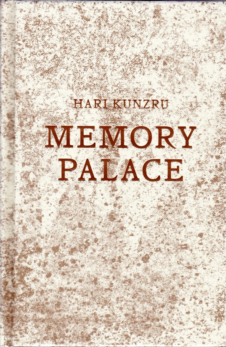
“Memory Palace” by Hari Kunzru (V&A Publishing, 2013)
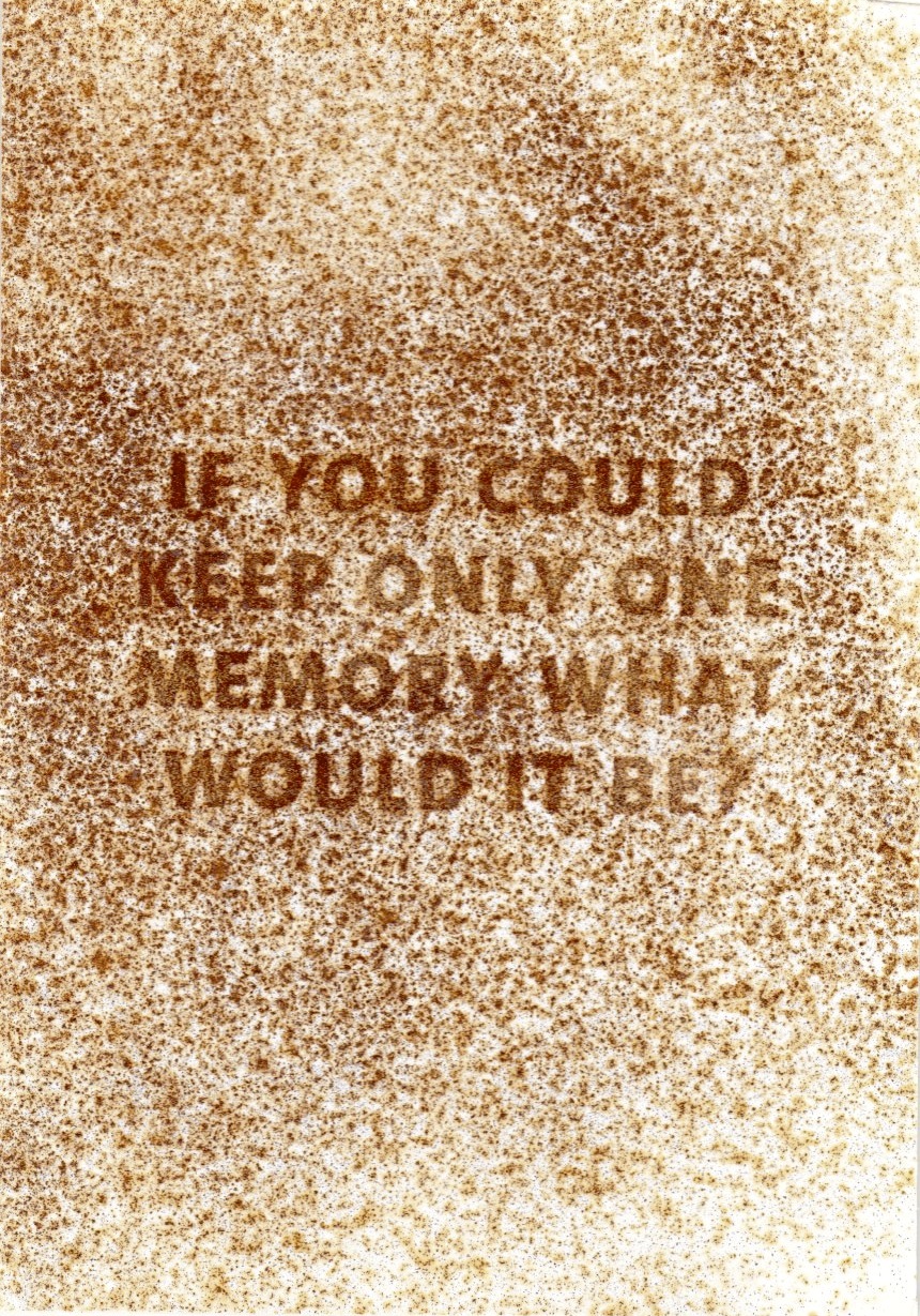
The “object-ness” of the book and the exhibition graphics (designed by Sara De Bondt Studio) actually bridge the gap between two- and three-dimensions. The Private View invitation features a “rusted” surface, echoed in the book’s binding, which also assumes the reassuring physicality of an antique tome; the exhibition graphics are laser-cut from stencil board, which casts a slight shadow onto the gallery walls.
“Memory Palace” Private View Invitation by Sara De Bondt Studio.
Many of the exhibits test the boundaries between dimensions. Some are larger than life structures, albeit with surfaces enhanced by all sorts of hand- and machine-made marks, but a long way from “the page” (where their creators usually work).
Walking into the exhibition, at first sight, there looks to be too much to read, but actually you could romp through the show in about 20 minutes. But, you will be stopped in your tracks, and take time to look, think and imagine.
One of the most compelling elements of the show is the use and abuse of wordplay; the result of names and places being half-remembered by the “memorialists”, which in turn transforms literal into lateral thoughts. It takes time to decipher the mythologised Underground Stations and the mangled nomenclature of scientists and philosophers. These teasing word games, in turn, unearth deeper, more accurate truths. Henning Wagenbreth’s covered in words and symbols, spells out some functions of the museum – “Muse Amuse Museum” – and reminds us that we’re standing in what is effectively a palace containing so many memories.
Finally, the narrator realises an obvious contradiction; that his Lord Inquisitor, may be closer to past heroes (Lawlords) than he’s letting on. It can be no coincidence that he is “lectured” in a way that is totally incompatible with the Inquisitor’s declared beliefs, which shun knowledge. The so-called “wilding” may simply be a strategy for preventing the majority from demanding the things that the powerful control and only they can enjoy. An uncomfortable sense of conspiracy undermines the narrator’s ability to survive. Yes, Memory Palace is dark, and it’s about to get darker…
Another contradiction struck me; the narrator learnt to memorise and recite, and his garbled versions of ideas and information provide a beacon for defiance, but to what ends? There is no sense that his words and phrases are understood by anyone; nor that the knowledge is of any use, for rebuilding, repairing, reanimating the dead technology. If no one can read or write, understand or decipher, then all knowledge is lost, and the repeating of meaningless mantras is simply cultish incanting, which is the accusation levelled against the memorialists. More like a glitchy PC than an Artificial Intelligence, the narrator is simply a data bank, and a corrupt one at that. Sadly, symbol, sign, meaning and interpretation have become separated from each other, and there doesn’t seem to be any way to put them back together again.
That visitors love to interact with exhibitions is proven by the final exhibit, Johnny Kelly’s interface for recording a favourite memory, to be immortalised within a patchwork of quotes and images on a weekly poster, and the Memory Bank website too. Either in silent contemplation or in a group of inquisitive friends, the live-action inscribing looked like a big hit with all the visitors that I observed.
Of course I had a go, but I won’t tell you my memory; perhaps like a wish, it should remain secret. But I could have added another memory, prompted by Erik Kessels’ installation of paper bales constructed into a “chapel”, which reminded me of my father’s recycling business back in the 1970s and the overwhelming aroma of tons and tons of printed paper…
This exhibition sets out to prompt memories, in effect, encouraging engagement between the visitor and the exhibition. That said, the first line of “human” interaction, between visitor and exhibition, is always the gallery staff. I make a point of asking gallery staff about a show. On my first visit to Memory Palace, I needed some clarification and asked; “…are the words on the walls from the book?” The reply was reticent; “not too sure, the main desk might be able to locate more information for you”. Hmmm, helpful but hardly enlightened. On my second visit, one of the most engaging pieces, a large light-box by Némo Tral was dark, the impact lost; but none of the staff knew it was switched off or why. These aren’t criticism, just observations.
When an exhibition is this ambitious; when it foregrounds the experiential qualities of the gallery; when so much effort has been put into the process of curation, commissioning and making these unique works; then it’s a shame that such easily fixed details might mar the experience of this great show for even one visitor.
For more information about Sky Arts Ignition sponsorship of new arts projects, see, here.
