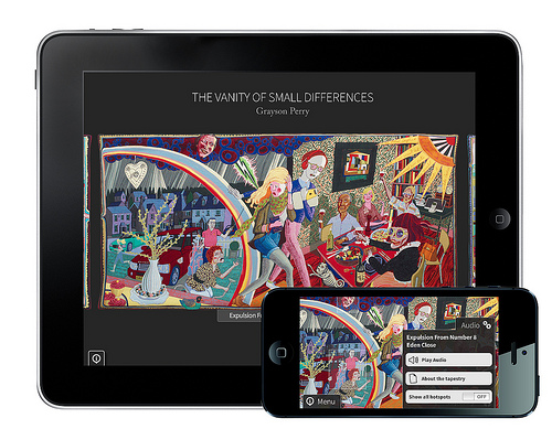
iPad and iPhone app by Aimer Media
The Vanity of Small Differences
Victoria Miro
26 Wharf Road, London N1
From 7 June to 11 August 2012
Visited 21 July 2012
Currently at Royal Academy of Arts, London
From 10 June to 18 August 2013
and Sunderland Museum, Tyne and Wear
From 28 June to 29 September 2013
Not just an exhibition; it’s a six-tapestry cycle, “The Vanity of Small Differences”; a three-programme television series, “All in the best possible taste with Grayson Perry” on Channel 4; a London show and national tour; a book by Hayward Publishing and now an app by Aimer Media; the multiple-media by which Grayson Perry has disseminated his thesis on British class and taste is an impressive exemplar of cross-platform marketing and, in academic terms, of engagement and impact. If Perry were earning REF (Research Excellence Framework) points for a higher education institution, it would score off the scale.
Last summer I watched the TV shows (thanks 4oD) and then stood in front of the tapestries on a sunny Saturday afternoon. It felt like half the Guardian readers of London were doing likewise, but the Victoria Miro gallery was spacious and calm (thanks to a recent addition by minimalist-maestro Claudio Silvestrin). Because it’s a commercial gallery and doesn’t attempt to capture visitors for an all-day session (with cafes and shops), the crowd milled and departed. It was a diverse audience too (possibly because of the TV-tie-in), providing an excellent opportunity for people watching and eavesdropping. A second gallery sofa would have been nice.
A reinterpretation of William Hogarth’s “A Rake’s Progress” (1732-1733), the project is a moral tale for 21st-century Britain. In the TV shows we hear Perry’s aims and motivation, travel with him around the country and go behind the scenes, witnessing his working process, a blend of research, drawing and making.
Perry’s exploration of how the British deliniate the class system offers no neat “one taste fits all” definitions, but demonstrates a more subtle stratification of taste, within classes as well as between them. We’re used to chopping up the Middle Class into upper- and lower-, but Perry reveals myriad variations, based on geography, income, education, inheritance and inclination. These “small differences” are stitched into the tapestries themselves, in compositions that highlight how characters transgress by moving beyond the familiar, and by Perry’s use of vignettes to mirror selected objects and juxtapose radical aesthetic shifts.
In a heartfelt article linking the project with her own taste-making experience, Suzanne Moore introduces the French philosopher Pierre Bourdieu’s notion of Cultural Capital (the assets – beyond wealth – that promote social mobility and manifest as taste via objects; intellect/books and art, environment/home and interiors, appearance/fashion and gadgets). She bemoans the fact that successive generations wouldn’t be able to class-hop (“accrue Cultural Capital”) as her and Perry did by way of free access to higher education, which Bourdieu recognised as crucial to upward mobility. Moore adds; “At a time when social mobility has ground to a halt – when inequality booms and cannot be bust – Perry reminds us of how we tell each other who we are and who we belong to. In these conservative times, this is a radical thing to be doing”.
Moore values that debate, manifest by discussion of taste, and says it’s missing from modern life. But that debate isn’t necessarily linked to upward mobility (which Moore fetishizes); the point Perry is making, on his “taste safari”, is that not every strata of society aspires to another, not every “class” strives for mobility or is ashamed of their “born and bred” taste. Perhaps only the Middle Class does, sandwiched between where it came from (a lot of the time) and where it’d like to be (but as Perry tragically demonstrates, money can’t buy you “class”). Taken as a whole, Perry’s project shows characters celebrating taste, in its manifestations.
The Middle Class may still sneer. But who cares if they do? The infamous “I know my place” sketch (by Monty Python and the Two Ronnies) that poked fun at the middleman (literally) – “I look down on him, but I look up to him”– is “so over”. Insults and put downs evolve, chav being this decade’s model, but some individuals reconstitute being “labelled” into a badge of honour, while nice-middle-class-kids have been “slumming it” ever since “bad” became “good”. They may grow out of it. Meanwhile, for the super rich it’s an accepted modus operandi, in the shape of “Euro Trash” and the “ski bum”.
Going back to Perry’s project and how he is disseminating the debate; now there’s an app (developed by Aimer Media for iPad and iPhone), launched to coincide with the tapestry roadshow. One edition of the cycle has been donated to the British Council Collection and Arts Council Collection jointly, for exhibition in the UK and abroad. Meanwhile, Perry’s own edition is in London, at the Royal Academy’s Summer Exhibition.
Go see the tapestries “in the stitch” as the devil is in the detail. Both Hogarth’s model and Perry’s homage delight in the minutiae of form, colour, pattern and juxtaposed objects. Aimer Media’s app zooms in, offering close-ups of the tapestries, much like the Great Art on Screen movie of the “Manet: Portraying Life” exhibition, which wowed audiences with a magnified vision of masterful brushstrokes that are more “real” than any gallery experience. Reviewed here.
Beyond the reproduced image though, the tapestries reveal much. The direction, size and style of stitches create a sort of “choppy sea” surface, a texture that enmeshes the depicted objects and characters, rendering a cohesive, almost claustrophobic vision of taste, relentless in its “wholeness”.
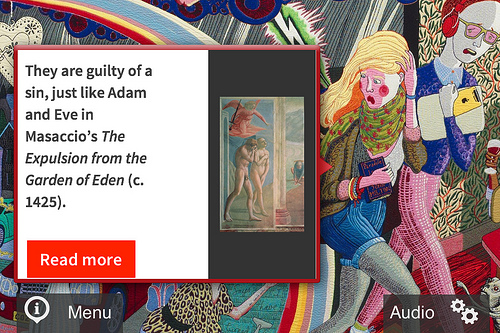
App, detail, showing art historical reference
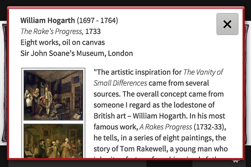
App, detail, showing more extensive background information on Hogarth
The app also offers to enhance the viewing experience by way of Perry’s commentary, and explanations of art historical references. When it comes to “reading images”, the public’s acceptance of explanatory media points to a real need for guidance. We’re literate when it comes to text, but not so happy looking at pictures and figuring out what they mean, i.e. reading visual images. Our education system continues to marginalise this transferrable skill, which will become more important as the screen replaces the page.
While one way to aid the reading of images is to fill-in-the-gaps with literary references – the traditional art historical method of iconography uses the myths and legends of ancient and biblical literature to “decode” the great history paintings of the past – there are a couple of snags with this.
If we use literature to “literally” foreground one meaning, does that become “the right answer”? This version validates the artist/author as meaning-maker, over the experience of the reader/viewer. If we consider that each audience member sees and interprets texts/images/objects differently, then the pervasion of spoken commentary headsets in galleries and museums might represent a desire to understand, but is it preventing gallery and museum visitors from really questions what they see, or simply receiving one version of a “truth”.
Commentaries are useful, but never definitive, and a more nuanced understanding of art is that interpretation is not cut and dried. By interpreting user-data an “interactive” app could go beyond didactic methods of meaning-making and offer commentary tailored to the user’s experience. More open ended, it could also prompt questions rather than simply provide answers.
With an artwork that refers to an historical precedent and includes a substantial amount of text (the least successful element of the tapestries, for me, as it’s difficult to read), then yes, background material is useful (a gallery hand-out can always), but perhaps only as a starting point. Observing the visitors at Victoria Miro, there were many conversations going on (there were no headsets to get in the way), perhaps because we love to talk about TV shows; what else is an evening of tele-viewing for but to provide workplace conversation the next day? TV viewers feel comfortable having an opinion about a nightly news programme or a regular soap. Thanks to his savvy multi-media approach, the lasting outcome of Perry’s “Vanity” project may be that the great British public becomes a little more confident discussing art, design and even tapestries.
